

Maps of US cities to the same scale
|
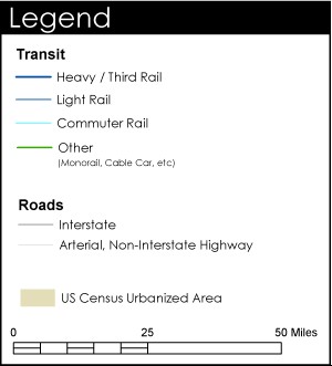
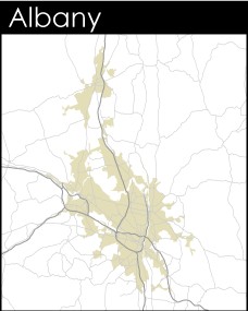
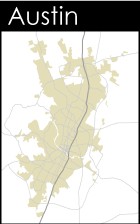
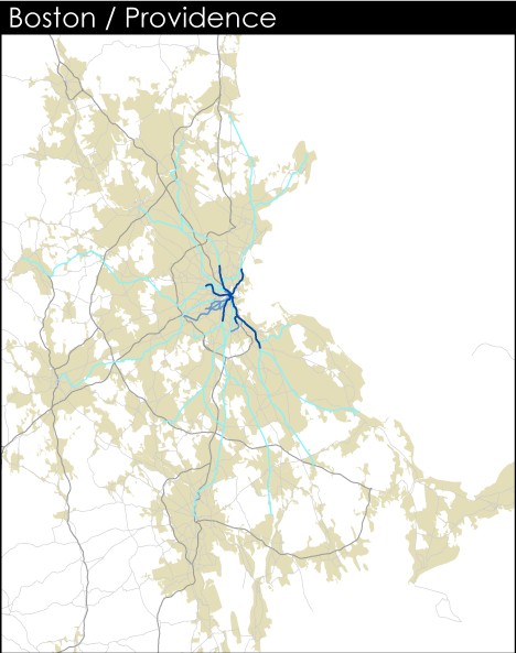
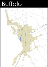
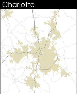
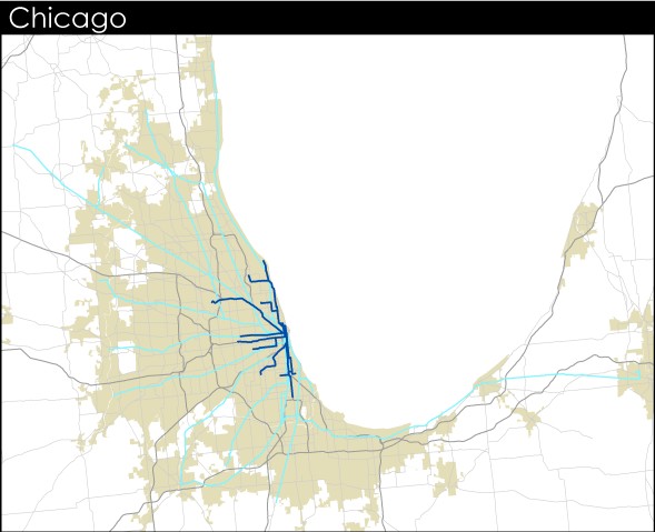
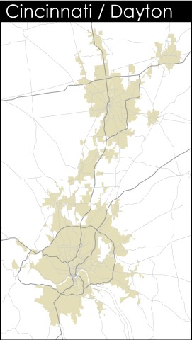
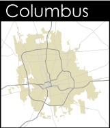
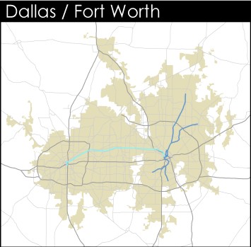
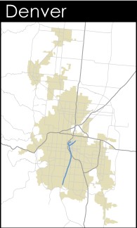
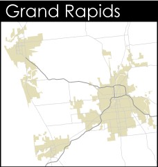
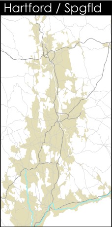
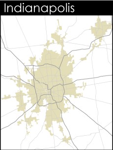
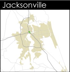
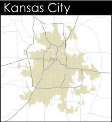
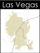
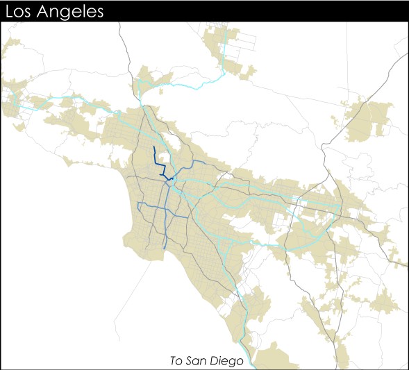
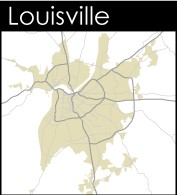
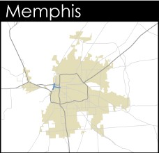
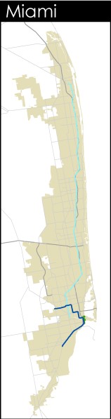
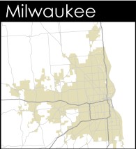
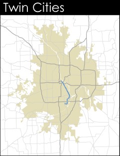
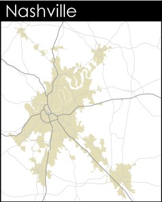
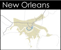
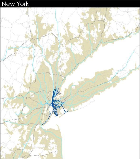
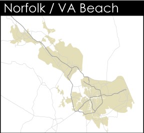
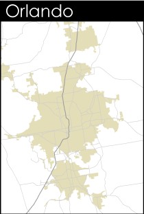
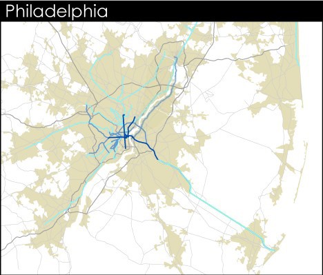
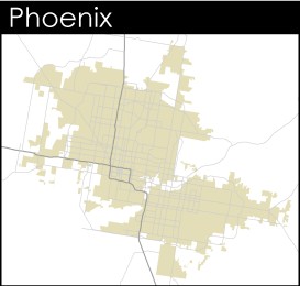
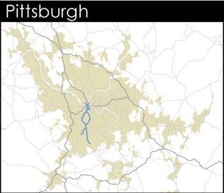
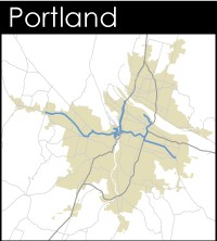
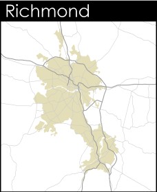
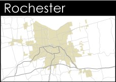
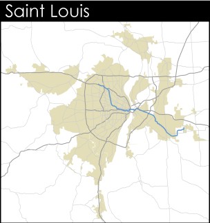
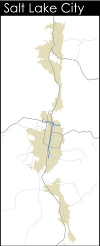
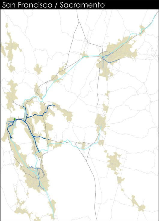
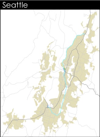
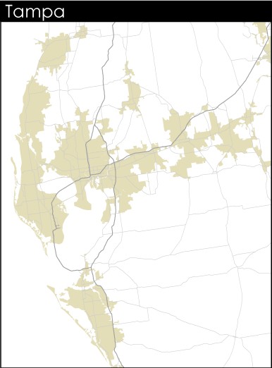
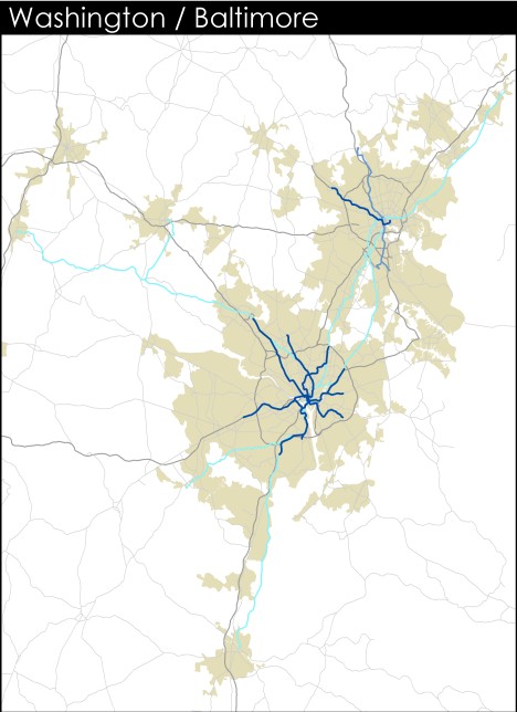
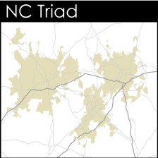
What you’re seeing is a series of maps that show the urbanized areas, major roadways and rail transit lines* of every metropolitan area in the United States with a population over one million. The maps are special for two reasons. First, the urbanized area boundaries follow official government standards. That is, they show continuous census tracts (roughly neighborhood-scale geographic units) with a population density of at least 1,000 people per square mile, as defined by the United States Census Bureau. Unlike most maps we’ve seen, these illustrate the actual built-up, non-rural metropolis as accurately as possible. Second, the maps are all to the same scale. You can pull up maps of multiple cities next to one another and compare.
You may be asking what this has to do with Washington and why it’s on BeyondDC. Well… we admit it: This feature doesn’t really have anything to do with Washington, at least not any more than it does every any large city in the country. No, it’s just something we put together for other reasons, thought was cool, and figured readers might enjoy.
* Not including airport people movers, tourist trains or heritage trolley operations.
|
|