Congress is considering whether or not to change DC’s height limit. Here are 9 suggestions that will help the city get the most benefit out of changing (but not eliminating) its height regulations.
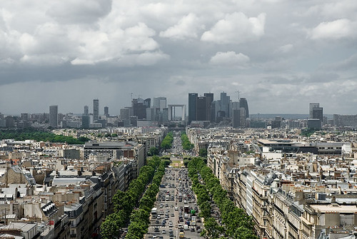
Paris’ La Defense skyline. Photo by KJ Vogelius on flickr.
Much of the debate about the height limit has settled into two opposing camps, those who want taller buildings, and those opposed to any change. But it doesn’t need to be so black and white.
Regulations can change in practical and beneficial ways, without destroying Washington’s unique layout. If Congress repeals or changes the DC Height Act, the District will be free to regulate height in much more flexible ways.
That in mind, here are some suggestions that Congress and the DC Council should consider as they move forward.
1. Don’t eliminate, calibrate
Even though eliminating all height limits completely isn’t anyone’s proposal and has never been seriously on the table, it’s worth saying up front just to be clear. There are good reasons to regulate height, but our existing laws are not necessarily the ideal set. We can make them more ideal with some fine tuning.
2. Target development where we want it
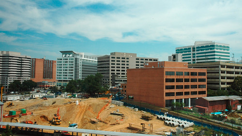
Many assume raising the height limit would result in taller buildings everywhere, or all over downtown, but that need not be the case. It would be smarter to pick specific areas where we want to encourage more development, and only increase the limit there.
The city can raise the limit only on blocks with a Metro station entrance, for example, or only within 1/8 mile of Metro stations with low existing ridership, or only near Farragut Square, or only in Anacostia. Whatever.
No doubt where to allow them would be a contentious question, but the city already has many regulations encouraging or discouraging development in certain areas. There’s no reason the height limit can’t be used in the same way. We can be selective.
3. Grant a residential bonus for downtown
Downtown DC has no trouble attracting development, but office is usually more profitable than residential, so downtown is often packed during work hours but pretty empty in the evenings. More residential would help downtown stay active on evenings and weekends, not to mention reduce the capacity stress on our transportation network by allowing more people to live close to their work.
But under current rules, developers often can’t justify using floor space under the height limit for residential when office is more lucrative. If they got a bonus for residential, allowing them to build taller only if some or all of the added height were used for apartments, that would benefit everyone.
4. More offices can go downtown, but also other places
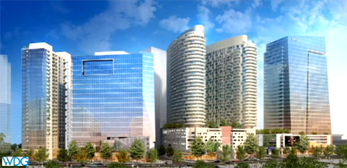
We want a lot of office buildings downtown because that’s where our regional transportation system converges. But we also want office buildings outside downtown so residential areas don’t empty out during work hours, and to encourage a healthy economy throughout the city.
Uptown nodes like Bethesda and Clarendon are good for the region and would be good for the city, and would happen in DC if we allowed them to. So while it may be desirable to allow taller buildings in some parts of downtown sometimes, it’s also desirable to encourage office development elsewhere as an anchor for uptown commercial districts.
5. Be inclusive of affordable housing
Height limit opponents say taller buildings will make DC more affordable, because it will increase the supply of housing, thus helping to address rising demand. Supporters of keeping it say tall buildings will make DC more expensive, because new development is almost always expensive. They’re both right, but those points aren’t mutually exclusive.
New buildings are indeed almost always expensive, because it costs a lot to build a skyscraper, and developers need to turn a profit within a few years.
But new buildings eventually become old ones, and this isn’t a short-term decision. Buildings that are expensive at first often become the next generation’s affordable housing. Part of the reason DC has an affordable housing problem now is that we didn’t build enough new buildings a generation ago. If we don’t build enough new units now, the next generation will be out of luck too.
In the mean time, we can solve the short-term affordability problem with inclusive zoning; in exchange for allowing taller buildings, the city should require some of their units to be affordable. Win-win.
6. Require good architecture
Some who want to change the height limit say regulations hurt DC’s architecture, resulting in boring-looking buildings. Meanwhile, many others hate tall buildings because so many skyscrapers are ugly. Both arguments are equally bad, because the world is full of both great and ugly buildings of every height.
But there’s no denying that tall buildings stand out, and thus become landmarks whether beautiful or ugly. To ensure we get the former rather than the latter, DC (or even NCPC) could require aesthetic review & approval for the design of any building above a certain height.
That sounds cumbersome, but it’s standard practice in many cities, and DC already does it in some neighborhoods.
A city the size of DC wouldn’t want to insist on aesthetic review for every building, but there’s no good reason DC can’t do it for tall ones.
Of course the devil is in the details. To use this sort of oversight, DC would have to establish design guidelines that tell architects what the city will approve or deny. That could be contentious, and might not be the same everywhere in the city.
7. Preserve historic facades and encourage entrances
Frequent, unique-looking entrances are incredibly important for quality walkable urbanism. One problem with tall buildings is many are so wide that they’re boring to walk next to at the ground level. The minimalist facades of modern architecture compound the problem.
This is why the urbanism in Georgetown is better than Rosslyn. It’s not that Rosslyn has buildings that are too tall, it’s that Rosslyn’s buildings are too wide, and too bare at the ground level.
While it’s not practical for tall buildings to change completely every 25′ the way rowhouses in Georgetown do, their ground floors can be designed to look and function as smaller buildings, and historic buildings can be integrated into larger developments above.
This may not strictly be a height limit issue, but it’s a good way to ensure that taller buildings improve the streetscape. It can be accomplished using the design guidelines and architectural review process outlined above.
8. Outlaw surface parking lots
Surface parking lots are the bane of walkable urbanism, but they’re common in almost every skyscraper-heavy downtown in America, because one large building can sap up years worth of demand, leaving developers of other properties waiting in limbo for reason to build.
Many developers in downtowns around the US opt to leave land nearly empty rather than fill it with short buildings, on the chance that they may strike it big with the next big once-a-generation mega skyscraper. Surface parking lots provide a convenient way to use that land in the mean time.
This is a big problem, and DC is not immune. In 2008 the developer of what’s now the shiny office building on the northwest corner of Connecticut Avenue and K Street wanted to use that land as a parking lot.
Outlawing surface parking lots in areas where tall buildings are permitted would go a long way towards ensuring downtown DC never looks anything like this.
9. Protect the iconic monuments
Development economics are important, but they’re not the only thing. The most valuable land in DC is probably the White House Ellipse, but we’re not going to put skyscrapers there. DC’s skyline view of the Capitol and Washington Monument is one of the world’s most iconic, and should of course be preserved.
But taller buildings in Farragut Square or Brookland or Anacostia wouldn’t impede that view any more than they do in Rosslyn, and La Defense did not destroy Paris.
We can, and should, allow taller buildings where they’re most appropriate, while protecting the views that define our city.
 Cross-posted at Greater Greater Washington.


