|
Special Features


Image Libraries


|
|
Blog
New WMATA bus maps are great, but need some tweaks
|
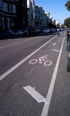
Central DC in WMATA’s new map. |
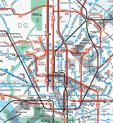
WMATA’s new bus maps are, in a word, awesome. They are so good, on so many levels. They will make navigating the bus system vastly easier, and less intimidating. But WMATA asked for comments, so I’ll make some.
What’s better
The main problem with WMATA’s old bus maps were that they were so complex that reading them was essentially impossible. WMATA has so many criss-crossing bus routes, all illustrated identically, that riders had to already be familiar with a bus route in order to use the maps. That dissuaded a lot of people from using WMATA buses, or from using them more extensively.
The main improvement of these new maps is that everything looks simpler. Individual routes are vastly easier to follow, thanks to more variety in line color, thickness, and improved spacing.
The best single new feature is that the best bus routes are highlighted with a thicker line, so it’s easier for riders to find the routes that are most convenient. This is exactly the reason why I published my own 15 minute bus map earlier this year. WMATA’s new maps are better than my version though, because they offer so much more information while still clearly highlighting the frequent network.
WMATA’s PlanItMetro blog has several further examples of how these new maps are more clear. For example, compare how the old and new maps illustrate the area around Greenbelt Metro station:
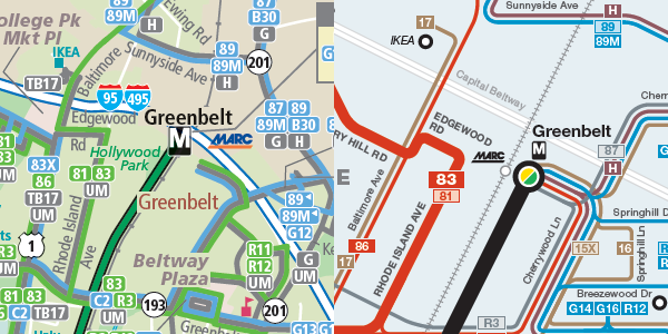
Old on the left, new on the right.
Good luck reading the version on the left.
What needs improvement
There are two big problems with the details of how these maps highlight the best routes.
The first is that some of the best bus routes in the region are hard to find on the maps. DC Circulator, Bethesda Circulator, and the King Street “trolley” shuttle all offer extremely good service, but are shown as minor routes on the map because they aren’t run by WMATA.
Failing to show non-WMATA buses in a fair way is a disservice to riders, and is counterproductive to the goal of encouraging overall transit ridership. WMATA exists in order to serve the needs of the DC region. What’s most important is a complete picture of transit services, regardless of who operates them. Self-serving parochialism should not be WMATA’s mindset.
The second problem with the way the new maps highlight good routes is that the standards for what qualifies as a highlighted route in Northern Virginia are too low. This unnecessarily clutters the Northern Virginia map, and doesn’t give riders accurate information.
Here’s part of the Northern Virginia map. There are so many thick red lines that it’s very difficult to follow them, which defeats the point of having them in the first place.
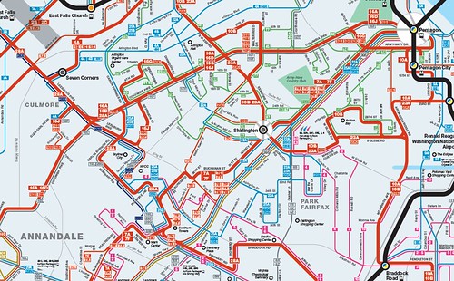
Northern Virginia, too cluttered.
Some of those “frequent” bus routes only come every 1/2 hour at off-peak times of day. Some of the others are branches that should be shown with a thin red line. Meanwhile the 9S, which is one of the most frequent routes in Virginia, doesn’t have a line at all.
Compare that Northern Virginia map with the Montgomery County version, which shows highlighted thick red routes much more clearly. The standards for a thick red line on the Montgomery County map are tight enough to keep them clear. The standards on the Virginia map are too low, resulting in a cluttered and less usable map.
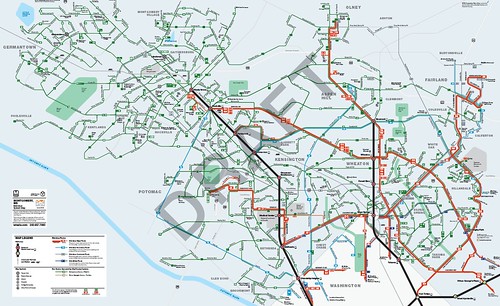
Montgomery County. The right half is good, but the left half needs work.
On the other hand, the Montgomery map has another problem. Look at Gaithersburg and Germantown, which take up the left half of that map. All the routes there are shown with the same kind of line because they’re all pretty similar, but that makes them hard to tell apart on the map. And since Gaithersburg and Germantown have twisty suburban streets rather than planned grids, the new map’s geographic distortion makes it harder rather than easier to read.
Recommendations
1. Add a middle thickness line weight and use it to highlight non-WMATA frequent routes, as well WMATA routes in the suburbs that need to be called out as “major”, but that don’t offer really frequent service. This will better illustrate the important non-WMATA routes, and improve the visual hierarchy in suburban areas, which are currently shown with either too many or too few highlighted routes. This will also better inform riders about the quality of routes.
2. Add more geographic clues in areas with a lot of homogenous routes that are difficult to distinguish, such as Gaithersburg and Germantown.
3. Add names to MARC and VRE station labels.
4. Make a single regional map available. There are good reasons to keep separate maps for DC, Montgomery, Prince George’s, and Virginia, but there’s no good reason not to publish a single overall map as well.
5. A really great next step would be to make these interactive maps, instead of pdfs. I’d love to be able to see individual routes highlighted separately whenever I hover my cursor on them, and then go to the timetable with a click.
Send WMATA your own comments
To make sure WMATA planners read your thoughts, leave them in the comments section of the PlanItMetro blog.
September 27th, 2012 | Permalink
Tags: bus, maps, proposal, transportation

How to fit cars, bikes, and transit on M Street SE/SW
|
DDOT’s options for transit lanes or cycle tracks on M Street. Why not both? |
Last week DDOT released its initial study of alternatives for M Street SE/SW. The study identifies 3 options for how the street might be redesigned, including options that include dedicated transit lanes and cycle tracks. However, none of DC’s options include both transit lanes and cycle tracks.
In a joint editorial published today at Greater Greater Washington, David Alpert and I discuss why DDOT used this strategy, and how the next round of planning can and should combine aspects of the existing 3 alternatives to form new and better multimodal options.
>> Go to GGW and read the editorial.
(Link fixed.)
September 18th, 2012 | Permalink
Tags: bike, bus, development, metrorail, proposal, roads/cars, streetcar, transportation, urbandesign
Next July 4th, DC should close 13th Street
|
New York’s Summer Streets program could be a model for a July 4th celebration in DC. |
The National Mall is a great place to watch DC’s July 4th fireworks celebration. But it’s also such a tremendous hassle that many Washingtonians prefer to watch from more local neighborhood vantage points. A street festival on 13th, NW would instantly become the prime non-Mall celebration.
Every year thousands of Washingtonians watch the fireworks from somewhere along the Meridian Hill escarpment. Cardozo High School’s football stadium is a popular choice, as is Meridian Hill Park. But the best vantage points are from the roadways of north-south streets, where they slope up the escarpment between Florida Avenue and Euclid Street. Unfortunately for fireworks watchers, an active street is not a safe place to put down a blanket.
But surely every single north-south street is not needed for transportation purposes on the 4th. 16th Street is probably too important as a traffic artery, but what about 13th? If the city were to close it to cars for a day, it would provide a fantastic viewing spot, right in the heart of the residential city. 14th Street could also work, but the views from 13th are significantly better.
Closing 13th Street would also provide another benefit: it could easily accommodate a street festival.
Instead of spending the 4th camping out for a good spot on the National Mall, imagine spending it strolling up and down a car-free 13th Street, lined with food, shopping, and art vendors south of Florida Avenue. Then just before dark, imagine hiking north of Florida Avenue to watch the fireworks from the sloping hill.
For years many DC residents have lamented that we have nothing like New York’s Summer Streets program, which closes Park Avenue to cars on 3 Saturdays each summer, resulting in a 7-miles-long walking and biking street fair. New York’s program has been hugely popular, and a DC version surely would be as well.
Why not kill two birds with one stone? Close 13th Street between Logan Circle and Euclid Street, providing DC residents with both a mile-long summer cyclovia, and an awesome new place for thousands to watch the fireworks, hassle-and-impediment-free.
Update: According to Pedro Ribeiro, Director of Communications for the DC Mayor’s Office, the city did in fact close 13th Street this year, between Euclid Street and Florida Avenue, beginning at 8:00 pm. That’s a great first step! Now let’s extend the closure down to Logan Circle, and make it all day.
July 9th, 2012 | Permalink
Tags: events, proposal
Soon to be vacant Mobil headquarters should be redeveloped
|
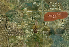
Mobil’s huge property, marked in red. Click to enlarge. |
In 1987 the Mobil gasoline corporation moved its corporate headquarters from New York to Merrifield, Virginia. It was a major coup for the DC region, and a big early step in the growth of Fairfax County as a major corporate base. In the style of the times and befitting a major corporation, they built and occupied a massive campus-style building, set back literally acres from any of the surrounding highways. The site is pictured at right.
12 years later, in 1999, Mobil merged with Exxon to form what is today the 3rd largest corporation in the world. ExxonMobil’s headquarters set up in Irving, TX, in suburban Dallas. The Merrifield office became the Downstream headquarters, directing refining, manufacturing and marketing.
And now they are vacating their 1.2 million square foot behemoth office building and consolidating their offices in Houston – the oil capital of America.
Apparently they are shopping the building to other prospective office tenants. Fairfax County says they don’t expect it to be vacant for long.
But should this building still be used? It’s a private fortress set in a huge forest, amidst an otherwise urbanizing area. It’s a dinosaur of 20th Century planning. Inefficient use of land, laid out to require everyone to drive, and surrounded by “open space” that’s impractical for anyone to use as an actual park. Bad bad bad.
On the other hand, it’s a huge piece of land at an absolutely great location. It would make a fantastic town center development. The land is too far from Dunn Loring Metro to be walkable, so it wouldn’t be a TOD, but it could easily accommodate a Reston Town Center or Shirlington-like development, which if not perfect would still be a big improvement over sprawl. And who knows, regional transportation planners are starting to discuss the possibility of light rail on Gallows Road (pdf, see page 2, item #8), so maybe in a few decades that transit connection will be there after all.
It’s unfortunate that the region will lose all the jobs associated with Mobil, but it would be even more unfortunate if this opportunity to redevelop one of the prime pieces of real estate in Fairfax County were missed.
June 8th, 2012 | Permalink
Tags: economy, energy, lightrail, master planning, proposal, transportation
What’s in a transit name?
|
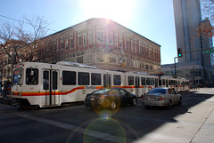
Is this light rail or streetcar? |
What’s the difference between a streetcar and light rail? What qualifies as BRT versus merely priority bus? One problem with contemporary transit planning is that there’s really no solidly defined answer for those questions.
Originally the term light rail was invented to describe streetcar systems that had express service characteristics. So light rail was really just rapid streetcar. But even the most express light rail systems often run slowly along on surface streets at the downtown end of their route, which muddies the waters.
Furthermore, transit agencies around the country name their lines whatever they want. For decades Philadelphia called one of its light rail lines a high speed trolley. Meanwhile, Tacoma, WA runs a short streetcar line that uses the exact same rail vehicles as Portland’s famous streetcar, but Tacoma calls it light rail.
The situation is even more muddy for buses, since terms like BRT and priority bus are relatively new. Indeed, communities buying off on the concept of BRT only to see it scaled back has become such a continuous problem that Congress is now considered adopting standards that bus lines must meet in order to be called BRT.
So this is a fairly big problem.
I do think there’s a fairly easy, practical, and common sense answer available, however. Does your line run in a dedicated transitway or not? If so, it’s rapid. If not, it’s local. Here’s a handy table describing this system, which is how I’ve personally been mentally sorting transit systems for years:

This does leave two problems unresolved.
First, how do you sort a striped transit lane? The bus lane on 7th Street in Gallery Place is obviously vastly inferior to a true busway, but surely it counts for something.
Second, what to do with transit lines that have different characteristics along different portions of their length? One of the main selling points of both LRT and BRT is that they’re very flexible, and can built to fit the needs of the community. Thus it’s pretty rare to find a line that operates in the same sort of running way for its entire length. Many use a dedicated transitway for part of their length, then mix with traffic elsewhere.
But at the very least, the above table can be useful as a way to generally describe many transit systems. So I think it’s useful.
February 28th, 2012 | Permalink
Tags: BRT, bus, lightrail, proposal, streetcar, transportation
Tell WMATA to give Silver Line stations good namesFairfax County has proposed truly awful names for its Metro stations on the soon-to-open Silver Line. They are indistinct, confusing, and would completely fail to establish any sort of identity for the neighborhoods they serve.
Luckily, the ultimate decision for what to name Metro stations falls to the WMATA Board, and they are interested in using some potentially superior names. They’ve created a public survey requesting feedback on the proposed names, including several alternate suggestions for each station.
In 2008 I suggested the following names for the four stations in Tysons Corner, some of which are being considered in Metro’s survey: Scott Run, Galleria Center, Westpark, Spring Hill.
Please, for the love of all that is good in the world, take the survey and tell Metro to use names that will help create a sense of place. At the very least, tell them to use names that aren’t so indistinguishable.
Take the survey now
February 21st, 2012 | Permalink
Tags: metrorail, proposal, transportation
Bike lane with striped door zone
Bike planners will tell you that it’s safest to ride in the left side of bike lanes, in order to avoid the door zone. But a lot of people don’t know that. So how can we get the message out?
How about door zone markings on bike lanes, like this image.
Photo by Lee Comma Dennis on flickr.
December 5th, 2011 | Permalink
Tags: bike, proposal, roads/cars, transportation
Make Longfellow Triangle a real parkLongfellow Triangle is one of many lightly used leftover spaces on the L’Enfant grid. With some creative thinking, the city could turn it into a more useful and enjoyable public space.
The triangle is bounded by Connecticut Avenue, Rhode Island Avenue, 18th Street, and M Street. While it would make sense to have a circle there, one never developed, likely because Rhode Island Avenue doesn’t carry through, but rather ends at the intersection. The triangle’s mirror image on the grid, where Massachusetts Avenue meets Vermont Avenue, is Thomas Circle.
Currently, Longfellow Triangle is too small to be a useful park, and too isolated by traffic to be a good plaza. But it doesn’t have to be so. Putting a circle there now is impossible, but with a little bit of street reconfiguration it would be possible to make it a bigger and better triangle park.
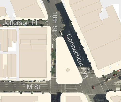
This is a map of the existing conditions at Longfellow Triangle:
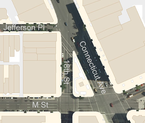
Existing conditions.
Look at how wide the streets are that surround the triangle. Connecticut Avenue is 6 lanes, not counting its generous median. 18th Street is 4 lanes. M Street is 5. All of them have on-street parking, although the parking lanes are used as through lanes at peak periods.
If the city re-purposed the parking lanes on each surrounding block and used that width to add to the triangle, the park space could be dramatically enlarged with little reduction in street capacity. On Connecticut Avenue the median could be re-purposed as well, or it could substitute for one of the parking lanes.
These images show how that might work. In the left image, parking lanes and the Connecticut Avenue median are identified in red and orange. In the right image, the orange spaces are shifted towards the triangle, and the travel lanes are correspondingly shifted outward.
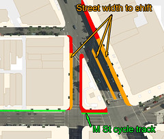 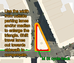
Shifting the parking lanes towards the triangle would increase usable park space.
The end result would be a considerably larger triangle, one with enough space to begin to take on some of the functions of a true city park. Instead of containing just a row of benches and some shurbs, the space would be large enough for tables, flower beds, and possibly a small lawn. Today’s underused leftover could become tomorrow’s Dupont Circle or Farragut Square.
The down side is that around 30 on-street parking spaces would be lost, and peak period street capacity would drop slightly. This seems a very reasonable price to pay for a greatly enhanced public space.
Other potential complications include the final placement of DDOT’s proposed M Street cycle track and the National Park Service, which is notoriously hard to work with. Neither of these hurdles appears to be a deal breaker, however. The cycle track will only take up a few feet, and if NPS reconfigured Thomas Circle in 2005 they might be willing to reconfigure Longfellow Triangle now.
Obviously this idea would require a considerable amount of additional study before it could be deemed practical. But if it is practical, the upside for urban livability might be tremendous.
Final result: An enlarged park.
 Cross-posted at Greater Greater Washington. Cross-posted at Greater Greater Washington.
August 31st, 2011 | Permalink
Tags: proposal
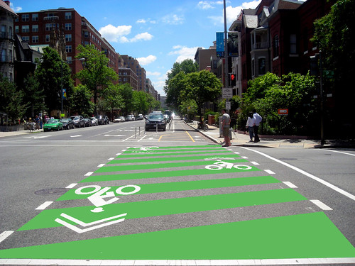
Cycle track street crossingsCycle tracks provide bikers with a high degree of separation from both automobiles and pedestrians. They are, by and large, very safe pieces of infrastructure. The one weakness of cycle tracks is at intersections, where car drivers turning out of the main roadway lanes parallel to the cycle track and onto cross streets may not always remember to watch for cyclists.
The 15th Street cycle track addresses this problem cleverly, with a pair of treatments intended to help drivers remember to watch for cyclists. The bike lane shifts over as it approaches an intersection so that car drivers can see if there are any bikes approaching in it, and the intersection itself is covered with sharrows and dashed lines. But can DDOT do more?
One addition to the cycle track that would surely be welcomed by cyclists would be green zebra striping. Zebra striped pedestrian crossings are extremely common all over DC, and the city has recently experimented with green bike lanes. It seems like common sense to combine two successful ideas in order to improve the safety of our facilities.
Here is a quick rendering of what this idea might look like:
August 18th, 2011 | Permalink
Tags: bike, proposal, transportation
A great idea for the Anacostia homeless shelter
It isn’t good enough for opponents of the plan to just say “no.” They’re obligated to propose a reasonable alternative.
|
|
Are NIMBYs who want to stop a new homeless shelter from locating on Anacostia’s main street justified?
It’s a tough question. One of the greatest lessons learned from America’s urban ghetto period in the late 20th Century was that if too many poor people are clustered together in a single area, that area becomes almost impossible for any of them to escape. Upward social mobility requires a mix of incomes. The line between providing services where they’re needed most and sending a neighborhood spiraling down towards becoming a ghetto is a difficult one to place.
And so, I think GGW contributor Veronica Davis is justified when she says “plans to put a homeless shelter in the middle of the business district, especially one without any ground-floor retail component, would impede Historic Anacostia’s progress.”
Historic Anactosia has been one of the city’s worst ghettos for decades, but these days it is improving, and if those improvements are to continue it’s important that key locations along the commercial main street (Good Hope Road) be allowed to become storefronts. If they aren’t, Anacostia might backslide into a difficult-to-escape poor enclave.
But even if all that is true, the shelter has got to go someplace, and should be convenient for its users, which are in Historic Anacostia. Therefore it isn’t good enough for opponents of the plan to just say “no.” They’re obligated to propose a reasonable alternative.
So what is the alternative? I think Veronica Davis has struck on a great idea:
“Locate a restaurant or retail business on the street level where the residents of the homeless shelter could have employment and gain some skills. The residences could be on the upper floor. This would allow for provision of social services and create jobs, while energizing the street level.”
The street needs a storefront, and homeless people need jobs. Why not kill two birds with one stone? Of course, adding retail increases the complexity of the project. The developer (Calvary Women’s Services) would need something to sell, and they might have to enlarge the building in order to accommodate both a store and a shelter. It would cost more up front, and charities don’t often have extra cash sitting around.
But including a store is such an improvement! It’s such a win-win, for both neighborhood residents and shelter users! If we can’t find a way to make it happen, or to make some other equally good alternative happen, then we are failing. Failing both to provide for the needs of the neighborhood, and failing to provide adequate services to the homeless users of the shelter.
It may not be justifiable to deny the shelter a home, but I think it is reasonable to ask that the homeless shelter be added in a way that doesn’t contribute to a neighborhood backslide. Ground floor retail may be a way to satisfy both needs.
August 3rd, 2011 | Permalink
Tags: development, proposal, social, urbandesign
|
Media


Site
About BeyondDC
Archive 2003-06
Contact
Category Tags:
Partners
|