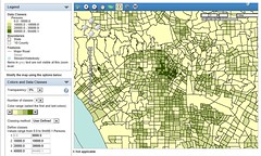
Rural Virginia leads eastern US in cars per householdThis map shows US counties, colored according to the average number of cars owned per household.
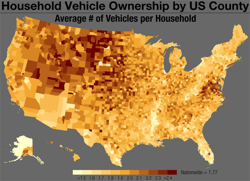
Several broad trends are visible, most of them not surprising to anyone. But it is surprising that so many counties in Virginia stand out, with higher rates than otherwise comparable counties in nearby eastern states. What’s different about the Old Dominion, versus West Virginia or North Carolina?
The map is from Tumblr blog Vizual Statistix, which has a lot of interesting data visualizations. It’s worth a read.
 Cross-posted at Greater Greater Washington.
December 2nd, 2013 | Permalink
Tags: demographics, maps, roads/cars, transportation
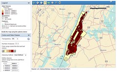
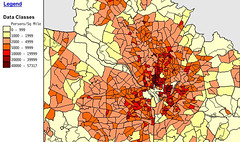
Yes, 14th Street is DC’s densest areaSunday’s Washington Post featured a big story about gentrification on 14th Street, including the claim that it “recently surpassed Columbia Heights as the densest area in the city.” Is that true? The US Census can tell us.
Using American FactFinder, I created this map illustrating the population density of DC’s central neighborhoods.

5 of DC’s 6 overall densest census tracts border on 14th Street, between downtown and the northern end of Columbia Heights. It’s definitely the city’s densest string of neighborhoods.
But is it denser north or south of Florida Avenue? That depends how you count. While the stretch of 14th Street between Florida Avenue and P Street remains a little sparser than in Columbia Heights, the stretch from P Street south to Thomas Circle is the densest single tract in DC.
Cross-posted at Greater Greater Washington.
July 22nd, 2013 | Permalink
Tags: demographics, maps
Compare the neighborhood density of American urban areasLast week’s post about census tract density in the DC area showed which neighborhoods inside the Beltway are densest. Now let’s look at the densest spots in the core areas of other large cities.
Urban areas are defined by the US Census as geographically connected areas with a population density of at least 1,000 people per square mile (ppsm). The standard provides a uniform definition of “city,” more useful for national comparisons than political boundaries. These maps show the central county in each of America’s 20 largest urban areas, in order beginning with the largest.
1. New York:
America’s biggest city breaks the scale. While others on this list might have a few neighborhoods in the top density category, New York is covered end to end. It’s one of only 4 cities with tracts above 100,000 ppsm. Its peak is 200,000 ppsm. |
2000
 |
2010
 |
| |
2. Los Angeles:
Despite its reputation for sprawl, LA compares favorably to the densest cities after New York. Its peak density of 94,000 ppsm is well above DC’s. |
2000
 |
2010
 |
> Continue reading
March 27th, 2013 | Permalink
Tags: demographics, history, maps
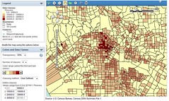
Logan Circle is now DC’s densest neighborhood
|
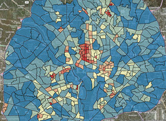
DC area density by census tract, in 2000 (top) and 2010 (bottom). Top image from US Census FactFinder. Bottom from Michael Rodriguez.
|
Density is a good thing for urbanism. More density means more shops and amenities nearby, better transit service, and shorter walks. But what qualifies as dense? Overall city density is often reported, but a more telling statistic is neighborhood density.
The two maps at right show DC neighborhood density at the time of the 2000 census (top) and 2010 census (bottom). I made the 2000 map using census.gov sometime after the 2000 census. Michael Rodriguez created the bottom map just recently. Unfortunately the two maps use different scales, but they’re still informative.
In 2000 the densest census tract in the DC region was in northern Columbia Heights, between Spring Road and Newton Street. It had 57,317 people per square mile (ppsm).
In 2010 that tract is up to 59,209 ppsm, but that’s only good enough for 2nd place in DC, and 3rd regionally.
The densest tract is now southern Logan Circle, between Rhode Island and Massachusetts Avenues. It’s boomed and is now a whopping 67,149 ppsm.
The rest of central Northwest, from Mount Pleasant down to Massachusetts Avenue, varies from around 30,000-50,000 ppsm. Capitol Hill is in the 20,000-30,000 ppsm range.
Meanwhile, in Alexandria, the tract at the corner of I-395 and Seminary Road is up to 59,886 ppsm, 2nd densest in the region after Logan Circle. There hasn’t been any new development in that tract since 2000, but the suburban-style apartment towers in it may have fewer singles and more families, which could account for the increase. Crystal City is 45,448 ppsm, and Ballston is 43,788 ppsm.
Suburban Maryland’s densest tract is in Langley Park, at 49,354 ppsm. Downtown Silver Spring is 34,816 ppsm, and downtown Bethesda is around 11,000 ppsm.
March 19th, 2013 | Permalink
Tags: demographics, history, maps
Growing Baltimore might get more TOD and a fancy train shedBaltimore’s decades-long population decline has officially reversed. The city grew by about 1,100 people last year. Congrats to Baltimore!
In more specific but also exciting news, Amtrak has adopted a new master plan for Baltimore’s Penn Station. It includes significant new development around the station, and a new canopy over the tracks that would dramatically improve the rider experience.
The plans are conceptual, and will have to go into greater detail before development can begin.
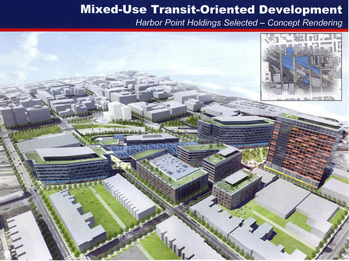
Concept plan for Penn Station. Image by Beatty Development.
March 15th, 2013 | Permalink
Tags: architecture, commuterrail, demographics, intercity, master planning, transportation


