


 The new I-395 air rights proposal. Still boring. |
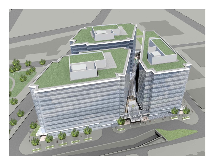
The I-395 air rights development in downtown Washington that I discussed last week has been redesigned. At that time I said it was good planning but bad architecture. That’s still true. The new design is marginally better with regards to urban design, but the architecture is as bland as ever.
What’s better: The old plan for this block called for two large buildings. The new plan calls for three slightly narrower ones. Narrow buildings are inherently more pedestrian friendly than wide ones, so this is an improvement. Compare the sidewalk vitality of a place like Georgetown to K Street. Both are lined with ground-floor retail, but in Georgetown there is a unique store with a unique facade every 25 feet, while on K Street the same storefront might take up half a block. More stuff on each block to look at and visit make Georgetown more pedestrian friendly.
The three buildings proposed here are more than the two from the previous proposal, therefore there’s more to look at, therefore this is better. But three buildings per block is not exactly a lot. The project would need thoughtful, vertically diverse architecture in order to be visually interesting. Unfortunately…
What’s not better: The architecture still stinks. We’re still looking at monolithic glass boxes that offer nothing in terms of visual interest, much less beauty. Even after the redesign, these buildings still look like the worst of boring architecture from 40 years ago.
Note to architects: Plain glass boxes aren’t good. Stop producing them.
December 14th, 2010 | Permalink
Tags: architecture, development, urbandesign


