


 Seven Corners bus service sign. |
One of the biggest problems with riding the bus is that bus routes are often hugely complicated. There are hundreds of criss-crossing routes all over the region, with hard-to-remember, non-descriptive names like “16Y” and “X2″. Even within individual corridors service patterns are often hopelessly complex, with several similarly-named routes all generally parallel to one another, but all following slightly different routes.
It’s a nightmare for riders, and it’s one of the big reasons why many people are comfortable taking Metrorail, but are intimidated by the bus. It’s also one of the big reasons why DC Circulator, with its small number of easy to understand routes, is often preferred over Metrobus.
But what can a big transit agency like WMATA do? Obviously eliminating most of their routes in order to show a simple map would not be productive.
One thing they can do is to call out the most frequent or highly-used bus routes with a special map or branding scheme. For example, Los Angeles produces a 15 minute map that only shows the most frequent routes. Another example is Boulder, Colorado, which gives each of its most important bus routes a unique name and paint scheme, rather than a number. They have buses named the Skip, the Dash, the Jump, and a few others.
But while those strategies are good for highlighting the most important routes, they don’t solve the problem of helping riders understand all the different variations between several smaller routes along the same corridor. For that, there’s no substitute for plain old strong wayfinding.
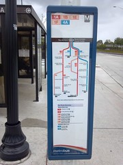
Recently I traveled via bus to Seven Corners, Virginia. Seven Corners has a brand new bus depot, which just opened in January of this year. It serves the Route 50 line, which is one of the most difficult to comprehend lines in the region. Between the “1 series” of routes and the “4 series,” there are at least 8 individual bus routes that follow this corridor and which stop at Seven Corners depot. It’s very difficult to keep them straight.
So WMATA designed and installed the sign pictured at right, which makes the whole network infinitely easier to understand by showing each route variation independently. It’s much more useful than the typical geographic map shown at many stations, in which individual routes are difficult to follow.
This is a nice, easy thing to do that can make a dramatic difference to riders. Hopefully WMATA will install similar maps along all its complicated bus lines.
June 6th, 2012 | Permalink
Tags: bus, transportation


