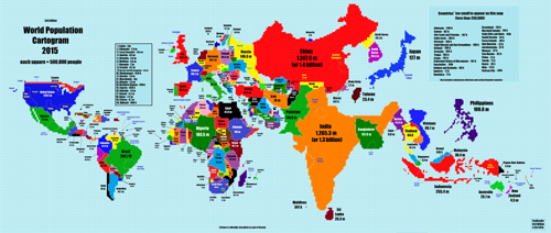
This is a world population cartogram, a false-geography map that resizes countries according to their population. It’s an interesting way to view the world, and compared to common projections perhaps more accurate, in its own way.

Map from Reddit user TeaDranks.
The United States is the world’s fourth largest country by land area, and third largest by population, so it’s not particularly distorted compared to geographic projections. But many other countries are.
China (1.4 billion) and India (1.3 billion) visually dominate, being by far the world’s two most populous countries. Others that stand out with seemingly oversized populations are Nigeria, Bangladesh, Japan, and the Philippines.
On the other end of the spectrum, the world’s two largest countries by land area are much reduced. Russia’s population of 146 million is still good enough for 9th highest globally, but that appears unimpressive against its normally huge area. And Canada, the world’s second largest country but only its 37th most populous, is nothing but a tiny sliver.
What stands out to you?
 Cross-posted at Greater Greater Washington.
January 26th, 2015 | Permalink
Tags: demographics, fun, maps


