


Metro does a pretty good job with wayfinding. Not perfect, but pretty good. There are uniform system maps, bus maps and neighborhood maps at every station, platforms with multiple mezzanines have signs indicating which are best for nearby landmarks, etc. They could do a whole lot worse (Baltimore comes to mind, where there’s not even a unified light rail / Metro map).
But one thing that Metro does at some stations completely flummoxes me. Take a look at the diagram of the red line on this sign:
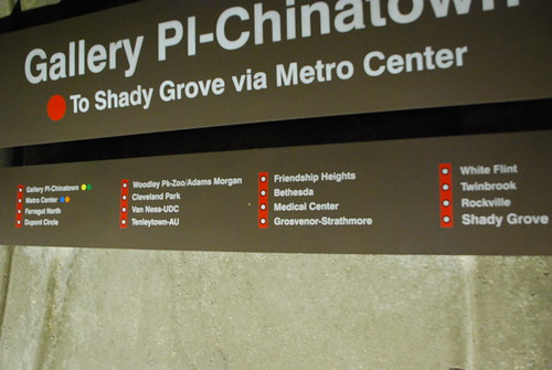
How am I supposed to know if the next station after Tenleytown-AU is Friendship Heights or Grosvenor-Strathmore? Even if arrows were added to make it clear that you’re supposed to read them as columns rather than like a snake, the diagram is still unnecessarily awkward. Why in the world would you choose to lay it out like that when there’s perfectly good alternative that makes much, much more intuitive sense?
September 24th, 2009 | Permalink
Tags: transportation


