


Last week’s post about census tract density in the DC area showed which neighborhoods inside the Beltway are densest. Now let’s look at the densest spots in the core areas of other large cities.
Urban areas are defined by the US Census as geographically connected areas with a population density of at least 1, 000 people per square mile (ppsm). The standard provides a uniform definition of “city, ” more useful for national comparisons than political boundaries. These maps show the central county in each of America’s 20 largest urban areas, in order beginning with the largest.
| 1. New York: America’s biggest city breaks the scale. While others on this list might have a few neighborhoods in the top density category, New York is covered end to end. It’s one of only 4 cities with tracts above 100, 000 ppsm. Its peak is 200, 000 ppsm. |
|
2000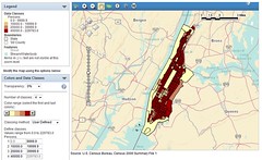 |
2010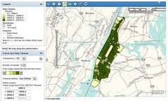 |
| 2. Los Angeles: Despite its reputation for sprawl, LA compares favorably to the densest cities after New York. Its peak density of 94, 000 ppsm is well above DC’s. |
|
2000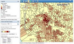 |
2010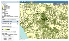 |
| 3. Chicago: Home to probably the single-densest census tract in America, a 508, 000 ppsm anomaly that’s so small it’s not visible at normal scale. Besides that tract, Chicago tops around at about the same level as LA. |
|
2000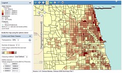 |
2010 |
| 4. Miami: Thanks to more narrowly-drawn census tracts along its high-rise coast, Miami’s peak density shot up from 38, 000 ppsm in 2000 to 77, 000 ppsm in 2010, but the actual change wasn’t as significant on the ground. |
|
2000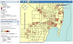 |
2010 |
| 5. Philadelphia: At 64, 000 ppsm, Philadelphia’s peak is about the same as DC’s, but Philly’s rowhouse neighborhoods extend farther out. |
|
2000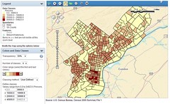 |
2010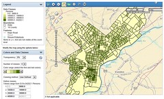 |
| 6. Dallas: Dallas’ density dropped significantly. It has fewer dense tracts in 2010 than in 2000, and its peak is down to 44, 000 ppsm from 57, 000 ppsm. |
|
2000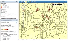 |
2010 |
| 7. Houston: Unlike Dallas, Houston appears to be densifying. Oddly, its densest area is not the core. |
|
2000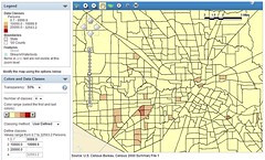 |
2010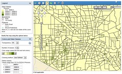 |
| 8. Washington (with Arlington & Alexandria): Washington is has more dense neighborhoods and a higher peak than in 2000. The numbers shown on these maps are slightly different than those on Michael Rodriguez’s map, which used a different map projection. These census numbers are official. |
|
2000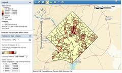 |
2010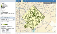 |
| 9. Atlanta: Not only is Atlanta shockingly sparse, its densest tract fell from 41, 000 ppsm in 2000 to just 21, 000 ppsm in 2010. The explanation? A downtown public housing complex was demolished, erasing the population of the densest 2000 tract. |
|
2000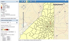 |
2010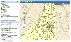 |
| 10. Boston: One of only 4 cities with a tract above 100, 000, Boston has a single tract that reaches 110, 000 ppsm. |
|
2000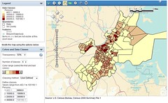 |
2010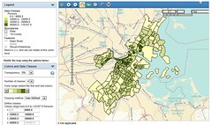 |
| 11. Detroit: Detroit’s peak density of 18, 000 ppsm is about the same as in 2000, but the number of mid-density tracts in the 10, 000-20, 000 ppsm range declined significantly as the city continued to empty. |
|
2000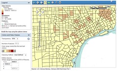 |
2010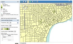 |
| 12. Phoenix: Central Phoenix didn’t change much, and tops out at 23, 000 ppsm. |
|
2000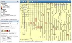 |
2010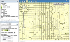 |
| 13. San Francisco: San Francisco has more tracts above 100, 000 ppsm than any city except New York. It tops out at 161, 000 ppsm. |
|
2000 |
2010 |
| 14. Seattle: With a peak of 51, 000 ppsm and a small but significant core, Seattle occupies a middle ground between the older denser cities and newer sparser ones. |
|
2000 |
2010 |
| 15. San Diego: While downtown San Diego densified compared to 2000, and its 50, 000 ppsm peak is higher, some of its other denser neighborhoods are sparser in 2010. |
|
2000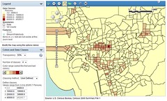 |
2010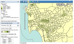 |
| 16. Minneapolis: Minneapolis’ changes were minor compared to most other cities. Its peak was 25, 000 ppsm in 2000, and it still is in 2010. |
|
2000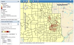 |
2010 |
| 17. Tampa: By far the sparsest city on this list, Tampa’s peak of 13, 000 ppsm means it has no tracts in the 3rd or 4th categories, and precious few crack even into the 2nd. |
|
2000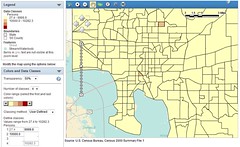 |
2010 |
| 18. Denver: Like a smaller Minneapolis, Denver looks much the same. Its peak of 23, 000 ppsm is respectable for a mid-sized non-coastal city. |
|
2000 |
2010 |
| 19. Baltimore: Baltimore’s lone tract in the densest category is an impressive 86, 000 ppsm, but that tract is down from a whopping 176, 000 ppsm in 2000. What happened? |
|
2000 |
2010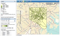 |
| 20. Saint Louis: Saint Louis’ losses have been less drastic than Detroit’s, but they still hurt. Its peak is down to a Tampa-like 13, 000 ppsm, from 15, 000 ppsm in 2000. |
|
2000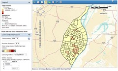 |
2010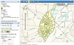 |
I made all these maps using American FactFinder on census.gov, which has data for every county in the United States. I couldn’t have done it without Geoff Hatchard, who walked me through the laborious census.gov process. If you’d like to make your own maps, I documented step-by-step instructions. Godspeed.
 Cross-posted at Greater Greater Washington.
March 27th, 2013 | Permalink
Tags: demographics, history, maps


