


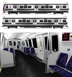
 WMATA’s new railcars will be visibly different from all others. |
Greater Greater Washington has a post up today discussing capacity and safety issues with WMATA’s new order of Metro railcars. In the post, GGW links to a WMATA report on the design and layout of the railcars. BeyondDC has looked at this before, but now that things are getting close to final, it’s worth another quick review.
First off, the exterior: I’m a big fan. I know there are some people out there who love the brown paneling on the side of Metro’s existing cars, but personally I find it ugly and am happy to be rid of it. The all-steel look is classic and no-nonsense. It looks like a bona fide subway car, which somehow makes it seem more legitimate. At least to me.
Inside, all remaining traces of the old orange-tone design have likewise been redesigned. The rubber flooring and less expensive seat padding seem like reasonable measures. The layout of poles is clearly designed to draw passengers away from the doors and into the aisle, which will be a welcome change come tourist season. I would have liked to see longitudinal seating, as GGW discusses, but well, can’t win them all.
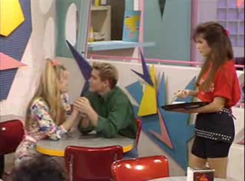
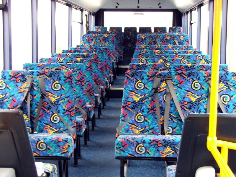
My only other complaint is the choice of seat fabric. Is there some rule that says transit seats can’t be a solid color? Some APTA national standard that seat fabrics must look like they’re from Saved By The Bell? Honestly, every time I see seats with those damn neon squigglies (technical term), I want to puke. Could we please just have a solid color? Or, if not, at least something simple and dignified?
July 22nd, 2010 | Permalink
Tags: metrorail, transportation


