


Q: How do you make a blogger tear his hair out?
A: Publish a major new rail transit map at the exact same time the blogger has just posted a far less interesting story proposing subtle changes to the bus map.
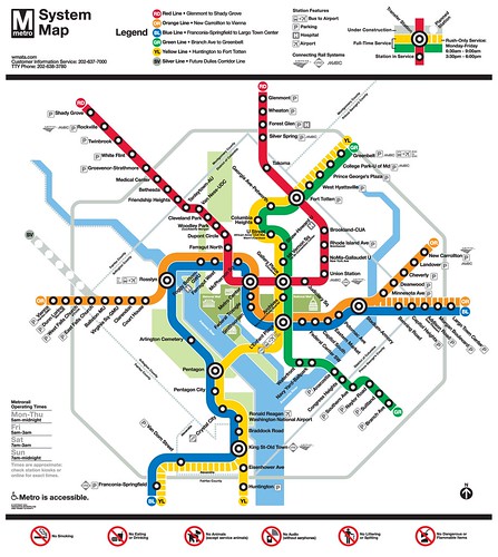
So yeah. That story about the Salt Lake City bus map will probably be lost in the excitement over Metro’s new rail system map. Rats. On the other hand, the good news is WMATA published a new rail system map! Yay!
Here it is:
Click the image for a larger version, or download the full-size pdf.
This is the most major revision to Metro’s map in the agency’s history. Among the changes:
- The map shows new service patterns that will result from WMATA’s Rush Plus plan, including routing some Orange Line trains to Largo and some Yellow Line trains to Springfield.
- The first phase of the Silver Line is shown, although there are no station labels since those names are still being decided.
- Some information that had been presented using text is now presented graphically, including the line color names and airport bus routes.
- The National Mall has been called out using a different shade of green from other parks in the region.
- Several icons have been updated to appear more contemporary, most importantly including the parking icon.
- The first phase of the Silver Line is shown, although there are no station labels since those names are still being decided.
At first glance, the map appears to be a nice and necessary update. I’m sure criticism – both positive and negative – will be made as people have time to look at it in closer detail.
One thing is clear to me, though: The map won’t be able to take many more additions before it begins to feel too cluttered, and requires a more wholesale redesign. This is a nice map, but it’s probably a short term solution. In the long term, we may need a more radical change to accommodate things like the introduction of light rail and the completion of the Silver Line.
March 19th, 2012 | Permalink
Tags: metrorail, transportation


