


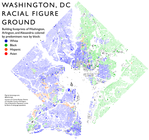
This incredibly cool map shows the footprints of every building in DC, Arlington and Alexandria, colored according to the predominant race living on that block.
Map from Kenton Ngo at kentonngo.com.
By coloring blocks only according to the most populous race on each block, rather than showing everyone who lives there, this map sacrifices overall diversity to instead show simple majorities. That makes it less racially precise than the famous racial dot maps that have been floating around the internet in recent years.
But the dot maps are too cluttered to show buildings, so making that racial tradeoff allows this map to illustrate the built environment too. It’s a good way to show two disparate pieces of information at the same time.
What pops out as interesting to you?
 Cross-posted at Greater Greater Washington.


