


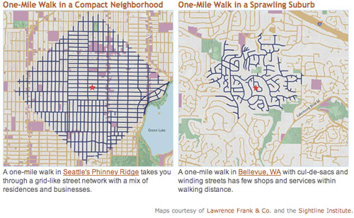
This graphic shows how much ground a pedestrian can cover walking along street sidewalks in a gridded Seattle neighborhood, versus a nearby suburb. Although both maps show a one-mile radius, there are far more destinations within that radius in the gridded neighborhood.
Seattle and Bellevue maps from sightline.org.
Both maps show neighborhoods that are primarily single-family detached houses: Greenwood, Seattle and Eastgate, Bellevue. But the similarities end there.
In Bellevue trips are indirect and circuitous. Not only are far more residential streets accessible in Seattle, but also more commercial streets (in purple on the map). Both neighborhoods have plenty of parks (shown in green).
Granted, the two maps appear to be at slightly different visual scales, population density is probably higher in Seattle, and pedestrians in Bellevue can probably cut through yards to get places a little faster. But the overall point remains true that far more destinations are within easy walking in Seattle, which – surprise – is why more people walk there.
For the record, the key isn’t a strict rectilinear grid; it’s interconnectivity. Boston’s medieval web of streets is just as good, and maybe even better. The real key variable is the density of intersections, not the straightness of streets.
February 28th, 2014 | Permalink
Tags: land use, maps, pedestrians, transportation, urbandesign


