|
Special Features


Image Libraries


|
|
Blog
Bus rapid transit lines in the United States badly lag the world’s most high-quality systems. This photo from Buenos Aires shows why: No US city is willing to dedicate so much street space to buses.

Buenos Aires BRT. Photo by exploreadorurbano on Instagram.
Count the lanes dedicated to the busway in that picture. Including the stations, medians, and bus lanes, it totals about eight lanes worth of traffic.
It takes that kind of dedication to fulfill BRT’s promise of subway-like service and capacity. You need all the components: Multiple bus lanes including passing lanes, big stations physically separated from the sidewalk, unmistakable barriers between the busway and general traffic.
Can you imagine any US city dedicating eight lanes to buses on a single street? On most streets we couldn’t do it even if we wanted to. K Street is 10 lanes wide including its medians, but Georgia Avenue and H Street are generally only six. 16th Street is five lanes at the max. Even if we completely banned cars from those streets, we’d lack the width to build Buenos Aires-style BRT.
Admittedly, Buenos Aires is an extreme example. This photo is from Avenida 9 de Julio, possibly the world’s widest city street. Planners there had an incredible amount of space to work with. Bogota’s famous TransMilenio BRT is probably a more instructive example; it takes more than five lanes.
Five lanes is physically possible on many US city streets, including in DC. But physically possible and politically practical are vastly different standards.
We wouldn’t want to anyway
Even if cities in the United States had both the physical space and political will to dedicate five-to-eight lanes to buses, there would be big trade-offs in doing so.
Streets that are too wide or have too-fast-moving traffic are hard for pedestrians to cross, and thus create barriers that can destroy a city’s walkability.
Bogota’s awesome five lane busways are practically highways, accounting for the several lanes of car traffic on either side. And like highways, they’re very good at moving vehicles and very hostile to pedestrians.
About the only way to make such a wide busway work on a city street without creating a highway would be to dedicate the entire street to transit, and not have car lanes on either side at all. Some US cities do have transit-only streets, so that may well be possible. But it would be different than South America’s model.

Arlington’s narrower Crystal City busway.
Smaller busways make sense for the US
None of this is to say that BRT in the United States is hopeless. It’s absolutely possible to build a solid and useful BRT line without quite that much street width. They just won’t be comparable to a subway in speed or capacity without passing lanes and gargantuan stations.
But who says they need to be?
Narrower busways like in Arlington and Ontario still offer tremendous advantages over running buses in mixed traffic. They speed up buses a lot, and are vastly more practical when retrofitting existing streets.
And while it’s true that North American-style busways can never have such high capacity as South American ones, well, that’s what rail is for.
It would be silly to insist one mode, any mode, must on its own accomplish all a city’s needs. Smart planning matches the need to the corridor, and is flexible enough to use the right mode, and the right street design, on every corridor, given the specific issues of that location.
 Comment on this at the version cross-posted to Greater Greater Washington. Comment on this at the version cross-posted to Greater Greater Washington.
Average Rating: 4.5 out of 5 based on 244 user reviews.
October 3rd, 2016 | Permalink
Tags: BRT, transportation, urbandesign

Four years ago, Paris made headlines for its bus stop of the future, a bigger and better bus stop with amenities like bikesharing and a book-sharing library attached. Now College Park has a bus stop with some of the same amenities, but using inexpensive, off-the-shelf pieces.

College Park’s bus stop of the future.
Paris’ bus stop of the future
In 2012, Paris’s transit agency tried out a luxurious new bus stop design. In addition to the normal sign, bench, and shelter, the stop had electric bikes, bookshelves, wifi, and stylish architecture. It looked great and it made waiting for the bus more enjoyable, but it was expensive and took up a lot of space.
Paris’s concept was a neat idea, but wasn’t ultimately practical for mass production.
 Paris’s bus stop of the future. Image from RATP. But some of the ideas from Paris’s attempt make sense. Locating a bikeshare station next to a bus stop makes it convenient for more people to use both. And book-sharing can be a nice amenity, if it’s easy and inexpensive to manage.
College Park’s version
Enter College Park, where rather than design a custom building, the city simply added some of those components to an existing bus stop using their standard off-the-shelf pieces.
They started with a normal bus stop sign and shelter, then added a standard mBike bikeshare station. To help with maintenance, the city chained a bike tire pump to the station sign.
For the library, they staked to the ground a Little Free Library, a pre-fab wood box for people to take and give away free books. There’s no librarian and no library cards; it runs on the honor system, and relies on people donating as many books as they take.

A similar Little Free Library in California. Photo by Michael R Perry on Flickr.
The stop is at the corner of Rhode Island Avenue and Muskogee Street, in front of the Hollywood shopping center, just one block south of College Park’s first protected bikeway. The stop serves Metrobus lines 81 and 83, which are among the busier lines in Prince George’s County.
It’s no grand Parisian bus station, but that would be overkill. For a bus stop in a relatively low-density suburban area, it’s pretty darn nice.
Comment on this at the version cross-posted to Greater Greater Washington.
Average Rating: 4.8 out of 5 based on 184 user reviews.
August 18th, 2016 | Permalink
Tags: BRT, bus, transportation, urbandesign
DC’s first bright red bus lanes now adorn four blocks of Georgia Avenue, near Howard University. DDOT crews added the red surface earlier this month.

Georgia Avenue’s new red carpet for buses.
The bus lanes run along both curbs, from Florida Avenue north to Barry Place. They speed Metrobus’ busy 70-series line through what was the slowest section of Georgia Avenue north of downtown.

The bright red color is a strong visual clue to car drivers to stay out of the lane. It’s a stark contrast to the Gallery Place bus lane a dozen blocks south, which is so poorly marked that many car drivers legitimately don’t know it’s there. For these four blocks, drivers will have no excuse.
Anecdotally, the red surface seems to be working pretty well. Most car drivers seem to stay out. To find out for sure, DDOT is in the process of collecting actual data, comparing the car violation rate now to the rate from before the red surface was added.
Nitty gritty
Cyclists and taxicabs are allowed the use the lanes in addition to buses. Signs along the street spell out the exact rules.

Since the lanes are along the curb, cars can enter them to turn right. Dashed white lane markings show where cars can enter.

To avoid wear-and-tear and to make the bus lanes safer for cyclists, the “red paint” is actually a gritty surface coating. If you walk along Georgia Avenue now, you can still see some of the leftover grit along the curb.

❤ the transit red carpet
By adding these lanes and marking them clearly, DC is taking an real step towards prioritizing street space for transit. At only four blocks long they’re are a humble start, but a start nonetheless.
The “red carpet” is an increasingly common part of the street design toolbox in New York, Chicago, San Francisco, and Seattle. It’s great that DC is getting on board too.
With more transit lanes in the works for K Street, H Street, and 16th Street, this humble start will hopefully soon become a trend. A red surface would probably help them all.

Yay!
Comment on this at the version cross-posted to Greater Greater Washington.
Average Rating: 4.9 out of 5 based on 179 user reviews.
June 21st, 2016 | Permalink
Tags: BRT, bus, transportation, urbandesign
Jane Jacobs was born May 4, 1916, 100 years ago today. She left the world in 2006, but in her 89 years of life she revolutionized how we think about cities. Here is what GGWash contributors said about Jane, the patron saint of American urbanism.

Today’s Google Doodle honors Jane. Image from Google.
Jane’s most famous book, The Death and Life of Great American Cities, is required reading for anyone interested in the form of cities. It’s helped generations of Americans understand what makes places like Georgetown so pleasant, and places like Boston’s City Hall so repulsive.
Even 55 years after its publication, urbanists continue to obsess over Death and Life, debating obscure passages like clerics feuding over a religious text.
Ben Ross went straight to the point, then warned of the next great problem afflicting our cities:
Jane Jacobs was a true genius who developed a new paradigm of city planning. Our best city neighborhoods now suffer from the “curse of success” that she foresaw as the consequence of a scarcity of urbanism. How to overcome that scarcity is a problem that she left to us.
Canaan Merchant summarized two big lessons Jane taught him:
Look at what is actually happening rather than relying on what is “supposed” to happen. A city’s beauty lies in its people rather than its buildings. Bring the people out and the buildings will take care of themselves.
Former contributor Abigail Zenner focused on how Jane successfully communicated ideas:
She introduced many people to the world of planning and gave us words to describe what we see every day in cities but have a hard time explaining in simple language. She was able to make a case that stirred peoples’ hearts.
Nick Finio took a contrarian position, quoting a 1998 critique of Death and Life from UC Berkeley professor Roger Montgomery:
Let’s not glorify her too much. Montgomery’s critique ends with this zinger: “Taken together, these themes do add up. Anti-government and anti-regulation beliefs, confidence in the existence of a nearly perfect competitive market, inattention to corporate power, denial of social class and race as determinative categories, taken together look mighty like the core belief system of liberatarian conservatism.”
But other contributors were quick to jump to Jacobs’ defense. They pointed out that while her views may not be a perfect guide to urban issues today, her work helped surface notions that needed to come to the fore, like defending the idea of the city against car-oriented places, and eyes on the street maintaining safety.
Jonathan Krall added:
Just because Jacobs had a healthy mistrust for government and for large projects doesn’t mean she was espousing neo-conservatism. I agree with Montgomery that Jacobs’ excellent and helpful descriptions of healthy city life and associated planning issues skip over some very challenging social and political issues. However, I disagree with his implication that Jacobs is suggesting her readers should ignore those challenges.
Payton Chung opined on Jacobs’ motivations:
Just like any “bible, ” there are bound to be contrary readings. There’s a fine line between libertarianism and anarchism, and I’d argue Jacobs’ overall oeuvre points to a mistrust of all large institutions, whether corporate or governmental.
When all was said and done, it may have been Brendan Casey who summed Jane up best:
The force was strong with that one.
What do you think of Jane, and of her impact on cities?
Comment on this at the version cross-posted to Greater Greater Washington.
Average Rating: 4.4 out of 5 based on 217 user reviews.
May 4th, 2016 | Permalink
Tags: history, people, urbandesign
Rockville Pike could one day become a 252-foot-wide mega boulevard with 12 car lanes, 4 bike lanes, 2 bus lanes, and over 50 feet of landscaping. But in designing a street with more than ample room for cars, bikes, and buses, planners abandon any hope the street will be walkable.

The plan for Rockville Pike. Image from Rockville.
Everybody gets a lane!
Rockville Pike is one the most important retail strip highways in the Washington region. Like most 20th Century retail roads, it’s designed for cars, and it carries a lot of them.
Rockville wants to make it a more urban main street, so planners there are drawing up a redevelopment plan. It’s a laudable goal, and it’s not easy on a high-traffic state highway like Rockville Pike.
At first glance, this plan has all the components of a good complete street design: Tree-lined sidwalks, protected bikeways, a center-running dedicated busway. Every mode gets all the street width it could possibly want.
And why not? Why go through the political headache of forcing the community to make the difficult choice between fewer car lanes versus bikes or BRT if you can fit everything in? With a mega boulevard like this, everybody gets what they want, and nobody loses. Right?
Wrong.
Walkability loses, and it’s the most important factor
At 252 feet wide, the new Rockville Pike will be practically impossible for pedestrians to cross. It will take multiple traffic light cycles and multiple minutes for anyone to cross.
Instead of a main street, Rockville will have a barrier. And that is a big problem for the rest of the plan.
Transit oriented development doesn’t work unless it’s walkable. If Rockville Pike is too wide, development on one side of the street will be effectively cut-off from development on the other side. Riders won’t be able to easily access the BRT stations. People will drive for even short trips. The concept of a community where people don’t need to drive everywhere will break down.
If you can’t walk, other multimodal options don’t work. Pedestrians are the linchpin to the whole thing.
To be sure, some level of compromise is always needed. If walkability were the only factor that mattered, all streets would be pedestrian-only. We add in car lanes, bike lanes, and transit because we have to make longer trips possible, and that’s a good thing.
But there’s a balance, and 252 feet veers so far to accommodate long distance travel that it seriously sacrifices short distance walking. In so doing, Rockville undermines the very foundation on which its redevelopment plans rest.

Make pedestrians a priority
The Pike needs to be narrower. Assuming the sidewalks, busway, and three general car lanes each direction are sacrosanct, that still leaves a lot of potential fat to trim.
Are the service roads really necessary if the plan also includes new parallel local streets? Do we really need redundant bi-direction bikeways next to both sidewalks? Could we possibly reduce the 74 feet of various landscaping, buffer, and turn lanes?
These would be difficult trade-offs, to be sure. But there are massive negative consequences to an uncrossable mega boulevard.
If Rockville wants the new Pike to work as multimodal urban place, pedestrians need to become a priority.
Comment on this at the version cross-posted to Greater Greater Washington.
Average Rating: 4.4 out of 5 based on 232 user reviews.
March 24th, 2016 | Permalink
Tags: bike, BRT, master planning, roads/cars, transportation, urbandesign
What do you do if you have active freight rail tracks running down the middle of a downtown street? Add bike lanes, of course!
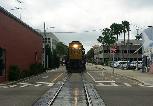
East Avenue, Clearwater, FL.
This is East Avenue in downtown Clearwater, Florida. It’s one of America’s most unusually multimodal streets.
On the left: A normal one-way general purpose lane with normal car traffic. In the middle: Freight rail tracks. On the right: A major regional two-way bikeway, the Pinellas Trail. What could go wrong?
Actually, it’s not as dangerous as it looks. Freight traffic on those tracks is relatively light, and extremely slow-moving. The train in this photo was moving maybe five miles per hour. And unlike cars, trains don’t suddenly change lanes. There’s zero danger of a CSX right hook.
In fact, the rail tracks are effectively a buffer between the bikeway and car lane. They make a bigger buffer than normal buffered bike lanes get. In a weird way, the tracks are a sort of protection.
So it’s totally bonkers. But maybe it works.
What do you think?
Comment on this at the version cross-posted to Greater Greater Washington.
Average Rating: 5 out of 5 based on 188 user reviews.
January 13th, 2016 | Permalink
Tags: bike, fun, transportation, urbandesign
Part of the appeal of the cultural juggernaut that is Star Wars has always been its fantastic settings, including its cities. As The Force Awakens arrives in theaters today, here are the five most fascinating cities from the six previous live-action Star Wars movies.
5. Theed

Theed. Image from Star Wars.
The Phantom Menace may have been a disaster of a movie, but its setting at the height of the galaxy’s pre-Empire luxury showed us a strong contender for the most beautiful city in the franchise. Theed is Queen Amidala’s home, and capital of the planet Naboo.
Picturesque Naboo is the Neoclassical Europe of the Star Wars universe. Its ornate buildings and grand, monument-strewn avenues are an idealized version of the Baroque Mediterranean. There’s no visible traffic or industry, besides one spaceport at the bottom of a waterfall. Theed’s citizens appear to do nothing but shop and picnic.
It’s the Garden of Eden of the Star Wars universe. Perfect and naive, and out of place once the galaxy descends into evil and civil war.
4. Mos Eisely

Mos Eisely. Image from Star Wars.
The complete opposite of Theed, Mos Eisely is a frontier settlement on a poor and dirty planet, a wretched hive of scum and villainy. If Theed is Habsburg Vienna, Mos Eisley is Dodge City. Its famous cantina nothing so much as a wild west saloon.
There’s precious little art of culture in Mos Eisley. Its hardscrabble populous struggles to survive, and its streets are full of pack animals, cargo crates, and industrial equipment.
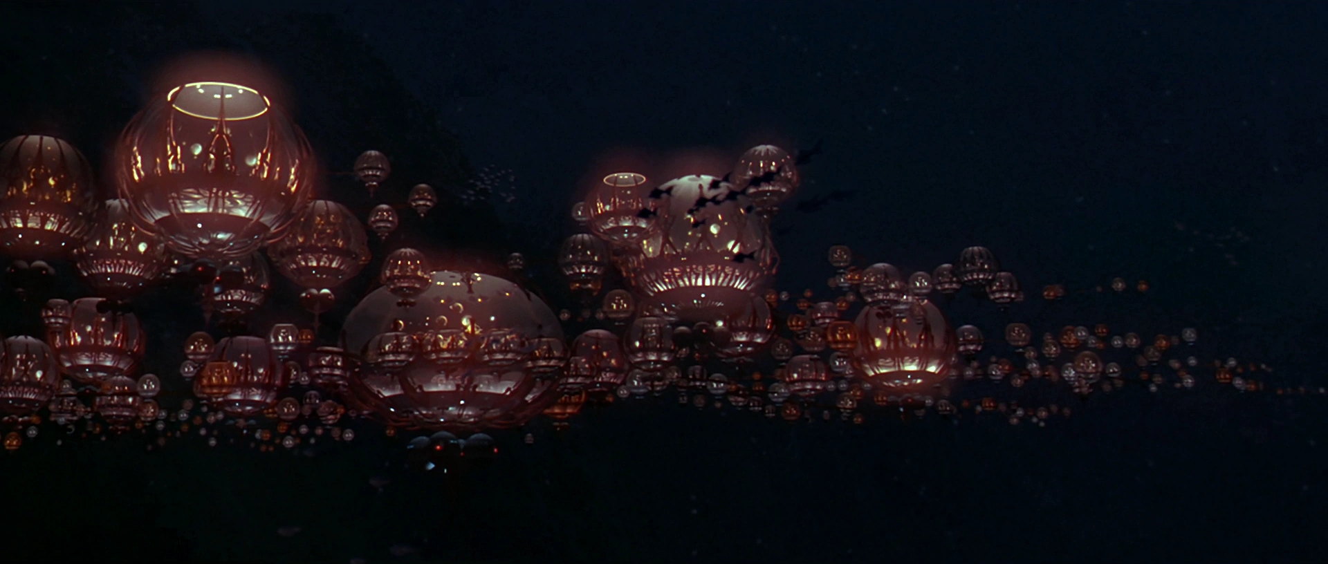
3. Gungan City

Gungan City. Image from Star Wars.
Return to Naboo for the secret underwater Gungan City. It’s beautiful, but like all things Gungan, it makes little sense.
With a fairly small number of orbs that appear to be mostly empty air, Gungan City is clearly more of a village than a metropolis. Maybe the Gungans prefer isolation, or maybe they’re too clumsy to live many side-by-side. Hopefully we’re never forced to sit through more Gungan scenes, and therefore never find out.
One would think that if Gungans are such great swimmers that they’re happy to build underwater cities, they’d spread their city vertically as much as sideways. Guess not.
2. Cloud City

Cloud City. Image from Star Wars.
High-concept sci-fi at its best, Cloud City is an atmosphere-mining colony on a gas giant planet with no solid surface.
Its workers harvest gases for use in Star Wars’ futuristic technologies, and its government is more corporate CEO than democratic president.
Being an expensive floating factory, Cloud City’s layout and infrastructure are necessarily vastly different from a cobbled-together frontier town like Mos Eisley. As a single, purpose-designed mega-structure, Cloud City needs nothing so messy as parking lots, and piecemeal expansions are strictly not happening.
And if you approach it without an invitation, cloud cars shoot at you. It’s the ultimate gated community.
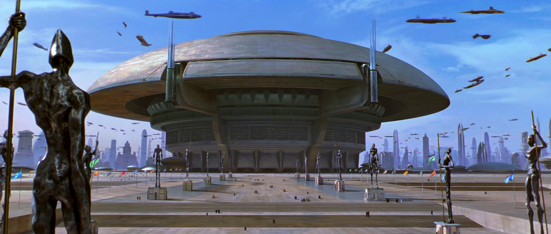
1. Coruscant

Coruscant. Image from Star Wars.
One city that covers a whole planet. Coruscant is either the ultimate in sprawl, or the ultimate in extreme urbanization. Given what we’ve seen on-screen, it seems to be the latter.
Like Washington, the capital of the Star Wars galaxy clearly has a height limit, with a canopy of blocky same-height buildings rolling over the landscape, and monuments like the Jedi Temple (above) dominating the skyline. But unlike DC, Coruscant’s city planners allow frequent skyscrapers to pierce the blocky canopy.
Unlike other Star Wars cities, Coruscant features busy air-highways, crowded with flying transports. But there don’t seem to be enough vehicles to move around a population as dense as Coruscant’s must be. Surely the planet is a public transit paradise.

Coruscant’s galactic capitol building, with air-highways. Image from Star Wars.
What will we see next?
If the past is any guide, The Force Awakens promises even more aliens and sci-fi landscapes. When I see it, I’ll be hoping to see some fun cityscapes too. And, I admit, a few light-saber duels.
Comment on this at the version cross-posted to Greater Greater Washington.
Aimee Custis contributed to this post.
Average Rating: 5 out of 5 based on 239 user reviews.
December 18th, 2015 | Permalink
Tags: fun, galleries, urbandesign
Pershing Park is one of DC’s most unique and potentially pleasant public spaces. Unfortunately, few people have ever enjoyed it, because the park’s best elements are hidden from view behind an uninviting raised embankment.

Pershing Park as seen from Pennsylvania Avenue. Photo by Google.
It’s nice on the inside
I like Pershing Park, at Pennsylvania and 15th Street NW. I wish it worked better.
The inside of the park is a terraced wetland garden that, when it’s in good condition, is absolutely lovely.

The pleasant interior. Photo by pcouture on Flickr.
There are ample shady seats, a duck pond to dip your feet in, and climbable concrete terraces that make the park feel like an adult-size jungle gym.
It’s fun, and pretty, and unlike anything else in DC.
Or at least, it was fun and pretty a few years ago. The park has fallen into disrepair lately. The pond is dry. Orange cones litter the open plaza. It’s abandoned and depressing.
Part of Pershing Park’s problems are simply neglect. Better maintenance could fix the pond and the concrete.
But there’s one big problem, and it may well be unfixable.
People can’t see it
Most people don’t know the park is there. You can’t see it from the street. From three sides, the only thing visible is a grassy embankment straight out of a suburban McDonalds parking lot. The fourth side is literally a parking lot.

Pershing Park from above. Image from Google.
Good urban parks draw pedestrians in from the surrounding sidewalk. When you’re standing outside Dupont Circle, you can see and hear interesting things happening inside the park there. The activity and people inside Dupont make you want to enter it yourself.
Pershing Park is the absolute opposite. It’s plain and boring from the sidewalk. There are interesting things there, but you can’t see them so they don’t draw you in.
Most people just ignore it; the park blends into the background and they don’t give it a second thought.
Those who do look closely see a bunker, a hostile sloping hill with few entry points. From busy Pennsylvania Avenue, Pershing Park more closely resembles an 18th Century military stockade than an inviting civic space.
Until that problem is solved, Pershing will never be a good park, no matter how pleasant it is on the inside. Until that’s solved, Pershing will always be an afterthought.
Let’s fix it
What to do with Pershing Park is increasingly becoming a hot-button issue. One group wants to redevelop it as a national World War I memorial. Kriston Capps at CityLab takes a preservationist bent and says we should restore it.
Either way, the park is falling apart and needs work.
Would it be possible to save the pleasant interior and radically change the bunker exterior? Maybe, maybe not. The park occupies sloping terrain that any design will have to work around. Unfortunately, there’s no way to avoid a retaining wall somewhere. At least not if we want to keep the terraces.
But retaining walls don’t have to be so plain or uninviting. There are better examples elsewhere in the city.
It would be a shame to lose such a unique space. If designers can find a way to restore Pershing Park’s terraces and pond while altering the park’s exterior to be more inviting, that would be an ideal solution.
But if not, tear the sucker out. A downtown park that nobody uses isn’t a useful downtown park.
Comment on this at the version cross-posted to Greater Greater Washington.
Average Rating: 4.4 out of 5 based on 298 user reviews.
August 5th, 2015 | Permalink
Tags: parks, urbandesign
Most gas stations these days are pretty garish, but gas stations weren’t always so. Check out this vintage 1924 station, from Connecticut Avenue in Woodley Park.
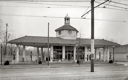
Lord Baltimore Filling Station. Photo by the National Photo Company, via the Library of Congress.
This is the Lord Baltimore Filling Station, at the corner of Connecticut Avenue and Ordway Street NW. It may not be truly typical of the era, but it’s hard to imagine seeing as sharp-looking a gas station today.
It’s not only the nice architecture that make this notable. It’s also the urban design. This isn’t as great for sidewalk life as a row of main street-style shops, but it’s a building that fronts on the sidewalk. It could be a lot worse.
Do you know of any unusually good-looking gas stations? What makes them interesting?
Cross-posted at Greater Greater Washington.
Average Rating: 4.5 out of 5 based on 159 user reviews.
April 6th, 2015 | Permalink
Tags: architecture, history, roads/cars, urbandesign
Wide suburban highways lined with big boxes and strip malls aren’t usually places one finds protected bikeways. But Stringtown Road in Grove City, Ohio is such a place. Check it out:
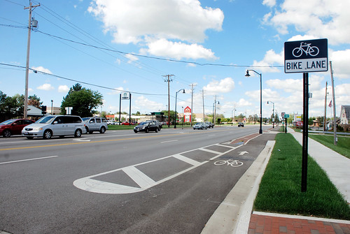
Stringtown Road.
Since a curb protects the bikeway from the road, it’s technically a sidepath, a sidewalk that’s for bikes instead of pedestrians.
And as you can see in photos from Google Street View, it’s nicer than riding in the street with fast-moving cars, but it’s still not exactly pleasant.
Huge curb cuts interrupt the bikeway, so cars don’t need to slow down much before pulling into the giant parking lots lining the road. There’s certainly a risk that careless drivers will turn without watching, and hit people on bikes.
But that’s a risk that will exist for any car-oriented highway. At least this one puts the bike lane front and center, just about as visible as it can be.
There are some sidepaths along large roads in the DC area, like Route 50 in Arlington or along Benning Road near RFK, but those aren’t commercial highways lined with shops, and their sidepaths aren’t right against the curb like Stringtown’s. This particular layout is pretty unusual.
As more and more suburban communities evolve to become more multimodal, experiments like this will help everyone around the country understand what works and what doesn’t. Grove City is near Columbus, where it’s not the only suburb experimenting with urban retrofits.
What do you think? Will this design work? Comment at Greater Greater Washington to talk about it.
Cross-posted at Greater Greater Washington.
Average Rating: 4.8 out of 5 based on 297 user reviews.
March 27th, 2015 | Permalink
Tags: bike, transportation, urbandesign
|
Media


Site
About BeyondDC
Archive 2003-06
Contact
Category Tags:
Partners
|


