For most of the last 30 years the tallest skyscraper in Montgomery County was Gaithersburg’s 275 foot tall Washingtonian Tower. Earlier this year it was eclipsed by the 289 foot tall North Bethesda Market. And now the developers of White Flint are proposing another tower taller still.
Oh, and it’s crazy-looking.

Proposed North Bethesda Market II. Image from JBG.
The proposed skyscraper is part of a massive mixed-use transit oriented development planned across the street from White Flint Metro. It will be called North Bethesda Market II, will have 345 residential units, and will be about 300 feet tall. It will anchor a development that also includes a 175, 000 square foot office building and 115, 000 square feet of retail space.
It makes sense to put skyscrapers in White Flint. The area is Montgomery County’s version of Tysons Corner. It’s a huge collection of dense but mostly suburban office buildings and residential high rises. With its Metro station it is as perfect a location for smart growth development as there could be in Montgomery County.
The project site plan shows that like the existing North Bethesda Market I, this new proposal is basically urban. The public spaces turn their back on Rockville Pike, which is unfortunate, but the urban design is still a big step up from existing conditions.

Proposed North Bethesda Market II. Image from JBG.
And then there’s the architecture. The bold modernist ziggurat is absolutely unlike anything else in our region. It is a shocking sculptural statement that succeeds in all the ways it is meant to. It’s not the kind of architecture that would make a good city if repeated over 10, 000 background buildings, but it will be an undeniable landmark – an icon to the city White Flint aspires to be.
I wouldn’t want to see more than one of these, but I like it for what it is.
Average Rating: 4.5 out of 5 based on 247 user reviews.
December 6th, 2011 | Permalink
Tags: architecture, development, urbandesign
Bike planners will tell you that it’s safest to ride in the left side of bike lanes, in order to avoid the door zone. But a lot of people don’t know that. So how can we get the message out?
How about door zone markings on bike lanes, like this image.
Photo by Lee Comma Dennis on flickr.
Average Rating: 4.9 out of 5 based on 162 user reviews.
December 5th, 2011 | Permalink
Tags: bike, proposal, roads/cars, transportation
Listen to any discussion of highway congestion and you will inevitably hear about Level of Service (LOS), which assigns a letter grade to the congestion level of road segments. Letter grades start with ‘A’ for free flow and run down to ‘F’ for “failing” (congested) roads. Simple enough.
Simple enough, except that it makes absolutely no sense whatsoever and is completely counter-intuitive.
The problem is that people hear about roads with grades of C, D, or E and think that means they are badly congested roads, because Cs, Ds and Es are bad grades in school. Traffic engineers often refer to streets with LOS D or E as “nearly failing, ” which sounds bad to anyone who speaks English.
But that isn’t how it actually works. Any LOS above F is good. A road with an LOS of E is still moving very well.
Take a look at this year’s Metropolitan Washington Aerial Traffic Congestion Survey. Download the pdf and go to its 11th page, where LOS speeds are defined. This is what you will find:
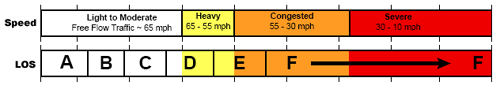
LOS A, B, and C are all free flow conditions. LOS D equates to highways moving at 65 miles per hour. LOS E is 55 mph. A highway can receive a score of LOS F – failing – and still be moving at somewhere around 40 mph.
So for the record, a highway scoring LOS D is moving faster than the legal speed limit on most highways in our region. How completely ridiculous.
Don’t ever let anyone tell you Ds and Es are bad grades for highways. They aren’t.
Average Rating: 5 out of 5 based on 276 user reviews.
December 2nd, 2011 | Permalink
Tags: roads/cars, transportation
 About a year ago WMATA published a draft map of bus routes that come at least every 15 minutes. That is, bus routes that are frequent enough for riders to conveniently walk up to bus stops whenever they want, rather than consult a schedule.
It’s a tremendously useful tool that allows potential riders to use the bus system in the same way they use the rail system, without worrying about waiting an hour for a bus to arrive.
GGW posted about this last year, but I had forgotten about it and wanted to call attention to it once again.
The full size draft map is available at the PlanItMetro blog, or via directly this link (pdf).
Average Rating: 4.5 out of 5 based on 212 user reviews.
December 1st, 2011 | Permalink
Tags: bus, transportation


