|
Special Features


Image Libraries


|
|
Blog
The Pike + Rose development on Rockville Pike is a surprisingly experimental collection of buildings. It’s contemporary in style, but also filled with architectural ornament. The result upends the common architectural conceit that ornament cannot be “of our time.”

Pike + Rose is one of the region’s most ambitious attempts to retrofit an aging suburban place to become more urban. It gets far more headlines for its planning than for its architecture.
But although Pike + Rose isn’t flashy enough to find itself on the cover of Architect Magazine, it’s fascinating and instructive for what it tells us about how architecture can interact with urbanism.
Ornament doesn’t have to be historic-looking
In the world of architecture criticism, ornament is taboo. Buildings should be “of their time;” they must not rely on historic styles to look good. Since so much ornament is either historic or kitschy faux historic, the world of architecture has turned its nose up at it for decades.
But many laypeople prefer buildings with little flourishes, because, well, little flourishes are pretty and people like pretty things. Those flourishes are particularly important on urban buildings, where people walking along a sidewalk need human-scale things to look at.
Pike + Rose attempts to rectify that mismatch by providing the sort of small-scale ornamental flourishes that pedestrians crave, but using unabashedly contemporary styles and materials.
Mixed but instructive results
No doubt about it, Pike + Rose is an experiment with mixed results. Its designers tried a lot of things, and failed as often as they succeeded. But failure teaches as much as success, and future architects can learn much from what happened here.
The most successful attempts are those that fully embrace their modern manufacturing, using carefully-placed materials to create repeating abstract patterns of factory-produced detail. These are unmistakably both contemporary and ornamental, and look great.


The same effect thrives on fences and other urban accoutrements.

Less successful are the more literal decorations. These are individually beautiful, but on buildings they’re awkward and kitschy.

Least successful of all are the murals, particularly this cartoonish fake advertisement for a baking machinery factory that never existed:

Other murals are more honest about what they are, and thus aren’t so bad.

It’s easy for architects to retreat to glass boxes and pretend they’re bold, and it’s easy for laypeople to point at old buildings and say “do that, ” but neither is a satisfying way to build modern cities.
The architects of Pike + Rose, WDG, deserve praise for pushing an envelope that needed to be pushed. Contemporary ornament can work, but it’s going to take talented designers willing to try controversial things to build on and refine these early results.
I hope this continues. Our cities will be more beautiful and more livable for it, even if it takes a while to figure it out.
 Comment on this at the version cross-posted to Greater Greater Washington. Comment on this at the version cross-posted to Greater Greater Washington.
Average Rating: 4.5 out of 5 based on 249 user reviews.
June 9th, 2016 | Permalink
Tags: architecture

Paris’s Arc de Triomphe is world famous, but did you know DC once had its own version?
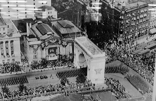
Photo from the DC Public Library.
The Washington, DC Victory Arch sat on Pennsylvania Avenue, at the corner of New York Avenue and 15th Street NW.
It was a temporary structure built to commemorate the end of World War I. This photo, from 1919, shows the US Army on parade following the end of the war. Presumably the arch was made of plaster, like the White City of Chicago, and thus never intended to be permanent.
Here’s another view, showing the arch from ground level.
Comment on this at the version cross-posted to Greater Greater Washington.
Average Rating: 4.8 out of 5 based on 295 user reviews.
February 11th, 2016 | Permalink
Tags: architecture, fun, history
Most gas stations these days are pretty garish, but gas stations weren’t always so. Check out this vintage 1924 station, from Connecticut Avenue in Woodley Park.
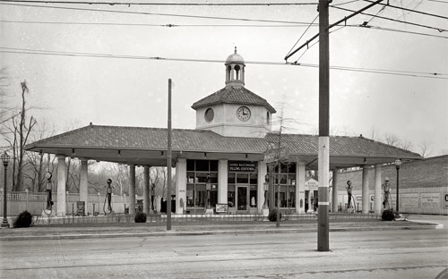
Lord Baltimore Filling Station. Photo by the National Photo Company, via the Library of Congress.
This is the Lord Baltimore Filling Station, at the corner of Connecticut Avenue and Ordway Street NW. It may not be truly typical of the era, but it’s hard to imagine seeing as sharp-looking a gas station today.
It’s not only the nice architecture that make this notable. It’s also the urban design. This isn’t as great for sidewalk life as a row of main street-style shops, but it’s a building that fronts on the sidewalk. It could be a lot worse.
Do you know of any unusually good-looking gas stations? What makes them interesting?
Cross-posted at Greater Greater Washington.
Average Rating: 5 out of 5 based on 156 user reviews.
April 6th, 2015 | Permalink
Tags: architecture, history, roads/cars, urbandesign
According to yesterday’s Express, DC is starting to look a lot like Amsterdam, and not just because of marijuana. That’s fantastic if true.
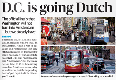
The top of yesterday’s Express story.
Among the reasons the Express cites for DC’s Amsterdamization are increasing bicycle use, the appearance of streetcars, and Georgetown’s improving C&O Canal.
Amsterdam is one of the world’s great bicycling and streetcar cities. It’s a joy to travel along its extensive bikeways, and even lanes where cars are allowed are amazingly bike friendly. And Amsterdam’s huge streetcar network (with streetcars in both dedicated lanes and mixed traffic) is a case study in successful urban transit.
DC’s nascent bikeway and streetcar networks pale in comparison, but Amsterdam is a superb model for us to aspire towards.
And if it’s true that we can never hope to have as many canals (short of a disastrous global warming-induced flood), we can at least ponder what might have been had the history of Constitution Avenue turned out differently.
Even more similarities
Transportation and canals aside, Amsterdam’s overall urban design is actually incredibly similar to DC’s. We’re both predominantly rowhouse cities, with plenty of brick. Even our street grids are similar: Amsterdam has a relatively small core with twisty medieval streets, but for the most part it’s a city of straight streets and radial avenues just like DC.
These scenes from Amsterdam wouldn’t look all that out of place in Dupont Circle, U Street, or Adams Morgan, apart from how little street space goes to cars..
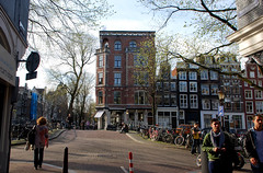 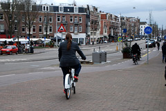
Amsterdam, but could be DC.
Admittedly, Amsterdam beats DC in a lot of ways. But it’s not Paris or Hong Kong, not so thoroughly alien. And DC is not Las Vegas. Amsterdam and DC aren’t identical, but we’re the same species of city, which means Amsterdam is better in ways that DC can practically emulate.
Plus, we’ve got Amsterdam Falafelshop.
Cross-posted at Greater Greater Washington.
Average Rating: 4.8 out of 5 based on 163 user reviews.
February 26th, 2015 | Permalink
Tags: architecture, bike, streetcar, transportation, urbandesign
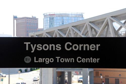
Metro’s new Silver Line is officially open and carrying passengers. Enjoy this photo tour of the new line and opening day festivities.
> Continue reading at Greater Greater Washington
Average Rating: 4.7 out of 5 based on 168 user reviews.
July 28th, 2014 | Permalink
Tags: architecture, development, events, galleries, metrorail, transportation
Most people consider the 555 foot tall Washington Monument to be DC’s tallest tower. It’s certainly the city’s most iconic. But it’s not the tallest. That distinction belongs to the 761 foot tall Hughes Tower.

Hughes Tower. Photo by thebrightwoodian on Flickr.
Hughes Tower is in Brightwood, near the corner of Georgia Avenue and Peabody Street NW. It’s primarily a radio transmission tower, broadcasting signals for the Metropolitan Police Department.
The tower is owned by the District of Columbia, and was built in 1989.
Although the tower vastly overshoots DC’s usual height limit, transmission towers are one of several exempted categories of structures. Thus, a 761-foot tower doesn’t necessarily violate federal law, though DC’s zoning code imposes other limits that prevent anyone from just building such a tower. The National Capital Planning Commission also wasn’t happy about this one.
Cross-posted at Greater Greater Washington.
Average Rating: 4.8 out of 5 based on 233 user reviews.
July 24th, 2014 | Permalink
Tags: architecture
|
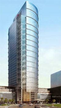
Proposed Capital One skyscraper. Image from Fairfax. |
Last Friday, Fairfax officially approved a new headquarters tower for Capital One in Tysons Corner. At 470 feet tall the new building will be the tallest in the DC region after the Washington Monument.
If that news sounds familiar, it’s because in May of 2013 developers proposed a 435 foot tall building, then the tallest in the region yet. And when Alexandria approved a 396 foot tall tower, that also would’ve been the tallest. Meanwhile, Arlington’s 384 foot tall 1812 North Moore tower recently finished construction, officially taking over the title of region’s tallest skyscraper (for now).
There may not be an explicit competition, but the fact is undeniable: Northern Virginia’s in a full-on skyscraper rivalry. And Tysons is pulling insurmountably ahead.
At 470 feet tall, this new Tysons building will be the first in the DC region to officially eclipse Richmond’s tallest, the 449 foot tall Monroe Building. Baltimore and Virginia Beach each have towers above 500 feet, often considered to be the breaking point for a true skyscraper.
Cross-posted at Greater Greater Washington.
Average Rating: 4.7 out of 5 based on 175 user reviews.
May 20th, 2014 | Permalink
Tags: architecture, development
Fairfax County is considering dressing up the Silver Line’s mammoth concrete pylons with murals. The idea could help animate the otherwise bleak, gray structures.
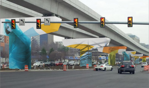
Mock up of a possible Silver Line mural. Image from the Tysons Partnership.
Ideally the Silver Line would’ve been underground through Tysons Corner. But federal rules that have since changed prevented that, forcing the Metro line above ground, onto a huge elevated structure.
That wasn’t the end of the world, but it did condemn Tysons to some unnecessary ugly.
So why not dress it up? Murals can unquestionably make big gray structures more colorful and interesting. They’re easy to implement, don’t cost very much, and help a little. There’s not much down side.
Murals are, however, still just lipstick on a pig. They don’t solve the underlying deadening effect of bare walls. For example the Discovery building mural on Colesville Road in Silver Spring is surely better than bare concrete, but shops & cafes would’ve been better still.
And Tysons’ murals won’t be as effective as the one in Silver Spring. Colesville Road is basically urban, basically walkable. The block with the mural is the weakest link on an otherwise lively urban street.
But in Tysons, the Silver Line runs down the middle of Leesburg Pike, one of the most pedestrian-hostile highways in the region. If murals are added to the Silver Line, they may become the best and most interesting part of the streetscape, as opposed to the worst.
So by all means, Fairfax County should absolutely do this. Murals are a great tool to cover any large blank structure. But what Tysons really needs is walkable streets with lively sidewalks.
Cross-posted at Greater Greater Washington.
Average Rating: 4.7 out of 5 based on 169 user reviews.
April 11th, 2014 | Permalink
Tags: architecture, metrorail, transportation, urbandesign
I’m on vacation in Europe until the 24th. Each weekday until my return there will be a brief post about some feature of the city I’m visiting that day.
Following the weekend in Amsterdam, it’s time to come home. I’m flying Aeroflot with a transfer in Moscow. If you’re a regular BeyondDC reader you already know about Moscow’s palatial subway and weird perpendicular archway bridge. Did you know Moscow is also home to Europe’s tallest skyscraper?
1, 112 foot tall Mercury City Tower would only rank as the 10th tallest skyscraper in the United States, but it’s over 100 feet taller than Europe’s nearest challenger, London’s Shard.
Mercury City Tower under construction in 2012. It’s now complete.
Photo by Mariano Mantel via flickr.
Average Rating: 5 out of 5 based on 272 user reviews.
March 24th, 2014 | Permalink
Tags: architecture
I’m on vacation in Europe until the 24th. Each weekday until my return there will be a brief post about some feature of the city I’m visiting that day.
Without a doubt, Paris is home to the world’s most successful urban renewal scheme. The Haussmann Plan was carried out primarily between 1853 and 1870, and significantly contributed to the creation of Paris’ most famous boulevards and its iconic architectural style.
Under the guidance of city planner Baron Georges-Eugène Haussmann, large sections of Paris were demolished and rebuilt along wider, grander, straighter boulevards. And new building regulations were adopted that delineated the height and form of buildings.
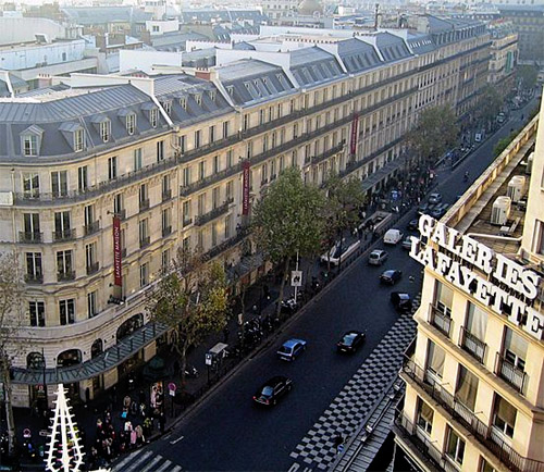
Boulevard Haussmann, with its strictly regulated buildings.
Photo by Thierry Bézecourt via Wikepedia.
Average Rating: 4.4 out of 5 based on 298 user reviews.
March 19th, 2014 | Permalink
Tags: architecture, history, History of cities, urbandesign
|
Media


Site
About BeyondDC
Archive 2003-06
Contact
Category Tags:
Partners
|


