|
Special Features

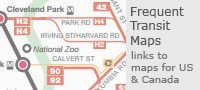


Image Libraries


|
|
Blog
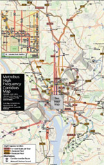
Arlington County produced this map showing ART bus routes color-coded with service frequencies. The thicker the line, the more often that bus comes. This sort of thing is very useful to riders.
It would be really cool to see a similar map for Metrobus.

Average Rating: 4.4 out of 5 based on 151 user reviews.
May 3rd, 2012 | Permalink
Tags: bus, transportation

|
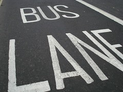
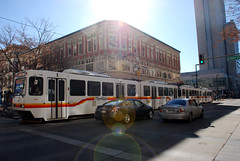
Photo by flickr user m.caimary. |
Although the final recommendations have yet to be made, some of the information from VDOT’s I-66 Multimodal Study is beginning to become publicly available.
The study is considering whether or not I-66 inside the Beltway should be widened. It’s also looking at the possibility of tolling, and of adding bus lanes to Route 50 and increasing bus service in that corridor as an alternative to driving on I-66.
They held a public meeting last night in Arlington, and will have another one tonight in Falls Church. The meeting materials are available online, including analysis of the various options.
Tonight’s meeting is from 6:30 to 8:30 pm at Mary Ellen Henderson Middle School, 7130 Leesburg Pike. It’s accessible via West Falls Church Metro. You can also email comments to VDOT at info@i66multimodalstudy.com.
Average Rating: 4.7 out of 5 based on 187 user reviews.
April 25th, 2012 | Permalink
Tags: bus, events, roads/cars, transportation
I’ve never seen an articulated coach bus before, but apparently such a thing exists. Can you imagine one of these rolling along the Beltway?
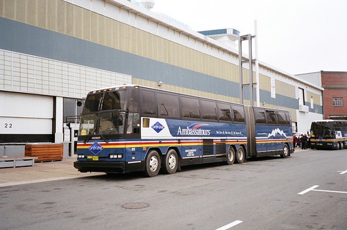
Holy cow. Photo by Paul A. Bateson, aka Busman Extraordinaire on flickr.
This bus is called a Prevost H5-60. It was produced in the late 1980s and early 1990s, and seems to have eventually been discontinued. It must have been a beast to operate and maintain.
But there would be benefits to a monster bus like this. It costs commuter operations like OmniRide a ton to run out-of-service buses back and forth in the reverse-peak direction at rush hour (a process called “deadheading”). High capacity buses would mean they’d have to pay fewer drivers to deadhead, and there would probably be fuel savings to using a smaller number of larger vehicles.
Plus, imagine the branding opportunities. Buses often blend into the background, but people notice unusual things. Buses like this would market themselves in ways that other buses don’t.
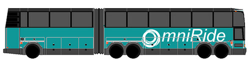
There seems to be a bit of an online cult following for the Prevost H5-60 among bus geeks. Another flickr user, MegaMoonLiner, has created a blank template for people to photoshop their own livery design onto an H5-60 frame. Sounds like fun:
Possibly a new low in BeyondDC transit geekery.
Average Rating: 4.4 out of 5 based on 174 user reviews.
April 12th, 2012 | Permalink
Tags: bus, fun, transportation
The map at right shows bus routes in Salt Lake City, with each route color coded to show the frequency of buses. Freaking genius idea.
One of the many reasons that rail systems are usually more popular with casual riders than bus systems is that rail systems are much easier to understand. With just five lines, WMATA’s Metrorail map is a breeze to figure out. On the other hand, WMATA’s bus system is so complex that they don’t even produce a single system map. Instead, we get three bus maps, each of them practically impossible to decipher.
Part of the problem is that any large bus agency (WMATA included) will necessarily have a lot of routes that don’t come very often, and generally aren’t used by very many people. Those routes clutter up their maps, making the overall bus system harder to understand for anyone hoping to know where they can use transit to travel quickly and easily.
One solution to this problem is to produce a separate frequent service map. Such maps are incredibly useful, but their weakness is that users simply looking for a system map may not be aware that a separate frequent service one exists.
So why not put the info on the regular map? Do what Salt Lake City’s transit agency has done here, and show the frequent routes in a different color.
Sure, it adds a little bit of extra clutter, but it also adds a tremendous amount of extremely useful extra data. The clutter cost is low in terms of information provided.
To its credit, WMATA’s bus map does show some premium services with different colors. Limited stop buses get a blue dashed line. But otherwise, a bus that comes every 5 minutes is shown with the same line as a bus that comes once per hour. And frankly, knowing that the 16th Street bus line is supposed to run about every 10 minutes all day long is much much more useful to know than that there is a limited-stop operation on it for a couple of hours on workdays.
I like the limited stop route, but knowing it’s there is far less important than knowing that the 16th Street line comes often enough that riders can expect to just walk up to a stop at any time of day and never have to wait very long for a bus. WMATA’s map isn’t showing the more important piece of information.
Incidentally, Salt Lake City has a very impressive transit system for a city of its size. It’s the 50th largest metropolitan area in the US, with a regional population equivalent to Birmingham, AL and Rochester, NY. It is smaller than Richmond, VA, and *much* smaller than the Norfolk region. And yet they have a 35-mile light rail system, a 44-mile commuter rail line, bus priority routes, and a modern streetcar under construction. It is probably the most impressive small city network in the country.
Thanks to Richard Layman for bringing attention to this.
Average Rating: 4.9 out of 5 based on 182 user reviews.
March 19th, 2012 | Permalink
Tags: bus, transportation
|
Is this light rail or streetcar? |
What’s the difference between a streetcar and light rail? What qualifies as BRT versus merely priority bus? One problem with contemporary transit planning is that there’s really no solidly defined answer for those questions.
Originally the term light rail was invented to describe streetcar systems that had express service characteristics. So light rail was really just rapid streetcar. But even the most express light rail systems often run slowly along on surface streets at the downtown end of their route, which muddies the waters.
Furthermore, transit agencies around the country name their lines whatever they want. For decades Philadelphia called one of its light rail lines a high speed trolley. Meanwhile, Tacoma, WA runs a short streetcar line that uses the exact same rail vehicles as Portland’s famous streetcar, but Tacoma calls it light rail.
The situation is even more muddy for buses, since terms like BRT and priority bus are relatively new. Indeed, communities buying off on the concept of BRT only to see it scaled back has become such a continuous problem that Congress is now considered adopting standards that bus lines must meet in order to be called BRT.
So this is a fairly big problem.
I do think there’s a fairly easy, practical, and common sense answer available, however. Does your line run in a dedicated transitway or not? If so, it’s rapid. If not, it’s local. Here’s a handy table describing this system, which is how I’ve personally been mentally sorting transit systems for years:

This does leave two problems unresolved.
First, how do you sort a striped transit lane? The bus lane on 7th Street in Gallery Place is obviously vastly inferior to a true busway, but surely it counts for something.
Second, what to do with transit lines that have different characteristics along different portions of their length? One of the main selling points of both LRT and BRT is that they’re very flexible, and can built to fit the needs of the community. Thus it’s pretty rare to find a line that operates in the same sort of running way for its entire length. Many use a dedicated transitway for part of their length, then mix with traffic elsewhere.
But at the very least, the above table can be useful as a way to generally describe many transit systems. So I think it’s useful.
Average Rating: 4.9 out of 5 based on 164 user reviews.
February 28th, 2012 | Permalink
Tags: BRT, bus, lightrail, proposal, streetcar, transportation
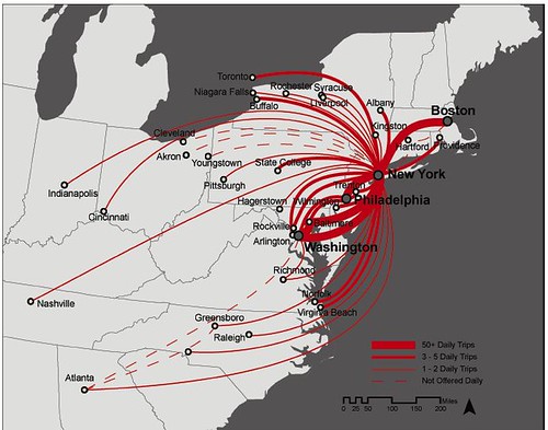
The Atlantic Cities had an interesting article a couple of days ago about Chinatown buses. What I found even more interesting than the article itself was the the accompanying map.
Average Rating: 4.6 out of 5 based on 153 user reviews.
February 2nd, 2012 | Permalink
Tags: bus, intercity, transportation
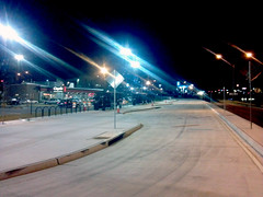
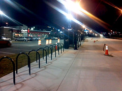
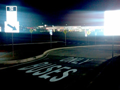
Earlier this morning, WMATA’s new Seven Corners bus depot officially opened. The new transit center is more like a super-sized bus stop than a true bus station, but nonetheless it’s a solid improvement.
Here is a map showing the transit center’s location. It takes advantage of the recently built pedestrian bridge over Route 50, which is a nice touch.
I happened to be in Seven Corners a couple of weeks ago and snapped these pictures of the almost-finished project. Forgive the cell phone quality.
Average Rating: 4.6 out of 5 based on 183 user reviews.
January 27th, 2012 | Permalink
Tags: bus, galleries, transportation
 About a year ago WMATA published a draft map of bus routes that come at least every 15 minutes. That is, bus routes that are frequent enough for riders to conveniently walk up to bus stops whenever they want, rather than consult a schedule. About a year ago WMATA published a draft map of bus routes that come at least every 15 minutes. That is, bus routes that are frequent enough for riders to conveniently walk up to bus stops whenever they want, rather than consult a schedule.
It’s a tremendously useful tool that allows potential riders to use the bus system in the same way they use the rail system, without worrying about waiting an hour for a bus to arrive.
GGW posted about this last year, but I had forgotten about it and wanted to call attention to it once again.
The full size draft map is available at the PlanItMetro blog, or via directly this link (pdf).
Average Rating: 4.6 out of 5 based on 294 user reviews.
December 1st, 2011 | Permalink
Tags: bus, transportation
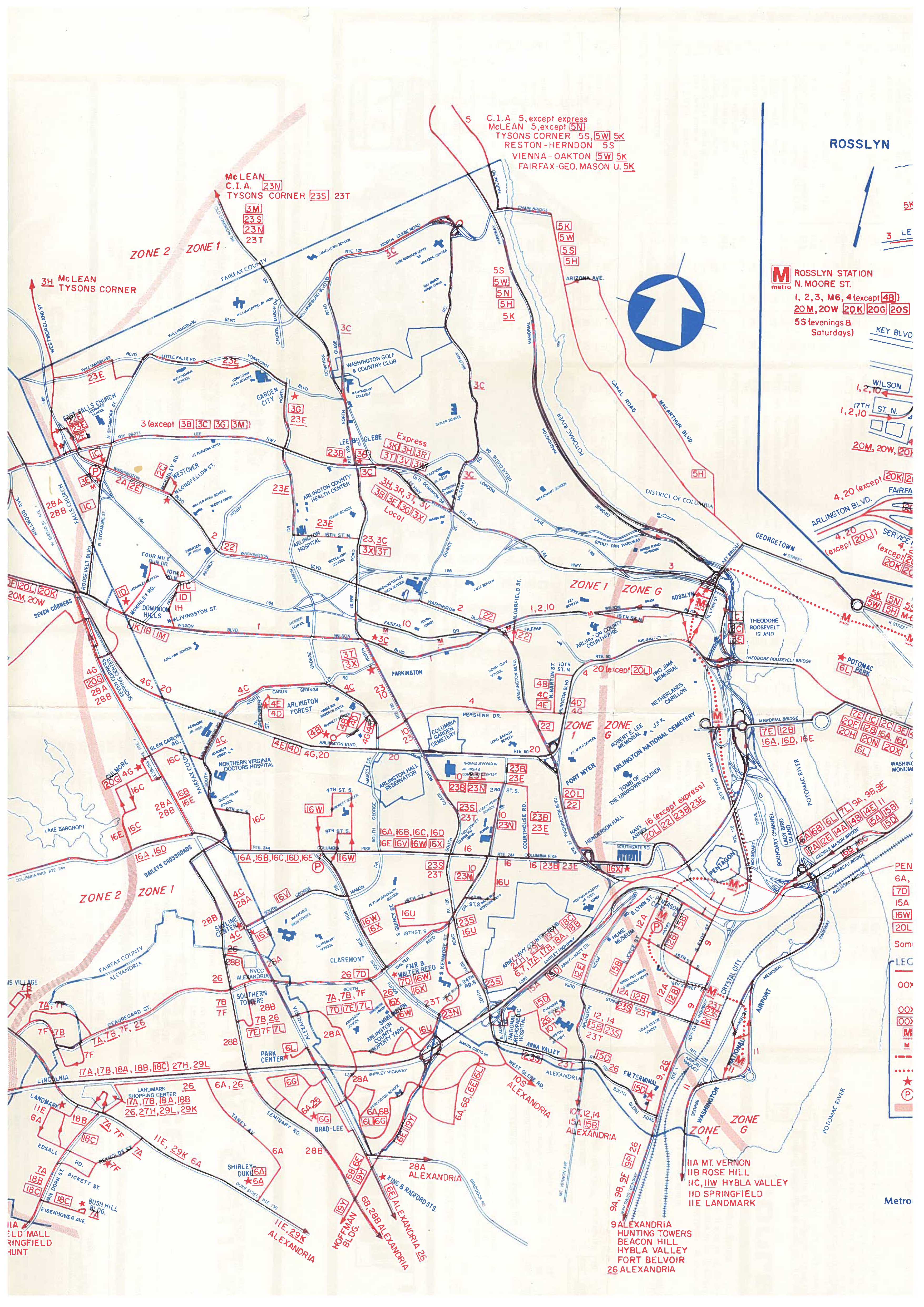
This is a partial scan of a 1978 Metrobus map produced by Arlington County. A couple of interesting things that jump out to me are the fare zone boundaries running along the left side of the page and through Arlington Cemetery, and several routes that no longer exist, such as route 10 running along Fairfax Drive in “Parkington” (now Ballston).
What do you see that’s interesting?
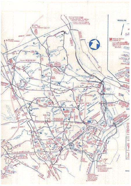
Somewhat larger version.
Much larger version.
Average Rating: 4.9 out of 5 based on 273 user reviews.
November 21st, 2011 | Permalink
Tags: bus, galleries, history, transportation
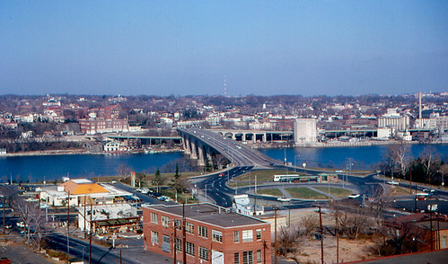
Take a look at this picture of Key Bridge, taken in 1965. Rosslyn is in the foreground, with Georgetown across the river. That circle, which was called Rosslyn Circle, is not there anymore. Zoom in to the full-size image and you can clearly see an old bus terminal. According to the photo description, the terminal is where DC Transit buses turned around. Much like DC Circulator today, the old DC Transit bus system included a route that crossed into Rosslyn. Photo by Roger Wollstadt.
Average Rating: 4.5 out of 5 based on 257 user reviews.
November 16th, 2011 | Permalink
Tags: bus, fun, galleries, history, roads/cars, transportation
|
Media


Site
About BeyondDC
Archive 2003-06
Contact
Category Tags:
Partners
|


