|
Special Features


Image Libraries


|
|
Blog
When Walmart announced it would open 6 stores in DC, many wondered whether the stores would use urban or suburban layouts. With the plans for all the stores finally available, now we know.
3 of the 6 stores will be unquestionably urban. 1 will be a hybrid with some urban characteristics. 2 will be almost completely suburban.
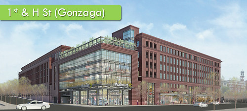
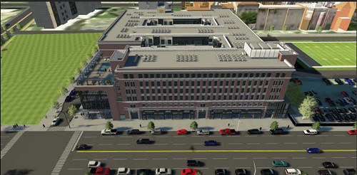
Gonzaga: The closest store to downtown is suitably the most urban. With apartments above and smaller-format retailers lining the street, Walmart’s H Street location is a model of what urban big boxes should be.
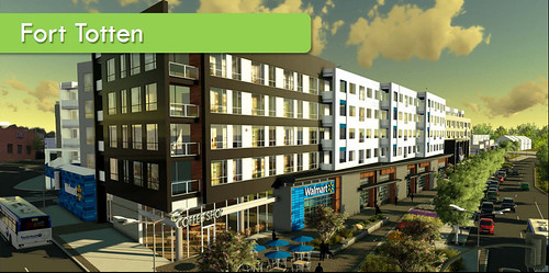
Fort Totten: Almost as good as the Gonzaga design, this store is inferior only because it’s in a much more isolated location, and because the building materials appear to be somewhat cheaper. But still, the design is unquestionably strong.
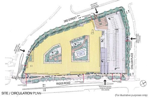
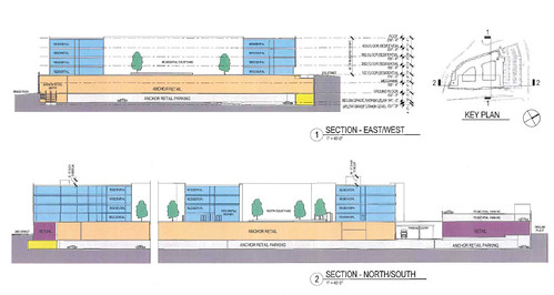
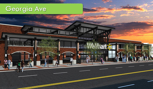
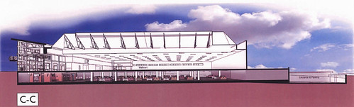
Georgia Avenue: Although this design lacks the mixed-use amenities of the previous two, it’s still primarily urban, with greater emphasis on pedestrian access than vehicular. It greets the street and parking is provided underground. It’s a reasonable choice for a neighborhood that has not seen much investment in recent years.
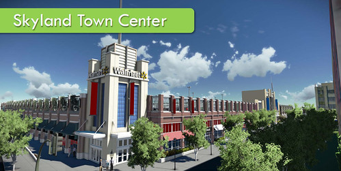
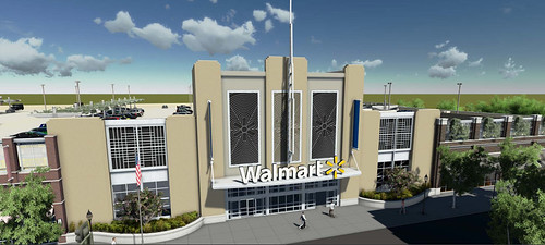
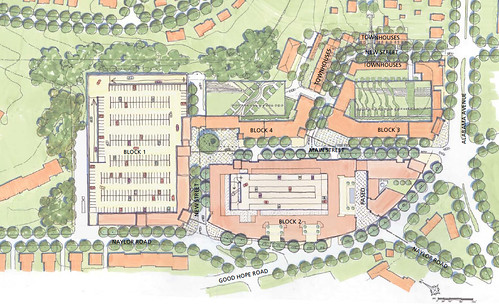
Skyland Town Center: Resembling something one might expect to see in Gaithersburg, this location is a bit like a shopping mall; it’s internally walkable, but poorly connected to any surrounding neighborhoods.
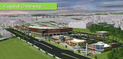
Capitol Gateway: The farthest out proposal from downtown is clearly primarily suburban. It’s a strip mall. But it does take a few tentative steps towards walkability, with both street-facing and parking lot-facing entrances.
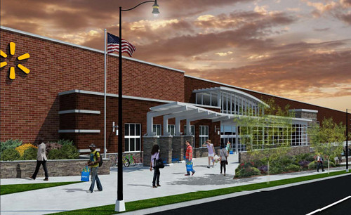
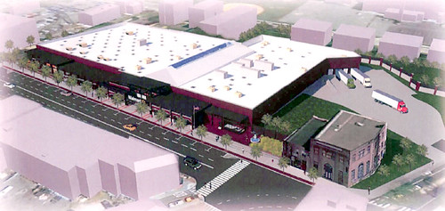
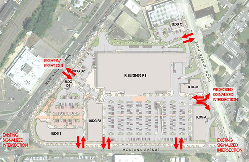
New York Avenue: The intersection of New York Avenue and Bladensburg Road is probably DC’s most car-oriented corner. And so it was predictable that Walmart would choose it for a store, and propose a totally suburban design.
The store faces away from the biggest street and fronts onto a big open-air parking lot. The only indication that this location is in a city instead of an exurb is that the Walmart will be stacked on top of another big box store (probably a Home Depot).

Is DC a testing ground?
Each of the 6 stores has such unique characteristics that one wonders if Walmart is using DC as an experiment to see which types of layouts work in the urban environment. By comparing the sales at the more urban stores to the more suburban ones, Walmart will gain many valuable insights.
Inevitably, Walmart will probably want to establish stores in other central cities around the country. The DC example will very likely influence the design of those future stores.
All images in this post are from Walmart.
 Cross-posted at Greater Greater Washington. Cross-posted at Greater Greater Washington.
Average Rating: 4.5 out of 5 based on 259 user reviews.
April 26th, 2012 | Permalink
Tags: architecture, development, urbandesign

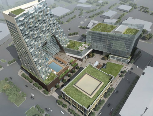
For most of the last 30 years the tallest skyscraper in Montgomery County was Gaithersburg’s 275 foot tall Washingtonian Tower. Earlier this year it was eclipsed by the 289 foot tall North Bethesda Market. And now the developers of White Flint are proposing another tower taller still.
Oh, and it’s crazy-looking.
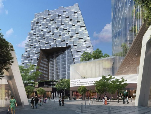
Proposed North Bethesda Market II. Image from JBG.
The proposed skyscraper is part of a massive mixed-use transit oriented development planned across the street from White Flint Metro. It will be called North Bethesda Market II, will have 345 residential units, and will be about 300 feet tall. It will anchor a development that also includes a 175, 000 square foot office building and 115, 000 square feet of retail space.
It makes sense to put skyscrapers in White Flint. The area is Montgomery County’s version of Tysons Corner. It’s a huge collection of dense but mostly suburban office buildings and residential high rises. With its Metro station it is as perfect a location for smart growth development as there could be in Montgomery County.
The project site plan shows that like the existing North Bethesda Market I, this new proposal is basically urban. The public spaces turn their back on Rockville Pike, which is unfortunate, but the urban design is still a big step up from existing conditions.
Proposed North Bethesda Market II. Image from JBG.
And then there’s the architecture. The bold modernist ziggurat is absolutely unlike anything else in our region. It is a shocking sculptural statement that succeeds in all the ways it is meant to. It’s not the kind of architecture that would make a good city if repeated over 10, 000 background buildings, but it will be an undeniable landmark – an icon to the city White Flint aspires to be.
I wouldn’t want to see more than one of these, but I like it for what it is.
Average Rating: 4.9 out of 5 based on 254 user reviews.
December 6th, 2011 | Permalink
Tags: architecture, development, urbandesign
Good for Metro, for covering this previously blank wall at Farragut West station with a little bit of color. Little projects like this are easy, inexpensive, and make the city a more vibrant and interesting place.
Ornament is a good thing. Let’s have more of it.

Forgive the cell phone picture.
Average Rating: 4.9 out of 5 based on 223 user reviews.
November 23rd, 2011 | Permalink
Tags: architecture, metrorail, transportation, urbandesign
Traditional architecture and modern architecture have different strengths and weaknesses.
Traditional architecture, with its focus on ornament and human-scaled components, provides the most visually stimulating sidewalk presence. That makes traditional architecture more pedestrian friendly and thus, from an urban design standpoint, superior.
On the other hand, modern architecture has its own set of strengths. Its focus on treating buildings as sculptures to be appreciated from afar as singular artistic statements is ideally suited for skyscrapers.
And so I have always wanted to see an architecture that combined the two, to provide sculpturally beautiful skyscrapers with ornamented, human-scaled bases.
The building pictured at right does exactly that. It is located in New Westminster, British Columbia, and is an experiment in hybridization. The building isn’t perfect; the materials and level of ornament on the traditional base aren’t quite right, for example. Regardless, it is a fascinating experiment, and a style I’d like to see used more often.
Average Rating: 4.6 out of 5 based on 222 user reviews.
September 27th, 2011 | Permalink
Tags: architecture
I’ve always thought it a shame that Baltimore’s Harbor Tunnel wasn’t built as a suspension bridge. What a glorious sight that would be, with the skyline as a backdrop. Now Baltimore may be getting a second chance.
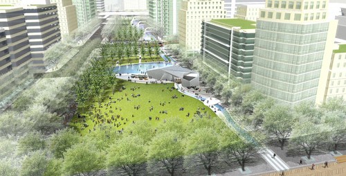
The Greater Baltimore Committee – basically the chamber of commerce – is considering ideas to redevelop Rash Field, the underused waterfront park space between Federal Hill and the Inner Harbor. So far their leading idea is to improve access to the park via a new pedestrian bridge crossing the Inner Harbor, connecting Rash Field and Federal Hill to the booming Harbor East area (see map).
The idea seems like a real winner all around. It would connect two neighborhoods of Baltimore that are extremely close geographically but extremely difficult to navigate between, and it would provide a visually beautiful, dramatic addition to the city’s skyline. A suspension or cable-stayed bridge over the Inner Harbor would instantly become one of the city’s most important visual icons.
This is still a preliminary idea. It’s no sure thing to happen, and even if it does move forward the design could change dramatically. But those caveats aside, here is GBC’s rendering of what such a bridge might look like:

Proposed Inner Harbor bridge. It would be designed to open for tall ships to pass.
Average Rating: 4.4 out of 5 based on 151 user reviews.
September 9th, 2011 | Permalink
Tags: architecture, transportation
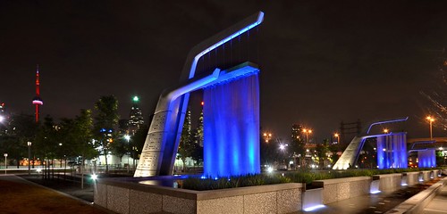
I love a good water feature. Somehow, fountains just make parks and plazas better. So I was interested to read about Sherbourne Common, a new park in Toronto that’s centered around an architecturally and ecologically innovative series of water features.
The park doubles as a stormwater treatment plant. It collects runoff water from around Toronto, runs it through an ultraviolet cleansing processor that purifies it, and then routes it through a series of interesting fountains before releasing it into Lake Ontario.
Turns out the park is one of the centerpieces of a large waterfront redevelopment, not unlike DC’s efforts along the Anacostia River. It seems that urbanistically, Sherbourne Common is pretty comparable to Yards Park.
Here are some pictures, from the City of Toronto’s image gallery.
Average Rating: 4.9 out of 5 based on 279 user reviews.
September 2nd, 2011 | Permalink
Tags: architecture, environment, galleries, urbandesign
Back in June some residents of Wallach Place worked themselves up into a NIMBY tizzy over a proposal to replace the one-story Yum’s building with a residential midrise. After a redesign by the project architect and some counter-pushback from the blogosphere, the Wallach neighbors seem satisfied.
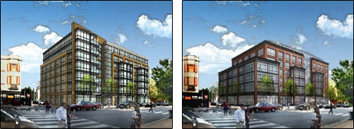
LEFT: Original proposal for Wallach/14th midrise.
RIGHT: Updated proposal, having responded to criticism from the Historic
Preservation Review Board and neighbors.
The neighbors’ original criticism of the building can only be described as classic NIMBYism. They nicknamed the building “WallachZilla, ” they said the proposal caught them off guard, they called it too tall and too hulking, they complained about shadows, and increased traffic, and said it doesn’t have enough parking. They implied the developers were slimy and cheap. And worst of all, they wondered why their neighborhood “needs” more housing in the first place. They also said they didn’t like its design, which was more of a fair comment.
The DC Historic Preservation Review Board agreed with the design criticism, saying the proposal was plain and lacked creativity. They asked the developer to come back with a modified, more interesting design.
Meanwhile, the Wallach neighbors clearly didn’t like being called NIMBYs. They started claiming their opposition isn’t about density and that they aren’t opposed to new development. They got defensive towards GGW, and attacked NIMBYism as a “weathly, snooty, close-the-door” mentality. And, impressively, they changed their tone towards the developer to one of cordiality and respect.
When the new design came out, the Wallach neighbors responded basically reasonably. They cheered the new version, which is smaller and has a more broken-up mass. They seem to have abandoned complaints about more people moving into the neighborhood. And although they couldn’t help themselves but to complain about the narrowness of the alley, they seem supportive of the new proposal overall.
In short, they’ve become YIMBYs. Maybe the change happened because of the new design, or more friendly treatment from the developers. Or maybe it was the result of intellectual disdain for being called NIMBYs, and a desire to prove their critics wrong. Either way, opponents became supporters.
And yes, the new proposal does look better. It’s more thoughtful and visually appealing. It definitely blends with its surroundings more harmoniously. The color scheme is softer, and the setbacks are more nuanced. These are good things. Unfortunately, the building is also 10 units smaller, which means at least 10 fewer people will be able to live in the neighborhood. The Wallach people haven’t addressed that, and presumably don’t care.
I wonder how they’d respond to a request for one additional floor in order to make up the difference. If it were set back and looked good, would they support the idea?
Average Rating: 4.9 out of 5 based on 284 user reviews.
August 9th, 2011 | Permalink
Tags: architecture, development
Check out this bus station in Cleveland, courtesy friend ofBeyondDC MPK:
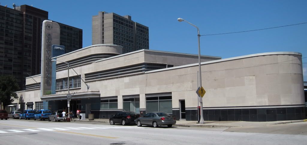
Look familiar? Here’s DC’s version, on New York Avenue:
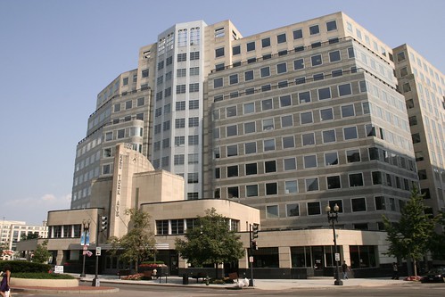
Photo by Elvert Barnes.
I wonder whether Cleveland’s version or DC’s came first, and whether any other cities have one.
Average Rating: 4.7 out of 5 based on 297 user reviews.
August 8th, 2011 | Permalink
Tags: architecture, bus, galleries, intercity, transportation
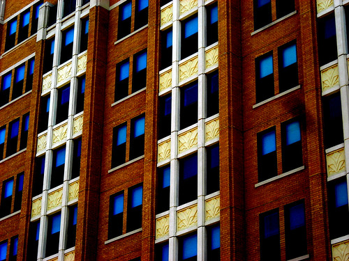
Earlier this week I posted an example of traditional ornament on a new building to dispel the myth that such a thing can’t be done. Another myth about ornament is that it must be stylistically traditional and is inherently incompatible with modern design. That’s also a myth, so let’s go ahead and dispel it as well.
Pictured below is the recently renovated building at 1348 H Street, NE. Technically speaking it isn’t new construction, but it’s been more or less completely rebuilt. Take a look at the new aesthetic details on the bay windows.

Those blue and purple bars serve no purpose except to add detail and interest to the facade. They are undeniably contemporary, but they are also undeniably ornamental. And they’re wonderful! They add visual interest and make the building appear to be of much higher quality than it would if the facade were bare.
It is just not true that ornament and contemporary architecture are mutually exclusive.
Average Rating: 4.9 out of 5 based on 158 user reviews.
July 15th, 2011 | Permalink
Tags: architecture, development
Ornament is important to urban buildings, especially large ones. It helps to break up overwhelming masses and gives pedestrians something more their scale at which to look. Thanks to ornament, no one calls old buildings “boxes” even when they are box shaped. The presence of ornament is one of the reasons why most normal people think old architecture is beautiful.
One of the arguments sometimes brought up by modernists in the grand debate over architecture is that it’s impossible to produce good looking ornament in the world of contemporary design and construction. We don’t use the right materials anymore, and our workers don’t have the necessary skills. So some say.
This new building in Clarendon would seem to prove them wrong.
Average Rating: 4.9 out of 5 based on 232 user reviews.
July 13th, 2011 | Permalink
Tags: architecture
|
Media


Site
About BeyondDC
Archive 2003-06
Contact
Category Tags:
Partners
|


