|
Special Features

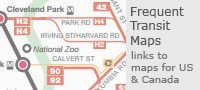


Image Libraries

|
|
Blog
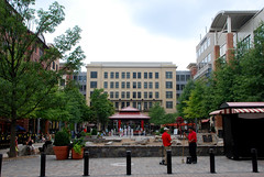
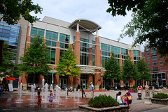
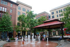
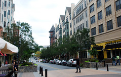
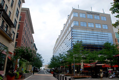
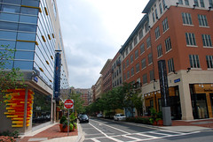
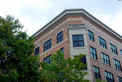
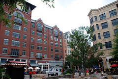
Rockville is a real city with a real downtown. During the 20th Century it was gobbled up by the expanding Washington suburbs, but it has a legitimate historic core. Like many cities, its historic downtown was gutted during the urban renewal days, and is only now recovering. The Rockville Town Square project is a redevelopment that covers a few blocks of the larger downtown area. Although it’s new, and still has a bit of a “plastic” feeling, it’s very well designed and more “real” feeling than many new-built town centers elsewhere.
The project is laid out around a comfortable central plaza. The buildings are all uniform height, giving the project a European feel. Although they were all built at the same time as part of the same project, the architecture of each building is unique, and the styles vary from traditional to modern.
Here are some loose pictures, taken in 2011.
Average Rating: 4.7 out of 5 based on 158 user reviews.
August 31st, 2012 | Permalink
Tags: architecture, galleries, urbandesign

|
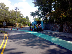
Arlington’s first green bike lane. |
When bikes and cars mix, the key to safety is for both bicyclists and car drivers to be aware of their surroundings, and expect to encounter each other. Therefore the safest bike lane is one that’s highly visible, so that car drivers see it and expect bikes to be using it.
With that in mind, progressive cities around the world have been painting bike lanes green at key locations, to make them more visible. Within the US, green painted lanes are especially common in Portland and New York. DC has exactly one, on 15th Street, SE.
And now Arlington is installing several, at important conflict points where cars and bikes cross. Its first one went in Wednesday afternoon, at the corner of Military Road and Nelly Custis Drive. If weather cooperates, 4 more will be installed around the county over the next few days.
This map shows all 5 of Arlington’s locations. They are Clarendon Blvd at 15th Street North, Wilson Blvd at Veitch Street, Lynn Street at 19th Street North, and 15th Street South across the Pentagon City Mall parking garage entrances. More could come later, at other similar conflict points.
Here is a set of 11 pictures of the first one being installed.
 Cross-posted at Greater Greater Washington. Cross-posted at Greater Greater Washington.
Average Rating: 4.5 out of 5 based on 269 user reviews.
August 30th, 2012 | Permalink
Tags: bike, galleries, transportation
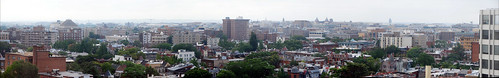
The Hinckley Hilton is one of the most prominent buildings in Northwest Washington. It offers nifty panoramic views of the central city. Thanks to some visiting relatives, I got a chance to photograph the view.
OK, so Washington’s skyline is kind of boring. But still. Who doesn’t love a good view?
Click here for the full-size version, and here for a version with key landmarks labeled.
Average Rating: 4.9 out of 5 based on 237 user reviews.
August 15th, 2012 | Permalink
Tags: galleries
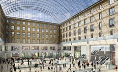
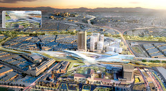
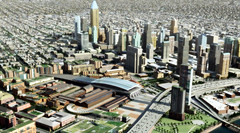
Amtrak made a big splash last month when they released plans to overhaul DC Union Station, but did you know that many other cities are also making big investments in their rail depots? The list, and the renderings, are pretty impressive.
Los Angeles Union Station opened in 1939 and is often referred to as “last of the great railway stations in America.” And for the past 3/4 of a century that superlative has been largely correct. As rail travel declined, so did rail station design. During the latter half of the 20th Century, many cities replaced their grand historic depots with so-called “amshaks”, cheap and awful buildings that have more in common with utility sheds than anything else.
But now that’s all changing, and soon Los Angeles will have to give up its title.
Look at all these plans from big cities around the rest of America:
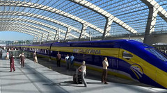
New York Moynihan Station | project website
This plan would shift New York’s Penn Station over one block, to reconceive the historic post office building next door as a station building. |
 |
 |
 |
 |
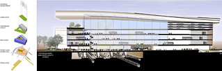
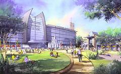
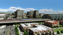
Atlanta MultiModal Passenger Terminal | project website
Future new intercity rail station. |
 |
 |
|
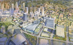
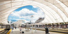
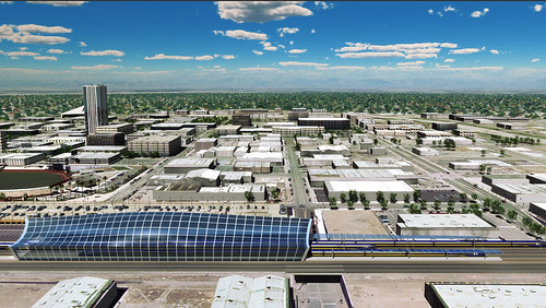
Denver Union Station | project website
Renovation of historic depot and addition of a new train room, service Amtrak, regional, and ski trains. |
 |
 |
 |
|
Miami Central Station | project website
New multimodal station at Miami airport, integrating Amtrak with local rail. Not downtown, but will become the main transit transfer point in the city. |
 |
 |
|
|
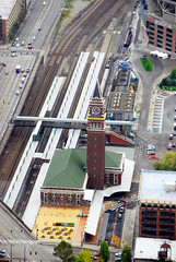
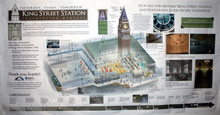
Seattle King Street Station | project website
Major restoration of historic depot, which had degraded significantly. |
 |
 |
|
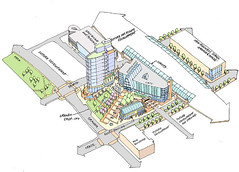
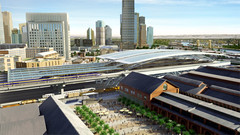
Charlotte Gateway Station | project website
New station integrating Amtrak with local rail. |
 |
 |
|
|
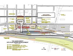
Saint Paul Union Depot | project website
Renovation of historic depot for Amtrak and local use. |
 |
 |
 |
|
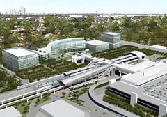
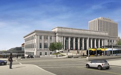
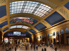
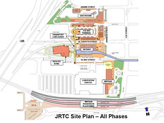
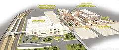
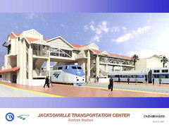
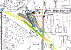
Jacksonville Regional Transportation Center | project website
Four-block project integrating Amtrak with local service. A series of new station buildings will be added surrounding the historic depot, which is used as Jacksonville’s convention center. |
 |
 |
 |
|
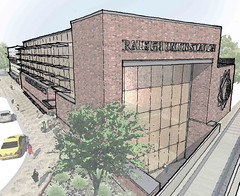
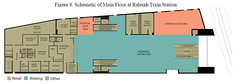
Raleigh Union Station | project website
Adaptive reuse of a historic warehouse to become a new Amtrak station. |
 |
 |
 |
|
Thanks to the California High Speed Rail (CAHSR) project, that state has several major station projects in planning.
Los Angeles Union Station | project website
Expansion of existing historic station, to include a new train room for CAHSR. A final design has not yet been picked, so multiple options are still under consideration. |
 |
 |
|
|
San Francisco Transbay Terminal | project website
Reconstruction of an existing bus station to handle future California High Speed Rail, as well as local regional/commuter rail. |
 |
 |
 |
|
Sacramento Station | project website
New station for CAHSR. |
 |
 |
|
|
San Jose Diridon Station | project website
New train room at existing station to integrate CA HSR with local rail. |
 |
 |
 |
|
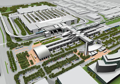
Anaheim Regional Transportation Intermodal Center | project website
New station for CAHSR. |
 |
 |
|
|
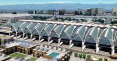
Fresno Southern Pacific Station | project website
New train room at historic depot for CAHSR. |
 |
|
|
Average Rating: 4.4 out of 5 based on 153 user reviews.
August 14th, 2012 | Permalink
Tags: architecture, development, galleries, intercity, metrorail, transportation
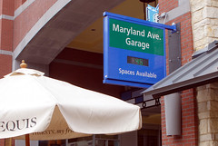
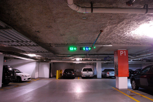
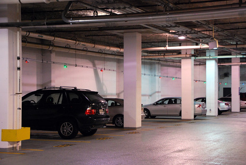
Here’s an idea: Put a sensor in every parking space within a big garage, capable of reading whether or not a vehicle is parked there. Attach a couple of lights to each space and rig them to display green if the space is open, and red if it’s in use. Feed the info to a central computer that counts up the open spaces and displays the number on a sign outside the garage, as well as on displays at the end of each parking aisle.
That system exists. Drivers benefit from it at a handful of garages around the DC region, most notably at BWI Airport and in downtown Rockville. It’s a neat concept that reduces drivers’ need to circle looking for a space, and therefore reduces congestion, fuel-loss, time-loss, and annoyance.
I don’t know how much it costs, but it sure is a nifty system.
Here are some photos showing how it works, from downtown Rockville:
Average Rating: 4.5 out of 5 based on 214 user reviews.
August 8th, 2012 | Permalink
Tags: galleries, roads/cars, transportation
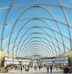
|
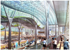
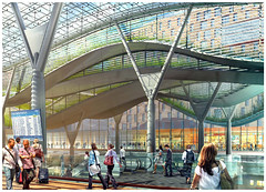
Proposed main level train room. |
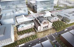
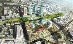
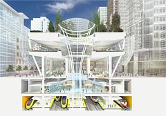
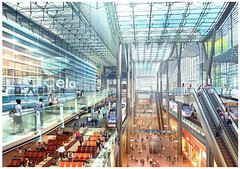
Amtrak released its long range plan for Union Station yesterday. If implemented, the proposed redesign will accommodate double the train service and triple the number of passengers as compared with the existing station.
The plan looks pretty nice, and includes some beautiful features. Foremost among them is a new European-style train room that would be unprecedented in North America. Instead of boarding trains from a dim cavern below the parking garage, riders would board from a brightly-lit glass enclosure.
Despite that, I can’t help but feel a little bit nervous about the whole thing.
A hundred years ago almost every major American city had a beautiful train station. Unfortunately many were destroyed during the 20th Century. Of those that survived, the vast majority are mere shells of their former selves. Washington Union Station is one of the only exceptions. It’s an absolutely beautiful historic building that remains active, vital, and functioning as an extremely busy train station. In my opinion it’s the best intercity rail station in America.
And so when plans come forward to dramatically change it, I get a little bit worried. So many of the country’s train stations have been ruined by redevelopment, it’s clearly a dangerous business.
But Union Station does legitimately need to be expanded. It’s a bottleneck that limits all of its rail users: Amtrak, MARC, VRE, even Metro. More capacity is needed, if not today then surely by this plan’s ~2030 timeline. So more slots for more trains have to be accommodated somehow.
So Union Station must expand, but carefully. The key concern with any potential redesign must be the continued health and vitality of the historic building. Amtrak must not allow its greatest station to suffer the fate of so many of its one-time peers. Expansion is fine, but the old building must not be replaced, even in function. Supplement, but don’t take over.
Thanks to historic preservation there is no danger that Washington Union Station will be bulldozed and replaced by a modern version, as New York’s famous Penn Station was. But there might be a danger that Washington would follow the example of Denver, where that city’s Union Station will soon be converted to a hotel, and all of its rail functions moved to new buildings directly behind the old depot.
The key demand for any expansion of Union Station must be that the original building continue to function as an integral part of the depot. Most Amtrak, MARC, and VRE passengers should continue to pass through it, and the concourse facilities should be as close as possible.
It’s true that many of the rail-related functions moved out of the original building decades ago. Nevertheless, the expansions so far have resulted in a seamless whole. Casual users don’t notice where the old building ends and the new one begins. Just about everyone passes through the original depot, which still includes ticketing, and remains where most internal Union Station circulation takes place.
Any expansion must work the same way.
So how does this new plan perform?
The general premise of the plan is to basically do two things: 1) Double the number of stub-end tracks on the main level, and 2) dramatically expand the lower food court level, adding new tracks and 2 additional waiting areas further north than the current concourse.
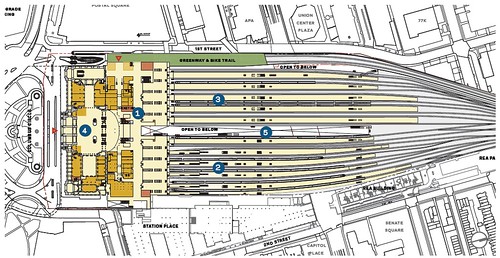
Proposed main level floor plan.

Proposed lower level floor plan, showing new concourses.
The main level concourse that was built in the 1980s will be renovated and enlarged. This is great news. It’s not a historic space, so renovating it is no loss (and will probably be a big improvement), and it is the most convenient location for a concourse to be accessed via the old building. These improvements should guarantee that the front of the building remains very important, and heavily used.
Behind the renovated front concourse, the existing train room will be replaced by a new European-style open version. This continues the existing layout, but with a vastly superior design. Thumbs up to that.
The two new lower level concourses will unfortunately serve to disperse users further away from the main building. Hopefully they will draw just enough people to remain busy themselves, but not so many that they become the new center of the station.
The middle concourse will be reserved for MARC and VRE. It does make sense to separate them from intercity traffic, so if there’s going to be a new concourse then this one makes sense.
The northernmost concourse will offer redundant access to all platforms. It’s there so users from NoMa don’t have to walk south to the main entrance and then backtrack north. As long as most of the station’s amenities remain in the front, this secondary access point will remain less convenient for most users, and therefore should not be a major problem.
The walkway connecting the two new northern concourses to the main building is called the center concourse. As the hub for two of the three boarding areas, this will surely become a busy area. It could threaten the old building’s vitality if too many rider amenities are moved from the front of the station to this walkway. The main ticket counter, for example, should remain in the old building. But as long as this walkway remains just a walkway, and does not take on the functions of a terminal, it should not be a problem.
All in all, there seems to be enough activity remaining in and near the old building to guarantee its continued use. There are lots of new things further north, but they appear to remain secondary to the front. These changes should make Union Station even better than it is now.
But I’m still a touch nervous. A lot will depend on the details of where rider amenities are located.
Here are more images from the report:
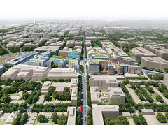
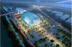
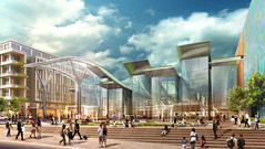
Overview of the entire development, including air-rights buildings. |

Proposed new rear entrance, leading directly to the glass-enclosed train room. |
Proposed new central concourse, as seen from approximately the current concourse-to-parking garage escalator. |
Elevators leading from one of the lower concourses up into the train room. |
Proposed new rear entrance. |
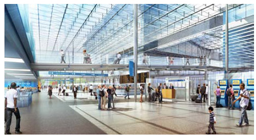
Proposed renovation to the existing stub-end concourse. |
Average Rating: 4.7 out of 5 based on 176 user reviews.
July 26th, 2012 | Permalink
Tags: architecture, commuterrail, development, galleries, intercity, preservation, transportation
VDOT has an awesome flickr photo set containing aerial pictures of construction projects in Northern Virginia. Foremost among the pictures are the Silver Line and Beltway HOT lanes, but there are also aerial photos of several other smaller projects.
Here is the full gallery. A teaser is below.
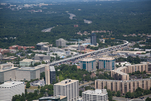
Silver Line under construction in Tysons Corner. Photo by VDOT.
Average Rating: 4.6 out of 5 based on 197 user reviews.
July 20th, 2012 | Permalink
Tags: galleries, metrorail, roads/cars, transportation
This is a village in the Faroe islands. The landscape is so alien. I think it’s fascinating.
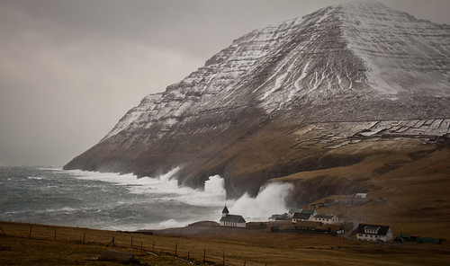
Photo by Joannis.
Average Rating: 4.9 out of 5 based on 165 user reviews.
July 19th, 2012 | Permalink
Tags: galleries
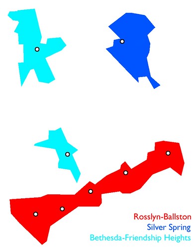
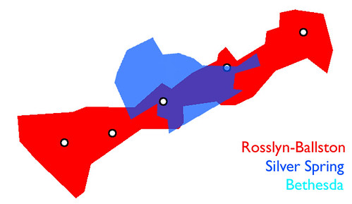
Montgomery and Arlington counties have both been very good at turning their Metro stations into TODs. However, the pattern of how they developed in each jurisdiction varies due to the spacing of Metro stations.
In Arlington, stations are clustered close together in two corridors (Rosslyn-Ballston and Pentagon-Crystal City), so that the TOD areas within each corridor function like neighborhoods within the larger “city” of Arlington. In Montgomery, stations are spaced a mile or so apart, resulting in TOD areas that each function as the downtown for otherwise independent cities, each with its own hinterlands.
Because the TODs in Arlington are clustered together, while those in Montgomery are spaced apart, it’s difficult to get a sense of how they compare to each other. Just how big is Silver Spring, compared to Rosslyn or Ballston, for example?
I set out to answer that question with a series of maps. These maps compare the Rosslyn-Ballston corridor’s 5 Metro station TODs to Bethesda, Friendship Heights, and Silver Spring, all at the same scale. I left out Pentagon-Crystal City, Rockville, and Alexandria, although they might make good additions some time in the future.
First, a reference map. Using Google Maps set at the 2, 000 foot view, I colored in the dense portions of each TOD, deleted the surroundings, then put them all on the same page. In this first map, Bethesda and Friendship Heights are shown at the proper distance from each other, in addition to being scaled by area.
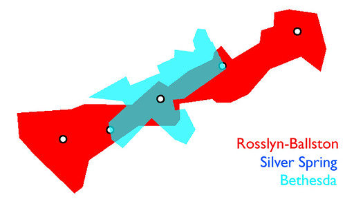
Rotating the Wisconsin Avenue axis of Bethesda-Friendship Heights to match Rosslyn-Ballston, and then placing downtown Silver Spring between them, produces 2 almost identical corridors.
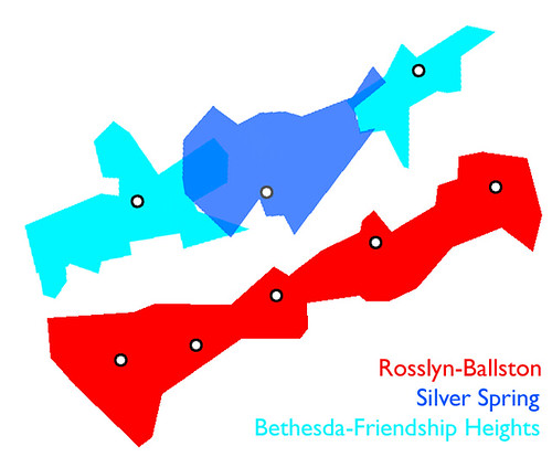
Overlaying Silver Spring and Bethesda atop Clarendon shows that if the Maryland TODs were part of Rosslyn-Ballston, they would each would stretch approximately from Court House to Virginia Square.
Average Rating: 4.8 out of 5 based on 267 user reviews.
June 19th, 2012 | Permalink
Tags: galleries, urbandesign
What do you if your city is built around a narrow river and needs a major grade-separated rapid transit line, but for whatever reason you can’t afford a subway? Why, you build a rivertop monorail, of course!
That’s what the city of Wuppertal, Germany did way back in 1897, when it built the Schwebebahn, or “floating train.” It’s been open and running ever since, except for a time during World War II when it was damaged.
Monorails have a fairly limited useful niche. They’re more expensive and less flexible than light rail, and have a more limited capacity than heavy metro rail. Their main advantage over traditional elevated rail is that their structure can be airier-looking, and therefore prettier.
Generally speaking, monorails are only useful if you’re going to build a rail line that you know will be 100% elevated, and if you’re worried a lot about aesthetics. A line running on top of a river is basically the perfect place. Just about anywhere else, you’d build something more traditional.
Anyway, the Schwebebahn is fascinating. Certainly it’s one of the world’s most unique transit lines. Here are a couple of pictures:

Schwebebahn in 1913. Public domain image linked from Wikipedia. |
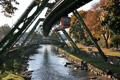
Schwebebahn in 2007. Image from Flickr user Ian Fisher. |
Average Rating: 4.4 out of 5 based on 167 user reviews.
May 16th, 2012 | Permalink
Tags: galleries, transportation
|
Media


Site
About BeyondDC
Archive 2003-06
Contact
Category Tags:
Partners
|


