|
Special Features


Image Libraries


|
|
Blog
The St. Joseph’s Seminary in Northeast DCs’s Michigan Park neighborhood has a large eight-acre property, but the seminary only uses two acres. Rather than let the rest sit empty, they plan to add 90 new rowhouses on four acres, and turn the rest into a park.

The historic seminary building, as seen from 13th Street NE. Photo by Jonathan Neeley.
The Josephites, as the seminarians call themselves, have been working with developer EYA to build on the site. EYA’s proposal is called 12th and Allison. It focuses on the northern part of the site, preserving the southern part and its historic seminary building.

Location of St. Joseph’s Seminary. Image from EYA.
The Josephites would retain ownership of the southern part of the property, which includes both the building itself as well as a little over two acres of open space.
To the north, EYA would extend Webster Street through the block, connecting to 12th Street (Webster currently ends when it hits 13th, on the east side of the property). Surrounding the new Webster Street would be 90 rowhouses, most of them north of the new street.
Triplexes everywhere versus rowhouses and a park
Today the seminary grounds look sort of like a park. But they’re not. The seminary is private property, and if the Josephites sell part or all of it, that part can be developed according to however it’s zoned.
Almost all of Michigan Park is zoned R-2, which allows “semi-detached” housing like duplexes and triplexes. Many of the blocks surrounding the seminary are lined with the latter.
But developers rarely build triplexes these days. They require so many setbacks that it doesn’t pencil out to add in any communal open spaces like parks. But the setbacks are rarely large enough to be very good private yards. For new construction in the city, regular rowhouses are more popular with both sellers and buyers.
Thus, EYA hopes to rezone the property to R-5A, the same as Providence Hospital across the street. R-5A zoning would allow for normal rowhouses, which in turn could be clustered together, allowing for better community open spaces.
But rezoning requires city action, and that opens the door to controversy.
At a community meeting in October of last year, a number of residents made it clear that they were opposed to development of any kind. At least twice throughout the winter, opponents spread these flyers throughout the neighborhood, forewarning against the evils of building:

Opponent flyer. Photo by Jonathan Neeley.
Michigan Park is a cozy, moderate-density neighborhood. It’s fair for residents to wonder about the impact of a new development, and hope to influence it. But hyperbole like that isn’t helpful and isn’t true. Saying this project would “irrevocably damage our community” is a stretch.
90 new units on two big blocks won’t turn the place on its head. That’s only a little denser in total than the surrounding blocks of duplexes and triplexes.
By clustering the development mostly north of Webster Street and preserving more open space south of it, the northern block will be noticeably denser than triplexes, but in return the historic seminary building and much of the open space on the south will be permanently preserved, designated historic, and off-limits to future development.
That’s a good trade. Right now, if the Josephites wanted, they could sell their entire property and develop 100% of it as duplexes and triplexes by-right, whether anybody objected or not. Rather, in exchange for rezoning to allow rowhouses, the seminary and considerable open space will be saved.
Next steps
In April, EYA will present its latest plans at local ANC meetings. They’ve reduced the density of the proposal from 180 houses to 90, and promised to design the buildings in a high-quality, contextual way.
After that, they’ll submit for zoning approval, and apply to the District’s Historic Preservation Review Board to designate the seminary building as a landmark. Expect hearings on it this fall.
 Comment on this at the version cross-posted to Greater Greater Washington. Comment on this at the version cross-posted to Greater Greater Washington.
Average Rating: 4.6 out of 5 based on 248 user reviews.
April 13th, 2016 | Permalink
Tags: development, land use, master planning, preservation

According to the California housing champion who’s suing communities that don’t allow enough new development, not building needed density is morally equivalent to tearing down people’s houses.
Photo by .Martin. on Flickr.
Sonja Trauss, founder of the SF Bay Area Renters’ Federation sums up the housing problem affecting nearly every growing American city today:
“Most people would be very uncomfortable tearing down 315 houses. But they don’t have a similar objection to never building them in the first place, even though I feel they’re morally equivalent. Those people show up anyway. They get born anyway. They get a job in the area anyway. What do they do? They live in an overcrowded situation, they pay too much rent, they have a commute that’s too long. Or maybe they outbid someone else, and someone else is displaced.”
Trauss hits the key points: The population is growing, and people have to live somewhere. If we refuse to allow them a place to live, that’s just like tearing down someone’s home.
Someone else is displaced
Trauss’ last sentence is particularly important. It explains how the victims of inadequate housing often are not even part of the discussion. She says “Or maybe [home buyers] outbid someone else, and someone else is displaced.”
Here’s how that works: One common argument among anti-development activists is that new development only benefits the wealthy people who can afford new homes. That’s wrong. It’s never the wealthy who are squeezed out by a lack of housing. Affluent people have options; they simply spend their money on the next best thing. Whenever there’s not enough of anything to meet demand, it’s the bottom of the market that ultimately loses out.
Stopping or reducing the density of any individual development doesn’t stop displacement or gentrification. It merely moves it, forcing some other person to live with its consequences.
Every time anti-development activists in Dupont or Georgetown or Capitol Hill reduce the density of a construction project, they take away a less-affluent person’s home East of the River, or in Maryland, or somewhere else. The wealthy person who would have lived in Capitol Hill instead moves to Kingman Park, the middle class person who would have lived in that Kingman Park home instead moves to Carver Langston, and the long-time renter in Carver Langston gets screwed.
As long as the population is growing, the only ultimate region-wide solution is to enact laws that allow enough development to accommodate demand.
Comment on this at the version cross-posted to Greater Greater Washington.
Average Rating: 4.9 out of 5 based on 248 user reviews.
January 5th, 2016 | Permalink
Tags: development, economy, environment, law, preservation
DC’s population is rising overall. But amid that rise, hundreds of thousands of people have come or gone since the year 2000. Among those who have left, inadequate housing is by far the biggest single reason.
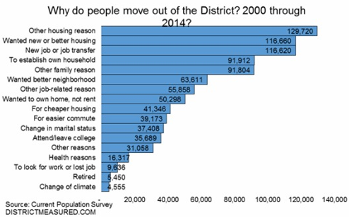
Image from the DC Office of Revenue Analysis.
According to survey data summarized in this report from the DC Office of Revenue Analysis, 937, 115 people have moved out of DC since the year 2000. 36% of them, 338, 000, cite a housing-related category as the reason why.
Some respondents say directly they needed cheaper housing. Others say they wanted newer housing, or better housing, or to own instead of rent. But the common denominator is that DC’s housing stock is inadequate, and that inadequacy is stifling the District’s population growth, as thousands who’d otherwise prefer to stay move away.
Every time some government agency restricts the housing market’s ability to meet DC’s tremendous demand, they make this problem worse. Every time the zoning commission downzones rowhouse neighborhoods, or every time a review board lowers a proposed building’s height, DC’s housing market becomes a little bit worse than necessary.
Over time as each restriction builds on the last, competition for the limited housing that’s available rises, prices shoot up, and the city’s less affluent populations are squeezed out.
It’s true that DC can never be all things to all people. For example, DC will never be able to supply as many large lot subdivisions as upper Montgomery County. But many types of housing that DC can absolutely supply are being unnaturally and unnecessarily restricted.
It’s a horrible situation.
What about schools?
DC’s inadequate schools are without a doubt also a major reason some people leave the District. According to Yesim Sayin Taylor of the Office of Revenue Analysis, we don’t know how many residents have left because of schools because the survey, which wasn’t designed specifically for DC, didn’t ask that question.
Presumably respondents who left because of schools cited something more general like “other family reason” or “wanted better neighborhood.”
Cross-posted at Greater Greater Washington.
Average Rating: 5 out of 5 based on 210 user reviews.
June 12th, 2015 | Permalink
Tags: demographics, development, economy, government, law, preservation
Now that DC’s oft-delayed H Street streetcar is hopefully near opening, DDOT officials are planning the next wave of lines. One of the biggest emerging questions (besides the role of dedicated lanes) is where the streetcars should run without wires.
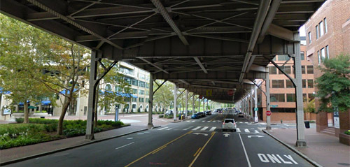
Current law prohibits wires under the Whitehurst Freeway. Should that change? Image from Google.
DC has important monumental views that wires could impact. Therefore, DDOT has been promising hybrid streetcars that can run off-wire for part of their route since 2009. It could mean wires along some roads but not at major intersections, crossing state avenues, or across the National Mall, for example.
DC Councilmember Mary Cheh is convening a public hearing today to discuss the question with District Department of Transportation (DDOT) officials including new director Leif Dormsjo.
Where wires are legal
Current DC law prohibits overhead wires in the central L’Enfant city (basically everything between Florida Avenue and the Anacostia River) and Georgetown, except on H Street. In 2010, the council exempted H Street from the law, specifically to permit streetcars there.
But only exempting H Street was never a permanent solution. It was a stopgap to let H Street move forward while giving DDOT time to study wire-free planning in more detail. Now it’s time for a broader plan.
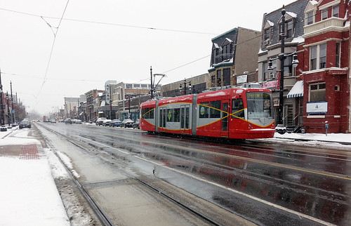
Wires on H Street.
Is wireless technology ready?
The 2010 law also required DDOT to study wireless streetcar technology before building any other lines, so leaders could make an informed decision about other exemptions.
DDOT completed that study in mid-2014, and in it concluded that off-wire technology is still only practical for short distances. Batteries, ground-based power supplies, and various other wire-free systems do exist, but they’re vastly more expensive and vastly less reliable than traditional overhead wires. Hybrid streetcars that operate on-wire part of the time, and off-wire at other times, remain by far the best option.
Moving forward, the DC Council could opt to change the wire law in one of four ways: 1) Keep the existing law allowing wires only outside the core; 2) Prohibit wires everywhere; 3) Allow wires everywhere; or 4) Allow wires in certain additional locations, but not others.
DDOT’s report proposes an approach in line with option 4:
In the near term, proven overhead contact system (OCS)-based technologies will form the basis of the system, with limited application of off-wire technologies in the most sensitive areas to the extent possible. As technologies advance, the amount of off-wire operations will be gradually increased.
This option makes sense. Most people agree that the north-south streetcar line should be wireless when it crosses the National Mall, but it would be absurd to demand the K Street line be wire-free when it runs under the Whitehurst Freeway.
Others worry that DDOT will not actually “gradually increase the amount of off-wire operations” once wires are in the ground. If DC buys streetcars that can handle only limited off-wire operation, it would cost money to upgrade, and that might not happen for a long time.
But wire-free technology still only works for short distances, so a hybrid is still the way to go. Modern streetcar wires can be relatively unobtrusive and won’t mar the streetscape. Allowing overhead wires in some other areas while prohibiting them in the most sensitive spots is the rational solution.
Cross-posted at Greater Greater Washington.
Average Rating: 4.4 out of 5 based on 288 user reviews.
February 4th, 2015 | Permalink
Tags: events, preservation, streetcar, transportation
Congress is considering whether or not to change DC’s height limit. Here are 9 suggestions that will help the city get the most benefit out of changing (but not eliminating) its height regulations.
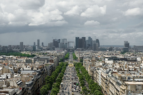
Paris’ La Defense skyline. Photo by KJ Vogelius on flickr.
Much of the debate about the height limit has settled into two opposing camps, those who want taller buildings, and those opposed to any change. But it doesn’t need to be so black and white.
Regulations can change in practical and beneficial ways, without destroying Washington’s unique layout. If Congress repeals or changes the DC Height Act, the District will be free to regulate height in much more flexible ways.
That in mind, here are some suggestions that Congress and the DC Council should consider as they move forward.
1. Don’t eliminate, calibrate
Even though eliminating all height limits completely isn’t anyone’s proposal and has never been seriously on the table, it’s worth saying up front just to be clear. There are good reasons to regulate height, but our existing laws are not necessarily the ideal set. We can make them more ideal with some fine tuning.
2. Target development where we want it
Many assume raising the height limit would result in taller buildings everywhere, or all over downtown, but that need not be the case. It would be smarter to pick specific areas where we want to encourage more development, and only increase the limit there.
The city can raise the limit only on blocks with a Metro station entrance, for example, or only within 1/8 mile of Metro stations with low existing ridership, or only near Farragut Square, or only in Anacostia. Whatever.
No doubt where to allow them would be a contentious question, but the city already has many regulations encouraging or discouraging development in certain areas. There’s no reason the height limit can’t be used in the same way. We can be selective.
3. Grant a residential bonus for downtown
Downtown DC has no trouble attracting development, but office is usually more profitable than residential, so downtown is often packed during work hours but pretty empty in the evenings. More residential would help downtown stay active on evenings and weekends, not to mention reduce the capacity stress on our transportation network by allowing more people to live close to their work.
But under current rules, developers often can’t justify using floor space under the height limit for residential when office is more lucrative. If they got a bonus for residential, allowing them to build taller only if some or all of the added height were used for apartments, that would benefit everyone.
4. More offices can go downtown, but also other places
We want a lot of office buildings downtown because that’s where our regional transportation system converges. But we also want office buildings outside downtown so residential areas don’t empty out during work hours, and to encourage a healthy economy throughout the city.
Uptown nodes like Bethesda and Clarendon are good for the region and would be good for the city, and would happen in DC if we allowed them to. So while it may be desirable to allow taller buildings in some parts of downtown sometimes, it’s also desirable to encourage office development elsewhere as an anchor for uptown commercial districts.
5. Be inclusive of affordable housing
Height limit opponents say taller buildings will make DC more affordable, because it will increase the supply of housing, thus helping to address rising demand. Supporters of keeping it say tall buildings will make DC more expensive, because new development is almost always expensive. They’re both right, but those points aren’t mutually exclusive.
New buildings are indeed almost always expensive, because it costs a lot to build a skyscraper, and developers need to turn a profit within a few years.
But new buildings eventually become old ones, and this isn’t a short-term decision. Buildings that are expensive at first often become the next generation’s affordable housing. Part of the reason DC has an affordable housing problem now is that we didn’t build enough new buildings a generation ago. If we don’t build enough new units now, the next generation will be out of luck too.
In the mean time, we can solve the short-term affordability problem with inclusive zoning; in exchange for allowing taller buildings, the city should require some of their units to be affordable. Win-win.
6. Require good architecture
Some who want to change the height limit say regulations hurt DC’s architecture, resulting in boring-looking buildings. Meanwhile, many others hate tall buildings because so many skyscrapers are ugly. Both arguments are equally bad, because the world is full of both great and ugly buildings of every height.
But there’s no denying that tall buildings stand out, and thus become landmarks whether beautiful or ugly. To ensure we get the former rather than the latter, DC (or even NCPC) could require aesthetic review & approval for the design of any building above a certain height.
That sounds cumbersome, but it’s standard practice in many cities, and DC already does it in some neighborhoods.
A city the size of DC wouldn’t want to insist on aesthetic review for every building, but there’s no good reason DC can’t do it for tall ones.
Of course the devil is in the details. To use this sort of oversight, DC would have to establish design guidelines that tell architects what the city will approve or deny. That could be contentious, and might not be the same everywhere in the city.
7. Preserve historic facades and encourage entrances
Frequent, unique-looking entrances are incredibly important for quality walkable urbanism. One problem with tall buildings is many are so wide that they’re boring to walk next to at the ground level. The minimalist facades of modern architecture compound the problem.
This is why the urbanism in Georgetown is better than Rosslyn. It’s not that Rosslyn has buildings that are too tall, it’s that Rosslyn’s buildings are too wide, and too bare at the ground level.
While it’s not practical for tall buildings to change completely every 25′ the way rowhouses in Georgetown do, their ground floors can be designed to look and function as smaller buildings, and historic buildings can be integrated into larger developments above.
This may not strictly be a height limit issue, but it’s a good way to ensure that taller buildings improve the streetscape. It can be accomplished using the design guidelines and architectural review process outlined above.
8. Outlaw surface parking lots
Surface parking lots are the bane of walkable urbanism, but they’re common in almost every skyscraper-heavy downtown in America, because one large building can sap up years worth of demand, leaving developers of other properties waiting in limbo for reason to build.
Many developers in downtowns around the US opt to leave land nearly empty rather than fill it with short buildings, on the chance that they may strike it big with the next big once-a-generation mega skyscraper. Surface parking lots provide a convenient way to use that land in the mean time.
This is a big problem, and DC is not immune. In 2008 the developer of what’s now the shiny office building on the northwest corner of Connecticut Avenue and K Street wanted to use that land as a parking lot.
Outlawing surface parking lots in areas where tall buildings are permitted would go a long way towards ensuring downtown DC never looks anything like this.
9. Protect the iconic monuments
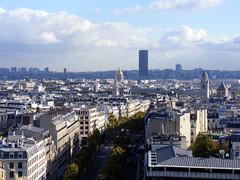
Development economics are important, but they’re not the only thing. The most valuable land in DC is probably the White House Ellipse, but we’re not going to put skyscrapers there. DC’s skyline view of the Capitol and Washington Monument is one of the world’s most iconic, and should of course be preserved.
But taller buildings in Farragut Square or Brookland or Anacostia wouldn’t impede that view any more than they do in Rosslyn, and La Defense did not destroy Paris.
We can, and should, allow taller buildings where they’re most appropriate, while protecting the views that define our city.
Cross-posted at Greater Greater Washington.
Average Rating: 4.4 out of 5 based on 256 user reviews.
October 30th, 2013 | Permalink
Tags: architecture, government, land use, preservation, proposal, urbandesign
I absolutely love exploring the world with Google Street View. Oh sure, real life is infinitely better, but I can’t afford plane tickets to all the places I can get lost in with Street View.
Yesterday I discovered Street View covers Midway Atoll, of Battle of Midway fame. The island was used for decades by the US military but is now depopulated except for a few visits per year by researchers. But all the buildings are still there, not to mention about 440, 000 albatross birds.
It’s fascinating, and a little creepy. Take a look.
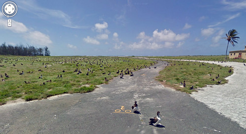
Every black smudge you see in this picture is a 3-foot bird. And yes, that’s a bike path.
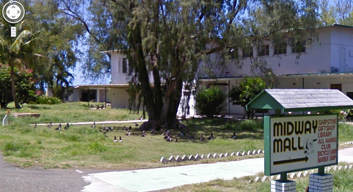
Downtown Midway, abandoned.
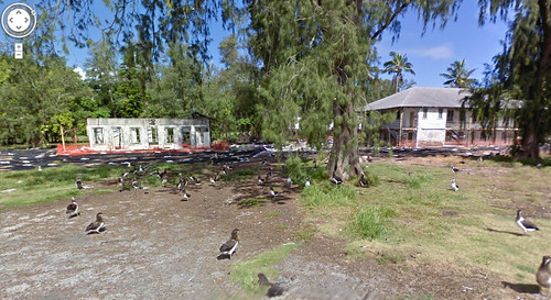
Ruins are everywhere, but the birds don’t mind.
Average Rating: 5 out of 5 based on 282 user reviews.
July 19th, 2013 | Permalink
Tags: bike, fun, history, preservation, transportation
The Yangtze River valley between Shanghai and Nanjing is one of China’s densest and most heavily populated regions. It’s also one of its most agriculturally rich. Just like in America, sprawl claims much of the land between cities in the megapolis, but unlike America, the sprawl is happening in a way that preserves much of the land as functioning farms.
This aerial shows how walking along one of those streets, one might never know the neighborhood is primarily farmland.
More pictures.

From google maps.
Average Rating: 4.4 out of 5 based on 251 user reviews.
May 8th, 2013 | Permalink
Tags: land use, preservation
In recent years there has been a lot of discussion about raising DC’s building height limit. Today that discussion moved into the realm of official policy-making, as Congress announced it will study the issue. Any change to the height limit would need Congressional sign-off.
In general I think the height limit should be raised subtly, in key places for key reasons, based on careful planning. I’m in favor of using taller buildings to incentivize more development where we want it, but don’t think it would be wise to simply eliminate the limit completely.
That’s sounds simple, but the issue is pretty complex. Here are some key points, with links to more expanded discussion:
- Uptowns: Raising the limit in places like Anacostia and Tenleytown would encourage them to develop as uptowns, like Arlington and Bethesda.
- Negatives: Raising the limit in downtown DC would increase pressure to tear down historic buildings, and decrease the pressure to fill in parking lots and other underused properties.
- Tall =/= dense: Counterintuitively, midrise development is often more dense than skyscrapers.
- Residential bonus: Giving developers a height bonus in exchange for building apartments instead of office would increase the vitality of downtown.
- Do it, but carefully: We should raise the height limit with a scalpel, not a hatchet.
- Trade-offs: Despite economic advantages, there are non-economic trade-offs about raising the height limit that we can’t ignore.
- Be practical:: We should consider how to realistically improve the city’s regulations, not stake out dogmatic extremes.
Average Rating: 4.7 out of 5 based on 217 user reviews.
November 8th, 2012 | Permalink
Tags: government, land use, master planning, preservation, urbandesign
David Alpert contributed to this article.
Last night, DDOT released renderings of its design for the proposed Spingarn streetcar barn. The proposal is a passable building, but the design is likely to disappoint residents who’d been expecting great architecture.
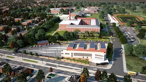
Streetcar barn design. Image from DDOT.
DDOT originally wanted to locate the maintenance facility for its H Street streetcar under the Hopscotch Bridge, near Union Station. That proved impossible, so DDOT switched its plans to the most practical alternate site: the Spingarn High School campus.
Though the design lacks the ornament and detail of DC’s historic streetcar barns, it is typical of contemporary institutional architecture, which is a step up from the bare bones necessary for industrial buildings.
In fact, this design looks very much like a modern school. If DCPS were building a new education building on the same site, it would probably look pretty similar, at least as seen from Benning Road. Adjacent residents likely won’t feel they are living right next to an industrial facility.
However, it’s not the sort of civic architecture that leaves much of an impression. Many cities’ new car barns aren’t good civic architecture either, but DDOT has been suggesting that this building would be better than merely okay.
The design guidelines call for “the highest aesthetic quality, ” and there’s a lot that could be done to improve this building. Some of DC’s new libraries show how civic buildings can indeed be exemplary.
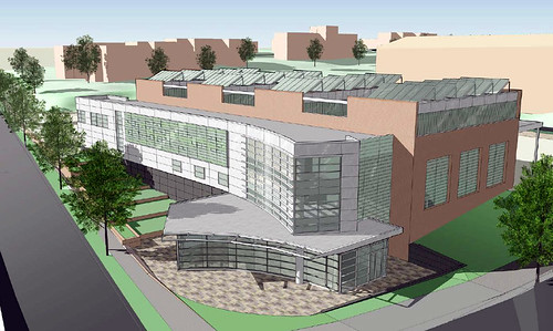
Image from DDOT.
Some changes can improve the design
The primary purpose of the barn will be to park and maintain streetcars, but it will also include a training center, offices, and employee prep areas. One nice touch in the building design is that those non-industrial uses line Benning Road, so that from the sidewalk the upper floors of the building look like a school or office instead of a warehouse. Unfortunately, the ground floor is bare, so the illusion is incomplete.
Design guidelines call for public art to be included, and these renderings don’t appear to have any. Perhaps that first floor wall would be a good location for a mural.
Another disappointing facet is the location of the public entry on the side rather than the front or corner, where most would expect it. The reason appears to be that the interior layout puts offices and a copy room at the street corner, pushing the entry back a few feet onto 26th Street. This seems needlessly confusing, and prioritizes the wrong function.
The Historic Preservation Review Board discussed the project on November 1. Their comments begin at the 2:00:00 mark on the archived video, and focus on whether or not a modern-looking building is appropriate, and whether the plan could be reduced to have less visual impact. They did not take any vote at that meeting, but will do so when they consider the landmark application for Spingarn later this month.
The streetcar project is important, and this car barn is good enough to not delay the project. But while this is pretty good for a building that’s basically a garage, it could be much better. A car barn on the Spingarn campus makes sense, and this one isn’t terrible, but residents asked for an exemplary building, and DDOT said it could deliver.
DDOT also needs to be more open to the public about its planning for the streetcar. These renderings came out at 4:30 pm the evening before a Presidential election. Given the concern neighbors have about the planning process for the car barn, DDOT must make every attempt to be as open as possible.
It’s not necessary to completely start over, but some improvements do seem in order. Likewise, as DDOT starts to plan for future car barns in other neighborhoods, they shouldn’t settle for “just okay.”
Cross-posted at Greater Greater Washington.
Average Rating: 4.8 out of 5 based on 266 user reviews.
November 6th, 2012 | Permalink
Tags: architecture, development, preservation, streetcar, transportation, urbandesign
|
The proposed redesign. |
The Main Hall at Washington Union Station is undergoing a redesign that will eliminate the Center Cafe, punch holes in the floor for escalators to the lower level food court, and change the room’s furniture layout. The comment period for the redesign proposal ends tomorrow November 15, so now is the time for anyone interested to take a look, and send in comments.
The gold-trimmed Main Hall is a fantastic and beautiful civic space, recent scaffolding aside. It’s one of the best Beaux Arts rooms in America, and is lively with visitors through long hours of the day and night. It’s a space that is working very well already, so any changes need to be carefully considered.
The hall was temporarily ruined by a poorly-conceived redesign in the 1970s. If project architects get too carried away with changes, the same could happen again.
The good news is that the redesign being proposed now is relatively restrained. That wasn’t always the case. The first proposal back in 2010 would have overwhelmed the historic character of the Main Hall with a clashing metal and glass structure in the center of the room. Two years later, the new proposal is a lot better. It makes less significant changes, and leaves the aesthetic focus of the hall where it belongs, on the world-class Beaux Arts features.
The proposed escalators down to the food court are a little troubling, because punching holes in the floor of such a grand space sounds very similar to the 1970s mistake. On the other hand, without the Center Cafe in that space the Main Hall may seem too large, maybe even a little barren. There needs to be something in about that location that breaks up the floor mass. Both the raised cafe and holes for escalators would be too much, but one or the other is just about right.
The escalators will also improve circulation in the station, and add a new reason for visitors to go through the Main Hall.
The 2010 escalator proposal was garish and inappropriate, but this new redesign is subdued enough that the benefits it brings are worth the trade-offs.
Except for the signs. The signs are awful.
The escalator proposal also includes a pair of vertical signs, sticking out from the holes in the Main Hall floor and up in to the middle of the room. This is actually a great idea, because a vertical element fills the huge room volume a bit, and something near the center of the hall adds a focal point. Unfortunately, the design of the signs themselves is all wrong.
Take a look:
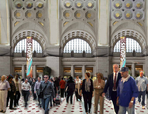
Rendering of the proposed redesign, showing large LED signs.
Talk about clashing!
LED signs that look like they came straight from a suburban strip mall aren’t right for one of the most famous Beaux Arts rooms in America. A vertical element that incorporates signs would be good there, but the design needs to be improved.
A better option would be to go with something dignified and ornate, that stands out but also works with the room’s historic character. Something like an iron street lamp with a banner attached would look great, and be far more appropriate for the context.
For more details on the proposed redesign, visit the Union Station Redevelopment Corporation. If you want to comment you can use the form on that site, but be sure to get your thoughts in by Thursday, October 25 November 15.
Update:According to an email from Union Station Redevelopment Corporation representative Lisa Klimko, the comment deadline has been extended to November 15.
Cross-posted at Greater Greater Washington.
Average Rating: 5 out of 5 based on 223 user reviews.
October 24th, 2012 | Permalink
Tags: architecture, development, preservation
|
Media


Site
About BeyondDC
Archive 2003-06
Contact
Category Tags:
Partners
|


