|
Special Features


Image Libraries


|
|
Blog
Trolleys and ruins are two things that nobody associates with Fairfax. And yet, it has got some of both.
Once upon a time there was a trolley line that ran from Washington, DC to Fairfax, VA, along a route roughly parallel to today’s Metrorail Orange Line. Remnants of that line still exist scattered around Northern Virginia.
One such remnant is this ruin of a bridge, located in the City of Fairfax near the intersection of US Route 50 and Chain Bridge Road (map). It’s a virtually forgotten structure, totally surrounded by thick vegetation and impossible to reach except on foot. To find it, you must know where to look, and seek it out purposefully.
I learned of the bridge while working in Fairfax a few years ago. Today I dropped by and snapped a couple of pictures. Enjoy.

The bridge, crossing over a headwater branch of Accotink Creek. |
The top of the bridge, its railbed overgrown with vegetation. |
Average Rating: 4.8 out of 5 based on 222 user reviews.
March 29th, 2012 | Permalink
Tags: galleries, history, streetcar, transportation

Car2go launched in DC on Sunday. On Tuesday evening I saw one in the wild for the first time. Punch-buggy, anyone?
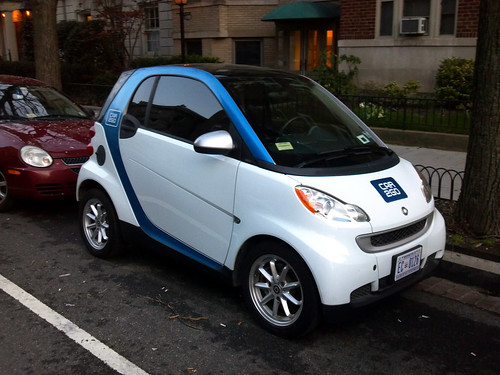
Car2go on R Street, NW.
Average Rating: 5 out of 5 based on 162 user reviews.
March 28th, 2012 | Permalink
Tags: development, roads/cars, transportation
Once the economic juggernaut of suburbia, enclosed malls are slowly dying all across America. The Washington region is no exception.
This map shows 31 enclosed malls in the DC area, color-coded by status: green for malls that are still open, and red for malls that are closed or in the process of closing.
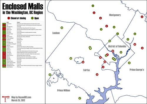
The 31 malls on the map range from small local ones like Fair City in Fairfax, to gargantuan super-regional ones like Tysons Corner. The only requirement to be on the map is that malls contain a common interior hallway lined with several shops.
Some, like Pentagon City, are chugging along as healthily as ever. Others, like Seven Corners Center, have been gone for years. Overall, more than 40% of the dots are red.
The reasons malls have closed vary as much as the malls themselves. Some closed because they were housed in cheap buildings that simply reached the end of their intended lifespans, while others couldn’t compete with the mixed-use town center developments that have become common in recent years.
Geography seems to be unimportant in whether a mall lives or dies. Red dots permeate all corners of the map, regardless of the wealth of the jurisdiction.
One thing that does seem to make a difference is size. Larger malls that draw from a wider area generally seem more likely to thrive than smaller ones. As the years go by and even more green dots turn to red, it’s likely the last hold outs will be the biggest and most famous.
Is this map comprehensive? Did I miss any malls? Let me know in the comments.
 Cross-posted at Greater Greater Washington. Cross-posted at Greater Greater Washington.
Average Rating: 4.4 out of 5 based on 205 user reviews.
March 27th, 2012 | Permalink
Tags: featured post, The New America
In keeping with this week’s unintentional theme of resposting random maps I’ve found on the internet, here’s a neat one showing the geographic distribution of regional accents in the US and Canada.
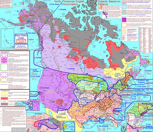
Map produced by Richard P. Aschmann.
Average Rating: 4.8 out of 5 based on 232 user reviews.
March 22nd, 2012 | Permalink
Tags: fun, social
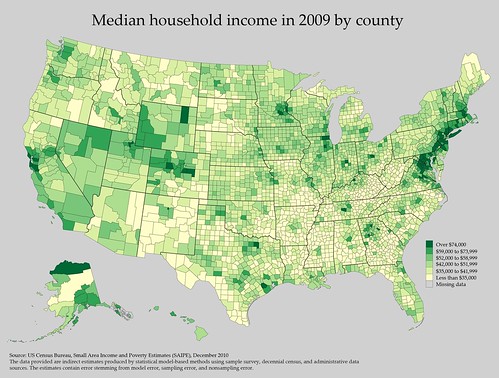
How about another map post? This one shows median household income by county. It’s from the US Census Bureau.
Average Rating: 4.7 out of 5 based on 239 user reviews.
March 21st, 2012 | Permalink
Tags: in general
Q: How do you make a blogger tear his hair out?
A: Publish a major new rail transit map at the exact same time the blogger has just posted a far less interesting story proposing subtle changes to the bus map.
So yeah. That story about the Salt Lake City bus map will probably be lost in the excitement over Metro’s new rail system map. Rats. On the other hand, the good news is WMATA published a new rail system map! Yay!
Here it is:
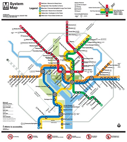
Click the image for a larger version, or download the full-size pdf.
This is the most major revision to Metro’s map in the agency’s history. Among the changes:
- The map shows new service patterns that will result from WMATA’s Rush Plus plan, including routing some Orange Line trains to Largo and some Yellow Line trains to Springfield.
- The first phase of the Silver Line is shown, although there are no station labels since those names are still being decided.
- Some information that had been presented using text is now presented graphically, including the line color names and airport bus routes.
- The National Mall has been called out using a different shade of green from other parks in the region.
- Several icons have been updated to appear more contemporary, most importantly including the parking icon.
At first glance, the map appears to be a nice and necessary update. I’m sure criticism – both positive and negative – will be made as people have time to look at it in closer detail.
One thing is clear to me, though: The map won’t be able to take many more additions before it begins to feel too cluttered, and requires a more wholesale redesign. This is a nice map, but it’s probably a short term solution. In the long term, we may need a more radical change to accommodate things like the introduction of light rail and the completion of the Silver Line.
Average Rating: 4.6 out of 5 based on 290 user reviews.
March 19th, 2012 | Permalink
Tags: metrorail, transportation
The map at right shows bus routes in Salt Lake City, with each route color coded to show the frequency of buses. Freaking genius idea.
One of the many reasons that rail systems are usually more popular with casual riders than bus systems is that rail systems are much easier to understand. With just five lines, WMATA’s Metrorail map is a breeze to figure out. On the other hand, WMATA’s bus system is so complex that they don’t even produce a single system map. Instead, we get three bus maps, each of them practically impossible to decipher.
Part of the problem is that any large bus agency (WMATA included) will necessarily have a lot of routes that don’t come very often, and generally aren’t used by very many people. Those routes clutter up their maps, making the overall bus system harder to understand for anyone hoping to know where they can use transit to travel quickly and easily.
One solution to this problem is to produce a separate frequent service map. Such maps are incredibly useful, but their weakness is that users simply looking for a system map may not be aware that a separate frequent service one exists.
So why not put the info on the regular map? Do what Salt Lake City’s transit agency has done here, and show the frequent routes in a different color.
Sure, it adds a little bit of extra clutter, but it also adds a tremendous amount of extremely useful extra data. The clutter cost is low in terms of information provided.
To its credit, WMATA’s bus map does show some premium services with different colors. Limited stop buses get a blue dashed line. But otherwise, a bus that comes every 5 minutes is shown with the same line as a bus that comes once per hour. And frankly, knowing that the 16th Street bus line is supposed to run about every 10 minutes all day long is much much more useful to know than that there is a limited-stop operation on it for a couple of hours on workdays.
I like the limited stop route, but knowing it’s there is far less important than knowing that the 16th Street line comes often enough that riders can expect to just walk up to a stop at any time of day and never have to wait very long for a bus. WMATA’s map isn’t showing the more important piece of information.
Incidentally, Salt Lake City has a very impressive transit system for a city of its size. It’s the 50th largest metropolitan area in the US, with a regional population equivalent to Birmingham, AL and Rochester, NY. It is smaller than Richmond, VA, and *much* smaller than the Norfolk region. And yet they have a 35-mile light rail system, a 44-mile commuter rail line, bus priority routes, and a modern streetcar under construction. It is probably the most impressive small city network in the country.
Thanks to Richard Layman for bringing attention to this.
Average Rating: 4.7 out of 5 based on 262 user reviews.
March 19th, 2012 | Permalink
Tags: bus, transportation
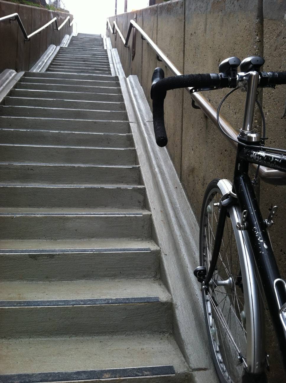
A new type of bicycle infrastructure has appeared in DC. “Stairchannels” are outdoor stairways with grooved ramps on either side that allow bicycles to be easily carried up or down the stairs.
WMATA recently installed one at the Rhode Island Avenue Metro station. The availability of the stairchannel reduces the need for costly and frequently broken elevators, so although it’s not a perfect solution (cyclists should dismount to use it), it is still nice to have.
I am not sure, but *think* it is the first public stairchannel in our region. An anonymous commenter says there is one on the Capital Crescent Trail near Bethesda.
Here are a couple of pictures, from the PlanItMetro blog.
Average Rating: 5 out of 5 based on 255 user reviews.
March 16th, 2012 | Permalink
Tags: bike, galleries, transportation, urbandesign
There is a lot to say about Metro’s new railcars, which will begin running in 2013. They have a lot of good new features, plus one or two goofy ones.
When they finally arrive I’ll talk about them in more detail, but for now I’ll just say this: I love the all-steel exterior look. It’s just a great, timeless aesthetic. And it’s too bad they mucked it up with that weird “disco ball” logo.
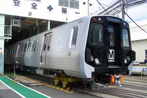
7000 series Metro railcar. Photo by WMATA.
Average Rating: 4.4 out of 5 based on 247 user reviews.
March 15th, 2012 | Permalink
Tags: metrorail, transportation
|

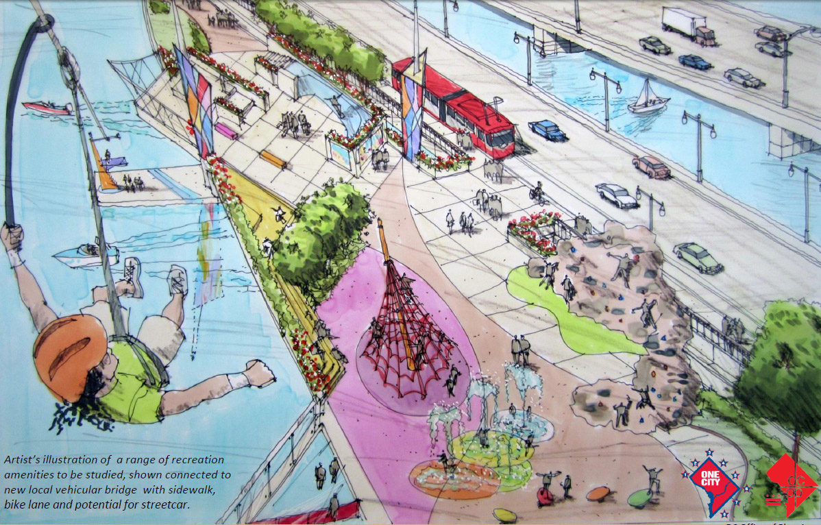
Rendering of 11th Street recreation bridge |
When DC’s new 11th Street Bridge opens, its old spans will no longer be necessary to maintain as transportation infrastructure. The DC Office of Planning is proposing that one of the old spans be converted into a park, filled with recreation amenities such as rock climbing walls, zip lines, and skate parks.
The idea is interesting and is definitely worth exploring, but it’s also going to be difficult to pull off successfully. If the city simply plops a couple of rock climbing walls on the old asphalt, the new park will be a failure.
The problem is that there is no built-in user base. The bridge is difficult to access from nearby neighborhoods, so it won’t likely get many casual walk-through users. Instead, it will rely on people who specifically go to the park as their final destination. That means it will have to provide specific reasons for people to visit. If there aren’t enough reasons, the park will be mostly empty.
So the park will need an anchor, or several anchors. And it will need transportation facilities to accommodate users, since there won’t be enough walkers to populate it fully.
If the city wants to fill the long span of 11th Street Bridge with enough people for it to feel lively and safe, this is what will have to be done:
- Program it heavily. The more stuff there is in the park, the more reason people will have to visit. So fill the thing up with activities. Attach a boat house, put in a mini golf course, whatever. Give people a reason to travel across the city and come to this place.
- Make it mixed use. Putting large office or residential buildings on the bridge is probably not realistic, but there is no reason why it shouldn’t include some small shops and food stands. And for goodness sake, keep them open. That perpetually closed pavilion at Pershing Park isn’t doing anyone any favors.
- Be inclusive. Provide space for food trucks, sidewalk vendors, street artists, performers, anybody. Let them in, and let them sell.
- Don’t cheap out on landscaping. Nobody wants to visit a concrete expanse. Obviously the range of plantings available on a hard surface with no soil is somewhat limited, but go to the expense and trouble of doing as much as you can.
- Provide transportation. People will need a means of getting to this park. There must be parking for cars and bikes (on-street is fine), bikesharing, and the streetcar should actually stop in the center of the bridge.
With enough planning and strong management, this idea could be a winner. Without, it will fail, and will ultimately be abandoned.
Average Rating: 4.6 out of 5 based on 286 user reviews.
March 14th, 2012 | Permalink
Tags: urbandesign
|
Media


Site
About BeyondDC
Archive 2003-06
Contact
Category Tags:
Partners
|