|
Special Features


Image Libraries


|
|
Blog
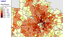
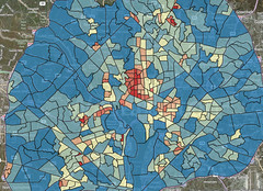
Last week’s post about census tract density in the DC area showed which neighborhoods inside the Beltway are densest. Now let’s look at the densest spots in the core areas of other large cities.
Urban areas are defined by the US Census as geographically connected areas with a population density of at least 1, 000 people per square mile (ppsm). The standard provides a uniform definition of “city, ” more useful for national comparisons than political boundaries. These maps show the central county in each of America’s 20 largest urban areas, in order beginning with the largest.
1. New York:
America’s biggest city breaks the scale. While others on this list might have a few neighborhoods in the top density category, New York is covered end to end. It’s one of only 4 cities with tracts above 100, 000 ppsm. Its peak is 200, 000 ppsm. |
2000
 |
2010
 |
| |
2. Los Angeles:
Despite its reputation for sprawl, LA compares favorably to the densest cities after New York. Its peak density of 94, 000 ppsm is well above DC’s. |
2000
 |
2010
 |
> Continue reading
Average Rating: 4.8 out of 5 based on 169 user reviews.
March 27th, 2013 | Permalink
Tags: demographics, history, maps

|
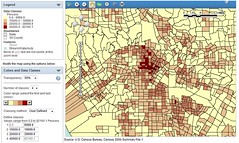
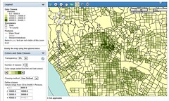
DC area density by census tract, in 2000 (top) and 2010 (bottom). Top image from US Census FactFinder. Bottom from Michael Rodriguez. |
Density is a good thing for urbanism. More density means more shops and amenities nearby, better transit service, and shorter walks. But what qualifies as dense? Overall city density is often reported, but a more telling statistic is neighborhood density.
The two maps at right show DC neighborhood density at the time of the 2000 census (top) and 2010 census (bottom). I made the 2000 map using census.gov sometime after the 2000 census. Michael Rodriguez created the bottom map just recently. Unfortunately the two maps use different scales, but they’re still informative.
In 2000 the densest census tract in the DC region was in northern Columbia Heights, between Spring Road and Newton Street. It had 57, 317 people per square mile (ppsm).
In 2010 that tract is up to 59, 209 ppsm, but that’s only good enough for 2nd place in DC, and 3rd regionally.
The densest tract is now southern Logan Circle, between Rhode Island and Massachusetts Avenues. It’s boomed and is now a whopping 67, 149 ppsm.
The rest of central Northwest, from Mount Pleasant down to Massachusetts Avenue, varies from around 30, 000-50, 000 ppsm. Capitol Hill is in the 20, 000-30, 000 ppsm range.
Meanwhile, in Alexandria, the tract at the corner of I-395 and Seminary Road is up to 59, 886 ppsm, 2nd densest in the region after Logan Circle. There hasn’t been any new development in that tract since 2000, but the suburban-style apartment towers in it may have fewer singles and more families, which could account for the increase. Crystal City is 45, 448 ppsm, and Ballston is 43, 788 ppsm.
Suburban Maryland’s densest tract is in Langley Park, at 49, 354 ppsm. Downtown Silver Spring is 34, 816 ppsm, and downtown Bethesda is around 11, 000 ppsm.
Average Rating: 4.7 out of 5 based on 287 user reviews.
March 19th, 2013 | Permalink
Tags: demographics, history, maps
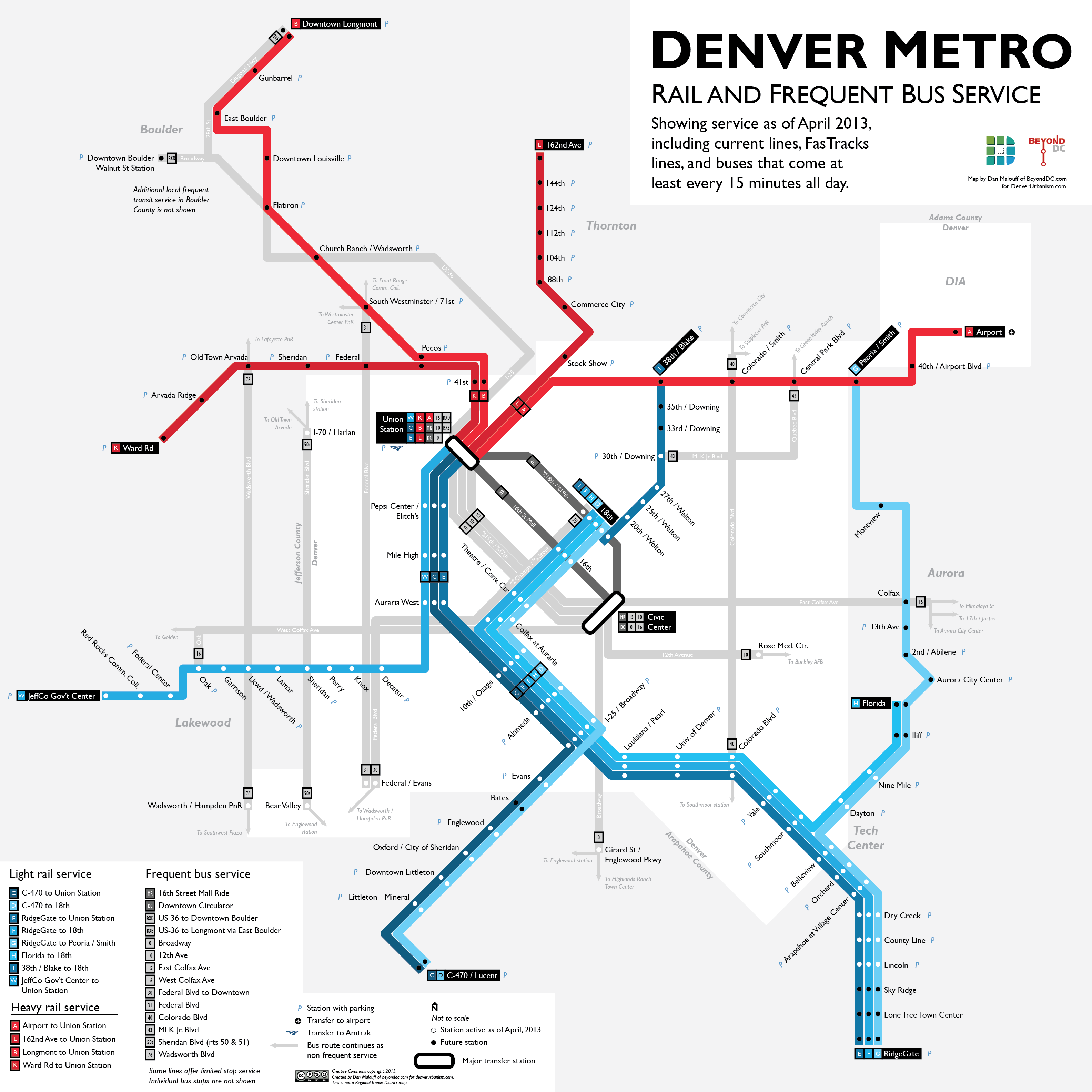
Denver is in the midst of a huge regional rail expansion. That’s great, but like in many cities (including DC, historically), the urban bus system has been largely ignored amidst all the hubbub over rail.
I got my planning degree at the University of Colorado, and after discussing Denver’s bus system with some friends recently, decided to produce this map. It shows the city’s high-frequency bus routes along with its existing and future rail lines.
Although the geography is obviously different, in many ways this map is a sequel to my DC 15-minute bus map from last August. I applied a lot of the lessons learned during that exercise to this Denver map. Compared to the DC version this map shows more information, presented more cleanly.
Read more at DenverUrbanism.com.
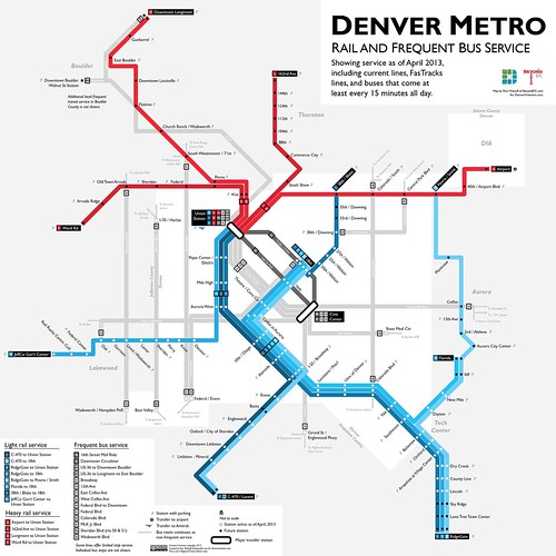
Denver rail and frequent bus map, including future lines. Click map for full size version.
Other sizes via flickr.
Average Rating: 4.9 out of 5 based on 270 user reviews.
February 27th, 2013 | Permalink
Tags: BRT, bus, commuterrail, lightrail, maps, streetcar, transportation
It’s common knowledge that the Northeast Corridor is Amtrak’s best line, but the northeast is not the only place in the US where a lot of people ride intercity trains. This map by Michael Hicks shows that California, the area around Chicago, and the Pacific Northwest also stand out as high ridership areas.
In the map, each circle represents one Amtrak station. The larger the circle, the more riders there are at that station.
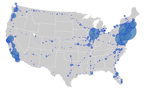
Image by Michael Hicks on flickr.
Note: Map creator Mike Hicks updated the map to remove Amtrak bus connections, and add Canadian cities where Amtrak trains end. This post has been updated with the new map. He also supplies the first draft of a separate close-in map of the Northeast. – February 6, 2013
Average Rating: 4.7 out of 5 based on 285 user reviews.
February 4th, 2013 | Permalink
Tags: intercity, maps, transportation
This map shows how often trains come at rush hour throughout the Metrorail system. Thick green lines are about every 2-3 minutes, dashed orange lines are every 5, and dotted red are more.
It would be interesting to see a similar map for the bus system.

From WMATA’s service standards report.
Average Rating: 4.6 out of 5 based on 251 user reviews.
January 22nd, 2013 | Permalink
Tags: maps, metrorail, transportation
|
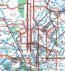
Central DC in WMATA’s new map. |
WMATA’s new bus maps are, in a word, awesome. They are so good, on so many levels. They will make navigating the bus system vastly easier, and less intimidating. But WMATA asked for comments, so I’ll make some.
What’s better
The main problem with WMATA’s old bus maps were that they were so complex that reading them was essentially impossible. WMATA has so many criss-crossing bus routes, all illustrated identically, that riders had to already be familiar with a bus route in order to use the maps. That dissuaded a lot of people from using WMATA buses, or from using them more extensively.
The main improvement of these new maps is that everything looks simpler. Individual routes are vastly easier to follow, thanks to more variety in line color, thickness, and improved spacing.
The best single new feature is that the best bus routes are highlighted with a thicker line, so it’s easier for riders to find the routes that are most convenient. This is exactly the reason why I published my own 15 minute bus map earlier this year. WMATA’s new maps are better than my version though, because they offer so much more information while still clearly highlighting the frequent network.
WMATA’s PlanItMetro blog has several further examples of how these new maps are more clear. For example, compare how the old and new maps illustrate the area around Greenbelt Metro station:
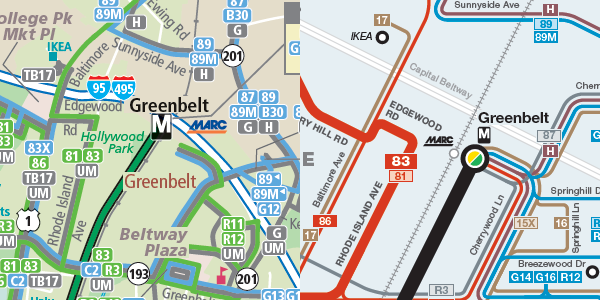
Old on the left, new on the right.
Good luck reading the version on the left.
What needs improvement
There are two big problems with the details of how these maps highlight the best routes.
The first is that some of the best bus routes in the region are hard to find on the maps. DC Circulator, Bethesda Circulator, and the King Street “trolley” shuttle all offer extremely good service, but are shown as minor routes on the map because they aren’t run by WMATA.
Failing to show non-WMATA buses in a fair way is a disservice to riders, and is counterproductive to the goal of encouraging overall transit ridership. WMATA exists in order to serve the needs of the DC region. What’s most important is a complete picture of transit services, regardless of who operates them. Self-serving parochialism should not be WMATA’s mindset.
The second problem with the way the new maps highlight good routes is that the standards for what qualifies as a highlighted route in Northern Virginia are too low. This unnecessarily clutters the Northern Virginia map, and doesn’t give riders accurate information.
Here’s part of the Northern Virginia map. There are so many thick red lines that it’s very difficult to follow them, which defeats the point of having them in the first place.
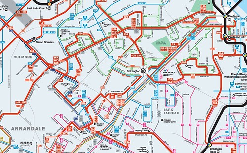
Northern Virginia, too cluttered.
Some of those “frequent” bus routes only come every 1/2 hour at off-peak times of day. Some of the others are branches that should be shown with a thin red line. Meanwhile the 9S, which is one of the most frequent routes in Virginia, doesn’t have a line at all.
Compare that Northern Virginia map with the Montgomery County version, which shows highlighted thick red routes much more clearly. The standards for a thick red line on the Montgomery County map are tight enough to keep them clear. The standards on the Virginia map are too low, resulting in a cluttered and less usable map.
Montgomery County. The right half is good, but the left half needs work.
On the other hand, the Montgomery map has another problem. Look at Gaithersburg and Germantown, which take up the left half of that map. All the routes there are shown with the same kind of line because they’re all pretty similar, but that makes them hard to tell apart on the map. And since Gaithersburg and Germantown have twisty suburban streets rather than planned grids, the new map’s geographic distortion makes it harder rather than easier to read.
Recommendations
1. Add a middle thickness line weight and use it to highlight non-WMATA frequent routes, as well WMATA routes in the suburbs that need to be called out as “major”, but that don’t offer really frequent service. This will better illustrate the important non-WMATA routes, and improve the visual hierarchy in suburban areas, which are currently shown with either too many or too few highlighted routes. This will also better inform riders about the quality of routes.
2. Add more geographic clues in areas with a lot of homogenous routes that are difficult to distinguish, such as Gaithersburg and Germantown.
3. Add names to MARC and VRE station labels.
4. Make a single regional map available. There are good reasons to keep separate maps for DC, Montgomery, Prince George’s, and Virginia, but there’s no good reason not to publish a single overall map as well.
5. A really great next step would be to make these interactive maps, instead of pdfs. I’d love to be able to see individual routes highlighted separately whenever I hover my cursor on them, and then go to the timetable with a click.
Send WMATA your own comments
To make sure WMATA planners read your thoughts, leave them in the comments section of the PlanItMetro blog.
Average Rating: 4.9 out of 5 based on 181 user reviews.
September 27th, 2012 | Permalink
Tags: bus, maps, proposal, transportation
One thing that always bothers me about bike maps is how complex they are, especially when it comes to the best trails. What would a different kind of bike map look like?
Here’s an example of what bothers me: Compare Google’s highway map for the DC region with its bike map at the same scale. Notice on the highway map how the most important roads pop out, with clearly defined lines that easily show the best driving routes. Then notice how the bike map is a muddled mess of criss-crossing lines and minor trail segments.
At the local scale all those little trail segments can be important. But at the regional scale it’s useless information. At the regional scale I just want to know where the best and longest trails are, in relatively simple geographic terms. I want a highway map for bike trails.
So I threw together a very simple one, showing only the most important of the regional trails. I didn’t put a huge amount of thought into it, nor did I spend a lot of time making the map as pretty as it could be. This is just an exercise.
A more dedicated and useful mapping effort might be to overlay the “bike highways” identified here atop the official regional maps, using a thick line that clearly indicates the importance of these routes. A stronger effort might also establish some objective standards for which trails to include, since arguments could be made that I left some important ones out.
But at the very least, this should help to visualize where the major biking corridors of the region exist.

 Cross-posted at Greater Greater Washington. Cross-posted at Greater Greater Washington.
Average Rating: 4.5 out of 5 based on 175 user reviews.
August 28th, 2012 | Permalink
Tags: bike, development, maps, transportation
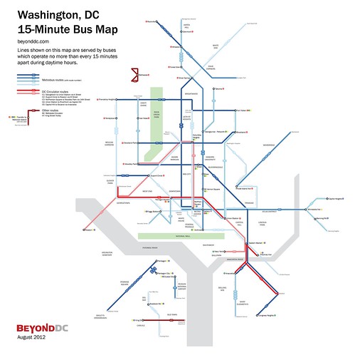
Back in 2010, WMATA produced a 15-minute bus map that showed bus routes with frequent service throughout the day. That map was just for planning purposes, but it’s such a useful idea that I took the next step, and turned it into a more user-friendly diagram.
In addition to Metrobus routes, this map also shows other frequent bus services in the region, including DC Circulator, Bethesda Circulator, and the King Street Trolley.
Cross-posted at Greater Greater Washington.
Average Rating: 4.5 out of 5 based on 206 user reviews.
August 10th, 2012 | Permalink
Tags: bus, featured post, maps, transportation
|
Media


Site
About BeyondDC
Archive 2003-06
Contact
Category Tags:
Partners
|