|
Special Features

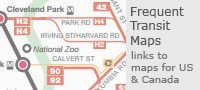


Image Libraries


|
|
Blog
There are more than 300 million people living in the United States today, but America is such a huge country that we still have staggeringly vast areas that are completely devoid of humans. This map illustrates those places. Everything colored green is a census block with zero population.

Map by Nik Freeman of mapsbynik.com.
The eastern US is pretty well populated except for a few spots in mountains and swamps. But the west is a different story. It’s covered with enormous stretches of land that are simply empty.
And Alaska’s emptiness makes even the western contiguous states look densely populated. Those green areas near the Arctic Circle look bigger than most other states.

Map by Nik Freeman of mapsbynik.com.
 Cross-posted at Greater Greater Washington. Cross-posted at Greater Greater Washington.
Average Rating: 4.8 out of 5 based on 256 user reviews.
April 16th, 2014 | Permalink
Tags: demographics, land use, maps

This graphic shows how much ground a pedestrian can cover walking along street sidewalks in a gridded Seattle neighborhood, versus a nearby suburb. Although both maps show a one-mile radius, there are far more destinations within that radius in the gridded neighborhood.
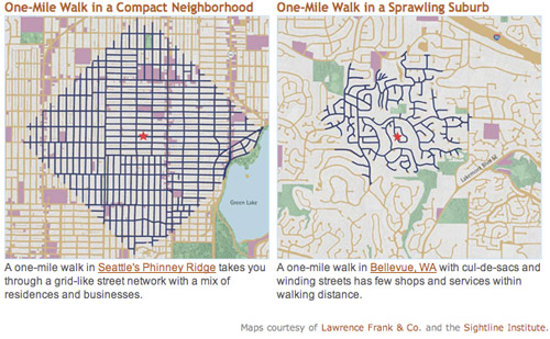
Seattle and Bellevue maps from sightline.org.
Both maps show neighborhoods that are primarily single-family detached houses: Greenwood, Seattle and Eastgate, Bellevue. But the similarities end there.
In Bellevue trips are indirect and circuitous. Not only are far more residential streets accessible in Seattle, but also more commercial streets (in purple on the map). Both neighborhoods have plenty of parks (shown in green).
Granted, the two maps appear to be at slightly different visual scales, population density is probably higher in Seattle, and pedestrians in Bellevue can probably cut through yards to get places a little faster. But the overall point remains true that far more destinations are within easy walking in Seattle, which – surprise – is why more people walk there.
For the record, the key isn’t a strict rectilinear grid; it’s interconnectivity. Boston’s medieval web of streets is just as good, and maybe even better. The real key variable is the density of intersections, not the straightness of streets.
Average Rating: 4.4 out of 5 based on 203 user reviews.
February 28th, 2014 | Permalink
Tags: land use, maps, pedestrians, transportation, urbandesign
Sochi’s main Olympic Village is 20 miles southeast from downtown Sochi, near the city’s airport. It’s home to the athlete residences, stadiums for the indoor sports, a theme park, and a huge rail station. The venues for mountain sports are 35 miles inland, near Krasnaya Polyana.
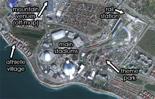
Satellite view of Sochi’s Olympic Village. Original image from Google.
Average Rating: 4.7 out of 5 based on 150 user reviews.
February 10th, 2014 | Permalink
Tags: land use, maps, parks
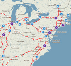
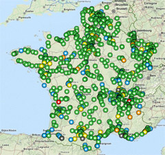
Well, this is embarrassing.
Using Amtrak’s real-time train tracker and the French equivalent, one can see the number of trains operating in each country at any given time. Putting them side-by-side isn’t a pretty sight.
It’s not quite as bad as it looks at first glance, because at this map scale Amtrak’s tracker clusters bunches of nearby trains into a single purple-colored dot. So there are admittedly a lot more trains in the Northeast and near Chicago than appear individually here.
On the other hand, Amtrak’s map shows all trains, while the French version is only showing regular speed ones. For high speed trains there’s a separate map.
Average Rating: 4.6 out of 5 based on 266 user reviews.
February 6th, 2014 | Permalink
Tags: intercity, maps, transportation
This map, from the American Intercity Bus Riders Association, attempts to show all the major intercity transit routes in America. It includes Amtrak, Greyhound, and several other bus carriers.
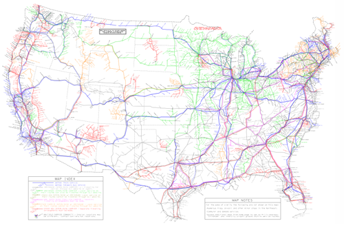
Map of Amtrak and intercity bus lines, from AIBRA.
It’s probably impossible for this kind of map to be 100% accurate all the time. In all likelihood there are some missing links, and missing carriers. But it’s still quite an impressive undertaking, and a useful tool to bookmark.
Cross-posted at Greater Greater Washington.
Average Rating: 4.4 out of 5 based on 253 user reviews.
February 3rd, 2014 | Permalink
Tags: intercity, maps, transportation
This map shows approximately how much snow it takes to cancel school in various parts of the United States.

Map from Reddit user atrubetskoy.
On Reddit, the map’s author explains the methodology:
[It’s from a] combination of a /r/SampleSize survey, City-data.com threads, NOAA maps and some other local news sources.
So while it may not be the most precise or reliable data, it’s still an interesting general look at snow closure patterns around the country.
Cross-posted at Greater Greater Washington.
Average Rating: 5 out of 5 based on 207 user reviews.
January 30th, 2014 | Permalink
Tags: environment, maps
This map shows US counties, colored according to the average number of cars owned per household.
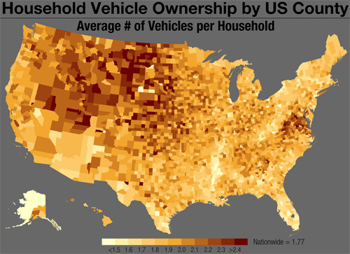
Several broad trends are visible, most of them not surprising to anyone. But it is surprising that so many counties in Virginia stand out, with higher rates than otherwise comparable counties in nearby eastern states. What’s different about the Old Dominion, versus West Virginia or North Carolina?
The map is from Tumblr blog Vizual Statistix, which has a lot of interesting data visualizations. It’s worth a read.
Cross-posted at Greater Greater Washington.
Average Rating: 5 out of 5 based on 245 user reviews.
December 2nd, 2013 | Permalink
Tags: demographics, maps, roads/cars, transportation
Last week Capital Bikeshare installed its 300th station. Quite an accomplishment! With stations now spread from Shady Grove to Alexandria, I thought it would be interesting to map their distribution, to see which parts of town have the most.
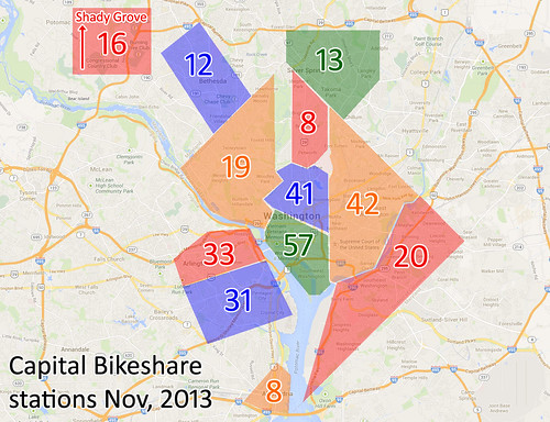
Bikeshare station distribution. Base map from Google.
Cross-posted at Greater Greater Washington.
Average Rating: 5 out of 5 based on 178 user reviews.
November 19th, 2013 | Permalink
Tags: bike, maps, transportation
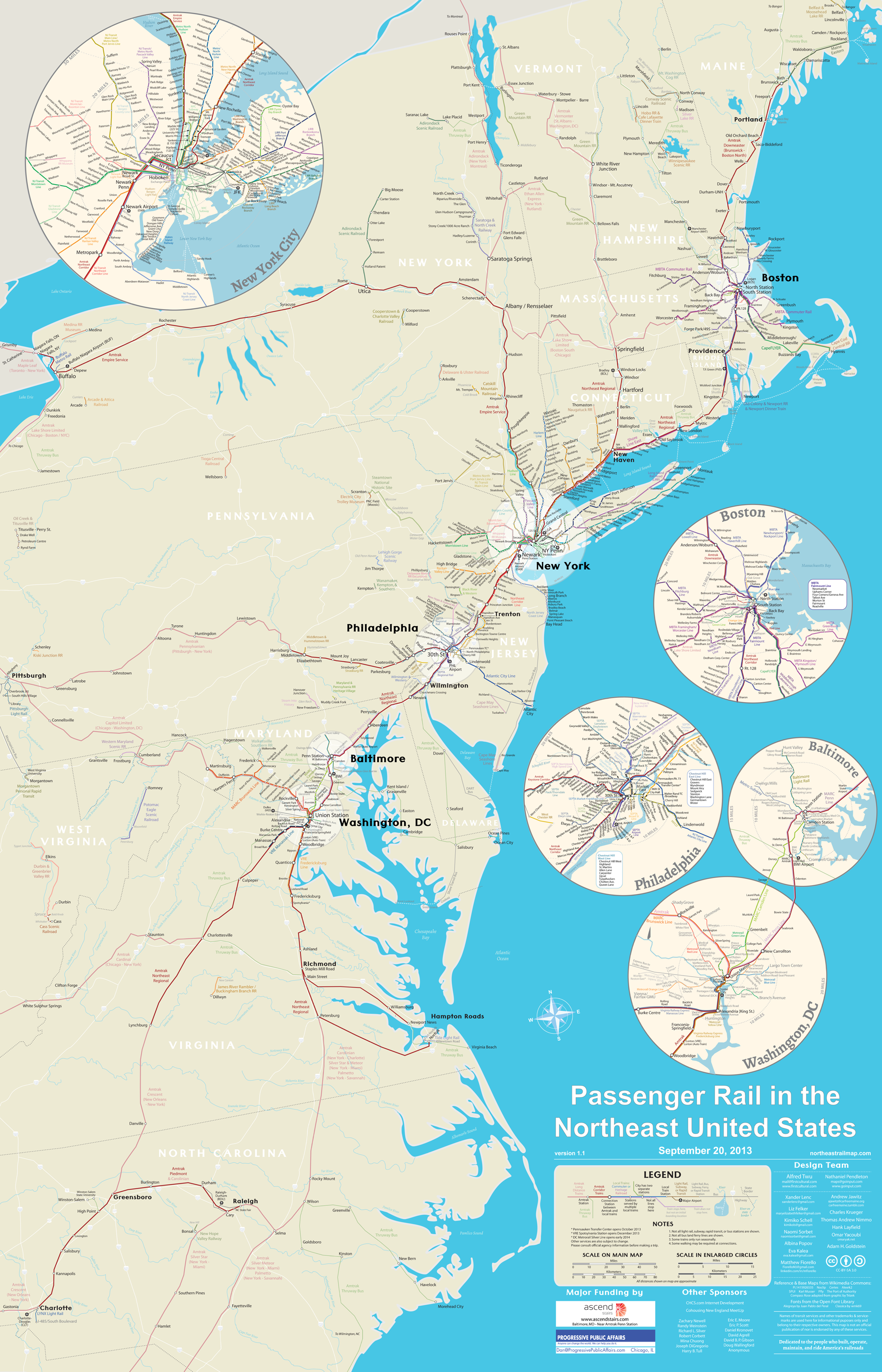
This map shows every Amtrak, commuter rail, metro, light rail, and tourist rail line from Maine to North Carolina, to scale.
It comes from NortheastRailMap.com, and you can even download it in a fully-editable Adobe Illustrator format.
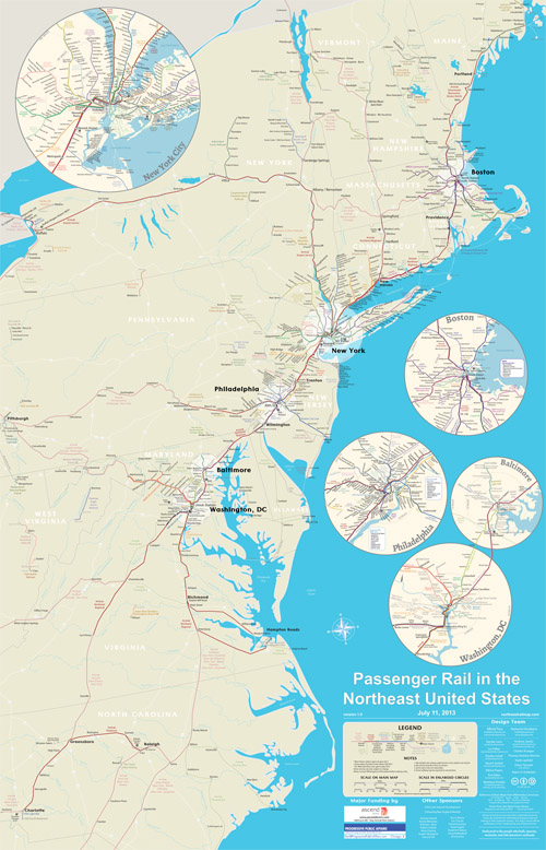
Image from NortheastRailMap.com.
Update: The map’s author has requested that you “like” their page on Facebook. Please help them out and do that!
Cross-posted at Greater Greater Washington.
Average Rating: 4.5 out of 5 based on 180 user reviews.
November 5th, 2013 | Permalink
Tags: commuterrail, intercity, lightrail, maps, metrorail, streetcar, transportation
Headed to Baltimore any time soon? If so, use this new frequent transit map, showing bus & rail routes that come at least every 15 minutes.
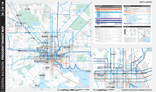
New Baltimore frequent transit map, by Marc Szarkowski for Envision Baltimore.
Compared to DC, Baltimore can be a difficult city to navigate via transit. But it’s getting easier thanks to the Charm City Circulator, weekend MARC, and the magic of frequent transit maps.
In 2011 Envision Baltimore produced an initial version of a frequent map, now they’ve updated it, and it’s better than ever.
The new map borrows heavily from WMATA’s 2012 bus maps that use a thick red line for more frequent routes. For Baltimore the thick lines are blue, but the effect and overall look is quite similar.
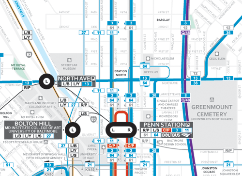
Close view of the area around Baltimore’s Penn Station. Map by Marc Szarkowski for Envision Baltimore.
I’ve added this new map to the list of all known US frequent transit maps on BeyondDC.
Cross-posted at Greater Greater Washington.
Average Rating: 4.9 out of 5 based on 278 user reviews.
October 15th, 2013 | Permalink
Tags: bus, maps, transportation
|
Media


Site
About BeyondDC
Archive 2003-06
Contact
Category Tags:
Partners
|