|
Special Features


Image Libraries


|
|
Blog
Graphic designer Peter Dovak has created a geographically accurate version of the new Metro map that WMATA released last week.
Peter’s map matches WMATA’s style as closely as possible, except it’s to scale. It looks stunningly like it could be an actual WMATA-produced map.
While this map is wonderful and fun, it also strongly illustrates why Metro opts for a more abstract official design. There’s so much empty white space in the suburbs, and the core is so cluttered, that a less accurate diagram is easier for riders to read.
See more at Peter’s website.
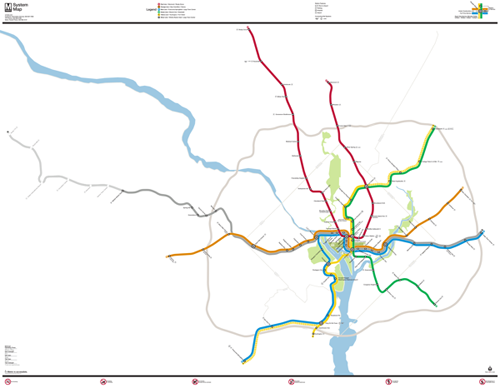
Map by Peter Dovak.
 Cross-posted at Greater Greater Washington. Cross-posted at Greater Greater Washington.
Average Rating: 4.9 out of 5 based on 165 user reviews.
September 18th, 2013 | Permalink
Tags: maps, metrorail, transportation

WMATA has released its next Metrorail map, proposed to go into trains and stations in time for the Silver Line to open.
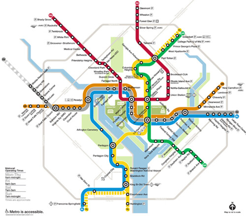
Proposed new map. Image by Lance Wyman for WMATA.
A new map is necessary to fit the complete Silver Line, which will run all the way through downtown DC and into Prince George’s County. The existing Metrorail map just shows the portion of the Silver Line that’s currently under construction, but the route will actually join with the Orange Line and run through DC.
The new map will also show Phase 2 of the Silver Line, extending all the way to Dulles Airport and Loudoun County. Phase 2 won’t open for several more years, but work on it recently started, and showing it on the map will help riders to become familiar with it sooner rather than later.
The new map incorporates several of the elements proposed in designer Lance Wyman’s draft from March, which was then refined in May. The new map is Wyman’s most graceful and streamlined yet.
Wyman narrowed the line thickness, lightened the station symbols, and changed the placement of the Silver Line in central DC, to be between the Blue and Orange Lines rather that atop them both.
The “whiskers” at stations where the 3 lines all share track are now white instead of solid black. The “pill” option for those shared stations, from the May draft, has been abandoned.
Overall, these changes make the map lighter and airier-looking, compared the March draft which was clunky and cluttered, especially in the DC core.
One thing missing from this map is DC’s H Street streetcar, which should open for service about the same time as the Silver Line. Although the streetcar won’t be operated by WMATA, it will certainly be an important rail service in the District.
As streetcar and BRT plans throughout the region move forward, WMATA may want to follow Boston’s lead, and show surface transit on its map as well.
But that’s a problem for another day.
Cross-posted at Greater Greater Washington.
Average Rating: 4.8 out of 5 based on 275 user reviews.
September 12th, 2013 | Permalink
Tags: maps, metrorail, streetcar, transportation
|
A portion of Arlington’s existing bike map. |
Arlington’s bike planners are designing a new bike map that will highlight the most comfortable routes, instead of focusing strictly on infrastructure. They want your help, to figure out the most important things to show on the map.
Most bike maps focus on infrastructure, with separate symbols for things like bike lanes, cycletracks, and trails. But another school of thought suggests they should focus on rider comfort, putting more emphasis on mixed-traffic roads with slow-speed car traffic, and doing more to call out things like hills.
To help strike the right map balance and illustrate the right things, planners are asking bike riders in the region to take a short survey. The survey has 13 questions and should take less than 5 minutes to complete.
Cross-posted at Greater Greater Washington.
Average Rating: 4.5 out of 5 based on 298 user reviews.
September 4th, 2013 | Permalink
Tags: bike, maps, transportation
Having recently added new rail service to Norfolk and Lynchburg, Amtrak is now beginning planning to extend service to Roanoke.
The plan is simply to extend the highly successful Lynchburg train a few miles further southwest. But since Roanoke hasn’t had rail service in decades, it will take 3-4 years to get everything ready.
Even if progress is slow, it’s exciting to see American intercity rail become popular again.

Amtrak’s route to Roanoke.
Cross-posted at Greater Greater Washington.
Average Rating: 4.4 out of 5 based on 203 user reviews.
August 22nd, 2013 | Permalink
Tags: intercity, maps, The New America, transportation
Sunday’s Washington Post featured a big story about gentrification on 14th Street, including the claim that it “recently surpassed Columbia Heights as the densest area in the city.” Is that true? The US Census can tell us.
Using American FactFinder, I created this map illustrating the population density of DC’s central neighborhoods.

5 of DC’s 6 overall densest census tracts border on 14th Street, between downtown and the northern end of Columbia Heights. It’s definitely the city’s densest string of neighborhoods.
But is it denser north or south of Florida Avenue? That depends how you count. While the stretch of 14th Street between Florida Avenue and P Street remains a little sparser than in Columbia Heights, the stretch from P Street south to Thomas Circle is the densest single tract in DC.
Cross-posted at Greater Greater Washington.
Average Rating: 4.8 out of 5 based on 233 user reviews.
July 22nd, 2013 | Permalink
Tags: demographics, maps
Google’s global 1984-2012 satellite timelapse shows remarkable growth in Northern Virginia. Take a look.

Westphalia master plan.
The most striking change is vast land development in Loudoun County, but that’s not the only visible growth. You can also see expansion of Tysons Corner (lower right), construction of the Dulles Greenway toll road, the airport’s new western runway, and at the very end, construction of the Beltway HOT lanes.
Cross-posted at Greater Greater Washington.
Average Rating: 4.5 out of 5 based on 241 user reviews.
June 4th, 2013 | Permalink
Tags: land use, maps
Constitution Avenue used to be a canal, and two creeks used to flow through central DC. David Ramos produced a series of maps showing where they went.
Imagine what a different city Washington might be today if these had been kept in place.
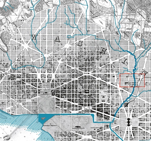
Image from David Ramos on ImaginaryTerrain.com.
Average Rating: 4.5 out of 5 based on 180 user reviews.
June 3rd, 2013 | Permalink
Tags: environment, maps
Frequent transit maps highlight bus and rail lines that come at least every 15 minutes. They’re great tools that help riders easily identify the most convenient routes.
Such maps exist for more than 20 cities around the US, including DC. Stuart Sirota of TND Planning Group made this one, for Baltimore.
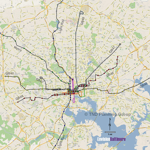
Baltimore frequent transit map, posted with permission from Stuart Sirota.
Cross-posted at Greater Greater Washington.
Average Rating: 4.7 out of 5 based on 158 user reviews.
May 29th, 2013 | Permalink
Tags: bus, lightrail, maps, metrorail, transportation
This map, produced by the Transportation Planning Board, shows “managed highway lanes” in the DC area. That’s planner jargon for HOV and tolls.
It’s only highways. It doesn’t show non-highway HOV, like along Route 1 in Alexandria. The map also appears to show I-495 incorrectly, since the Beltway HOT lanes are free for HOV-3.
But it’s still interesting to see which highways have special characteristics. One thing that pops out is how Virginia has a fairly comprehensive and interconnected network, while Maryland is more hit-or-miss.
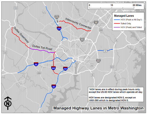
Managed lanes in the DC region, by TPB.
Average Rating: 4.9 out of 5 based on 269 user reviews.
May 2nd, 2013 | Permalink
Tags: maps, roads/cars, transportation
|
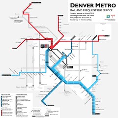
Denver frequent transit map, created by BeyondDC. |
Frequent transit maps specifically illustrate buses and trains that come at least every 15 minutes. They’re great tools that help people easily identify the most convenient routes. More and more transit agencies are publishing them. In other places, transit advocates are making their own.
Hopefully in the near future every transit agency will produce a frequent map as a matter of course. But for now they’re still pretty rare.
Wouldn’t it be great to have links to every one in the US and Canada? I think it would. So let’s make a list!
Here’s what I’ve got so far. Of the 42 US and Canadian urbanized areas above 1 million population, I’ve found 14 with frequent transit maps, including unofficial versions. I found several via the Human Transit blog, where Garrett Walker talks about them often.
Surely there are more. If you know of any I haven’t caught so far, leave a comment and I’ll edit the list.
> View the list.
Average Rating: 4.6 out of 5 based on 235 user reviews.
April 16th, 2013 | Permalink
Tags: bus, maps, transportation
|
Media


Site
About BeyondDC
Archive 2003-06
Contact
Category Tags:
Partners
|


